Is it Time to Buy the Dip?

It was a tough week for investors as fears from the ongoing oil price meltdown have pushed beyond just the energy sector and into broader market. Corrections are a normal part of every bull market and should be looked as opportunities to deploy un-invested capital. Of course the $64,000 question for investors looking to do so is when will the bottom of this correction be in?  

During this multi-year bull market I have found something that works very well. In the bottom pane of the chart below is a plot of VIX (blue lines) with Bollinger bands (gold) overlaid on top. The upper pane is a plot of the SP500 stock market index.  For those not familiar the VIX is commonly referred to as the “fear index” by the financial news talking heads. But that is a misnomer as there are times based on the price of this index that it construes fear, but other times it reflects complacency.  Without spending more time on the VIX as I will leave that to the reader, in very simple and general terms, it tends to rise when the market falls and falls when the market rises.  You can see that in the chart below.  Peaks in the VIX tend to mark bottoms in the market and vice versa. What you can also see is that every time that 1) the VIX closes above 17 and 2) outside the Bollinger band and then back in, it has been excellent at identifying those times to “buy-the-dip”.

Looking ahead to next week – Since the VIX is still outside the Bollinger bands and has NOT moved back inside, we have yet to see the bottom and as such “dip” buyers should continue to be patient and wait for confirmation.

Russia - The meltdown continues

The Russian stock market has had a rough go of it since its peak in the first half of 2011. As you can see in the chart below since that time it has been in a severe downtrend and has lost more than 50% of its value.

Not only has the Russian stock market been negatively impacted by the breakout in US dollar strength (see chart below) as have most other non-dollar denominated assets but also been piled on by two other significant events.  The first being the fact that since their economy is mostly energy based, the massive decline in energy prices (gasoline, oil, heating oil, natural gas, etc) of late are shrinking exports.  This combined with the geopolitical fallout of the Crimea and Ukraine debacle (and the resulting outcome/punishment of economic sanctions) is having a toxic effect on their economy and driving away outside investors.

The uber bearish head and shoulders pattern that formed this year has played out to its projected target this week. As one who is interested in undervalued assets the Russian stock market is currently very attractively priced and represents a compelling value right here when compared to most other world indexes.  In spite of this positive development and my desire to buy things at a discount, until the negative geopolitical and energy trend forces are resolved, this is a market one should avoid at all costs.  It is not unreasonable to think that it could again touch its 2008-09 low around 10 which would be another 50% decline from here. My biggest fear is that it would not be unreasonable that if these developments continue without some sort of relief, Mr Putin may be forced to act in desperation to save his country and people. There is only so many times you can poke an angry dog before it retaliates.  Lets hope it can end constructively for all parties.

Consumer's early Christmas gift

Happy Belated Thanksgiving.

I hope everyone had a wonderful time with family and have lost those feelings of being too full.

Since the double bottom in 2009, oil has risen more than 300% peaking in April of 2011.  Since that high, it has consolidated and been range-bound bouncing between $80-$110/bbl.  Unlike virtually most other commodities which are in a bear market, oil has held up pretty well.  That is, until earlier this year when in August it broke below its long term support line.  As you can see in the chart below it has been in a free fall ever since, closing Friday at $66/bbl, down 14% this week alone.  As with most commodity price declines, over-supply and weakening demand tend to be the major contributors.

Declines like this are eventually followed by either a change-in-trend rally or a multi-week strong counter-trend push so an opportunity (eventually) awaits. Before you bottom guessers try to catch the proverbial falling knife, be aware the measured move out of this pattern is around the $60/bbl level (the red circle on the blue horizontal line), the same price it found support in July 2009. If price were to follow symmetry down as it did up, its possible we could see oil prices back in the $40/bbl range next year. Unless you are nimble and investing/trading on a very short time frame or being short, it would be my recommendation to stay away from this sector until price has confirmed a bottom is in. What I will be looking for is volume confirmation (via exhaustion selling) combined with some sort of bottoming pattern (such as a divergent low double bottom).  Then and only then should those looking for a swing long investment jump in.

The smart money is short oil and energy stocks right now and the trend is definitely with them. If you too are short, congratulations but be careful and insure you have protective stops in place. A quick reversal in plans by OPEC to cut supply would be all that is needed to turn a profitable investment to a loser.


Health Care Checkup

Knowing markets only do two things, the first thing I want do before I take a position in an investment is to determine if it is trending or consolidating.  The goal is to find something in a trend, hop on board and ride it as long as it continues to rise.  That sounds great in theory and when put in practice is easier said than done because of the finite time periods of trends.  The hardest part is to find a balance between entering a trend early to capture the most out of the eventual move against getting in too early and find it wasn’t a new uptrend at all, rather just a corrective move in a downtrend.  I find the most effective way to determine if something is trending is to look at a weekly chart of the investment as the longer time frame tends to smooth out daily price noise and presents a much clearer picture.  A good example is the chart below of the health care ETF, IYH.  Even if you are not a technician or have much experience looking at charts it should be pretty easy to look and say this has been in a very nice uptrend since the August, 2011 low where it has since gained nearly 150%.  Just because a stock is trending up does not necessarily make it a good use of your investment dollar. What I find helpful is to look at its performance and compare it against say a broad market index like the SP500 or the US total Stock market index.  If it is not outperforming the index, why not just invest in the index? The bottom pane of my chart shows the ratio of IYH’s performance against the US broad market (SP500) and shows a similarly attractive uptrend reflecting a significant out-performance against the index.

Since this meets the criteria I have laid out is now a good time to buy? When entering a long term position once I have determined it is trending up I look at shorter term daily charts and wait for either the breakout from a short term consolidation or pull back. Entering then provides a better risk/reward than just randomly buying. Additionally on that pullback I would like see it be confirmed with an increase in volume to prove that there are others who are seeing this as a buying opportunity too, not just me.  While that always does not present itself, when it does, it is icing on the cake.

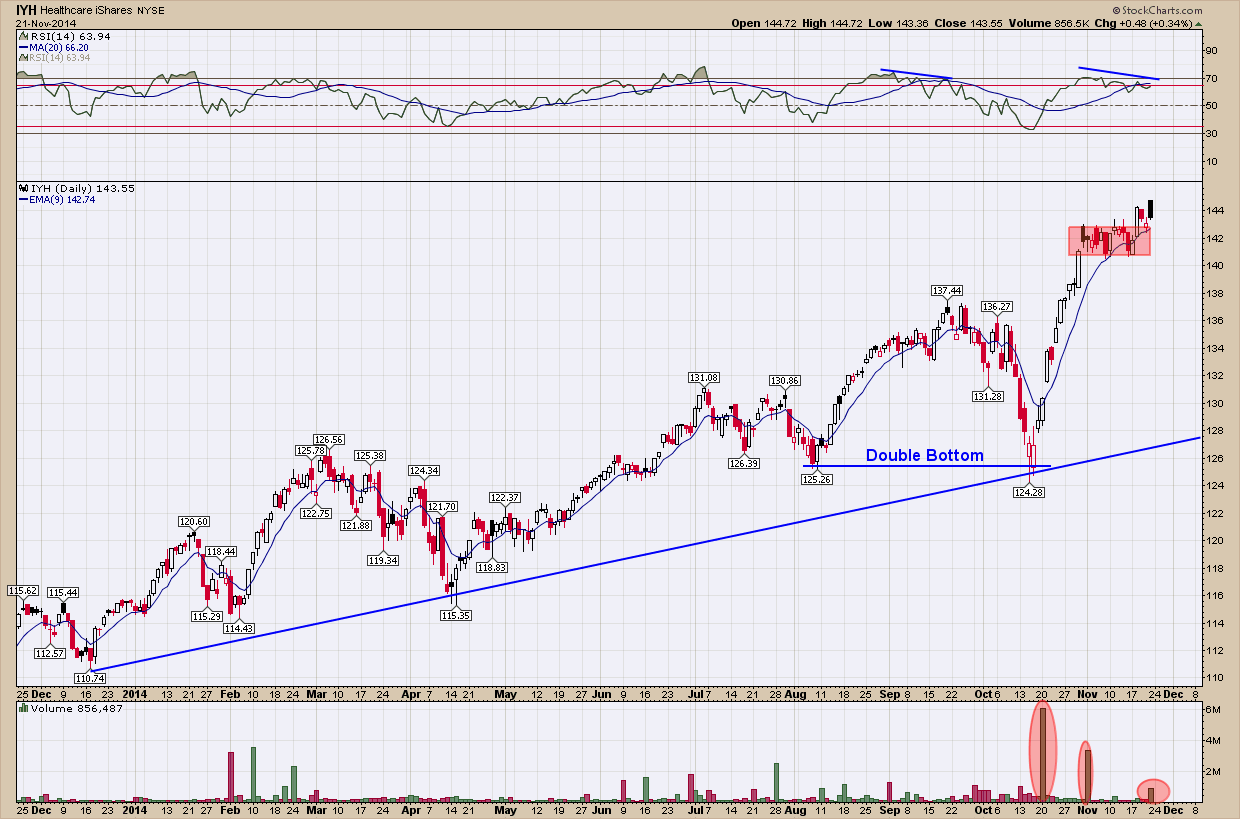
Taking a look at a second, shorter term daily chart of IYH below you can see we created a double bottom pullback buying opportunity back in the 3rd week of October.  Notice how the (blue) uptrend line that acted as support in December of last year and April of this, provided it once again as prices trampolined higher once hit. Also, note the massive volume increase which provided that confirmation I desire (it was more than 10x the average volume).

One final note, you can also see how price has consolidated these past few weeks (red box) and the bulls once again won control as prices are pushed higher.  While I am not a buyer here (it’s too far away from the support line and the negative momentum divergence is a red flag to me) this is an excellent example of a very strong stock in an uptrend that when pullbacks and consolidation occur, have provided excellent buying opportunities.

Gold - Is it Deja Vu all over again?

At the risk of raising the ire of the gold bugs and a bombardment of hate mail, I wanted to check in with how the golden shiny metal has been doing since past looks at the precious metals sector focused only on silver.   

Below is a (very busy) weekly chart of the spot price of Gold since the end of 2008.

If you follow the strong move up from the 2008 bottom, you can see gold peaked in mid-2011 just above $1920/oz. Once it topped it consolidated for nearly 20 months staying above the $1550 red horizontal support level.  You can see it tested that level 4 times at which point on that final 4th touch, the support gave way and began an impulsive move downward.  This is a good example of the more times price touches a specific support level the greater the chance that level eventually gives way. Typically this occurs on the 3rd or 4th touch and this time was no different.  

When these consolidation patterns develop and finally breakdown, you can estimate where the final end of the breakdown will finish. For this pattern that calculation is simply done by taking the height from the peak to the support line (blue vertical line (A)) and subtracting that amount from the breakout level (A’). As you can see this estimate actually worked out to be very, very close to the actual ending price.

Now fast forward to today.  Interestingly, what has set up is almost exactly to what happened in 2011 and should look very similar even to those who don’t want to believe another leg down is possible … a consolidation pattern and 4 touches of the support level.  Using the same methodology as we did in the first break of support (A) above to calculate an estimated target where gold may actually find its next bottom if it should break it works out to be ~$770. Just as it happened in the first breakdown (A), I would price would initially take an impulsive move down and then slow the angle of its decent as it nears its next support level. From a timing aspect and were this to happen I would expect it to take months to reach its final level wherever that may be. One thing will most likely also occur is it wont be a straight line down but ebb and flow frustrating both the bulls and bears along the way. 

From a risk/reward ratio, that lower price objective is a very big drop and something I personally would not want to be long precious metals in my investment account if it were to occur.  If the breakdown does not occur and before i would consider a bottom is in and worth adding to my investment account, i would want as a minimum to see gold make successive higher highs and lows but also a confirmed break above the blue down-trending resistance line. Unless and until this happens, the prevailing trend (down) is in control and needs to be respected.