No Foolin'

It was almost 2 years ago I wrote about a developing rising wedge in the SP500 which had potentially bearish implications. As it so happens the bearish breakdown never happened and we continued to push higher. As it turns out, and for all the negative references analysts use to support their arguments as to why prices are going to fall, rising wedges have very poor predictive success. In fact they have one of the worst performance rankings, 20th out of 21 when looking at all patterns.

Fast forward to today and sure enough you can see in the chart below, the SP500 is sporting another rising wedge. The most disconcerting thing about this wedge is the projected target if it were to play out. About 12% lower than from where we closed out Q1. 

For these patterns that actually do breakdown, less than a 50% meet their target price objective (measured move). If you stop and think about it that makes sense because rising wedges typically occur in uptrends, in this case a very strong uptrend. Corrections in strong uptrends are characteristically short and shallow.

So while I don’t want to discount the pattern just because of its low probability, it is helpful to understand target support levels if we do see a breakdown … just in case this one is real. If price breaks the lower blue support line, the next level of support would be just below at the red horizontal price labeled S1, around 2040.  A break below that would find support at S1 around 1990 and finally if that does not hold, I would expect this to be one that falls all the way down to its measured move near 1820.

While I am not predicting a correction, this pattern has my attention. And until this pattern is resolved it is, at a minimum, a warning flag telling me it is not a time to be a hero and put more money into a long (US stock market) equity trade. Of course, things can change very quickly but looking at the bigger picture, there is nothing that is saying this bull market run is over rather we are in the middle of period consolidation in a longer term uptrend.

Have a great rest of the week

Benvenuti in Italia

While we all understand over the long run a diversified portfolio has provided better returns and lower risk, over the past 1-2 years it has also been the main factor of underperformance. Apart from a few exceptions, being invested in anything but US stocks has been hazardous to your portfolio. Knowing one of the most powerful phenomenon’s in investing (and life for that matter) being reversion to the mean, I know this US centric investment thesis can’t go on forever.  As such, each week we scour the world looking for investing opportunities outside the US that will present both good risk/reward and a means to a better diversified portfolio.

One country that fits all the requirement and is on our radar is Italy using their ETF, EWI, as a proxy. You can see in the middle pane of the chart below, the Italian stock market has fallen more than 29% since it peaked in the middle of last year.  The decline was nicely contained within the blue downtrend line as each time it tried to rally above it, it was promptly rejected and prices continued lower.  That all ended last month when price broke out, quickly fell back to retest the blue downtrend line and then immediately propelled higher. The other thing that should jump out at you since the breakout is price has continued to make higher highs and higher lows, which is the definition of an uptrend. This is one of the confirmations we look for before investing as trend followers want to invest only in things that are trending up.

While finding an investment that has fallen, has bottomed and begun a new trend higher is what we strive to find, we have found in today’s market there is no sense in using client investment dollars unless there is a possibility it can outperform a US alternative.  The bottom pane in the chart is a ratio of the performance of the SP500 to the Italy ETF.  You can see up until the start of this year where the ratio peaked, being invested in the SP500 had provide a better return by 45%.  Since that time three important events have occurred 1) the ratio broke below the blue uptrend line 2) the ratio broke below the blue horizontal support 3) the ratio is forming lower highs and lower lows.  These are all confirmations informing us the trend for the ratio has changed from up to down. 

With the US markets struggling to go higher and looking very tired (more on that in another post) Italy looks as if it is worthy of some equity investment dollars.  Rather than add to equity exposure, a swap from a US equity into Italy seems worthy of consideration.

italy.png


Social Media Stocks - The Phoenix Rises

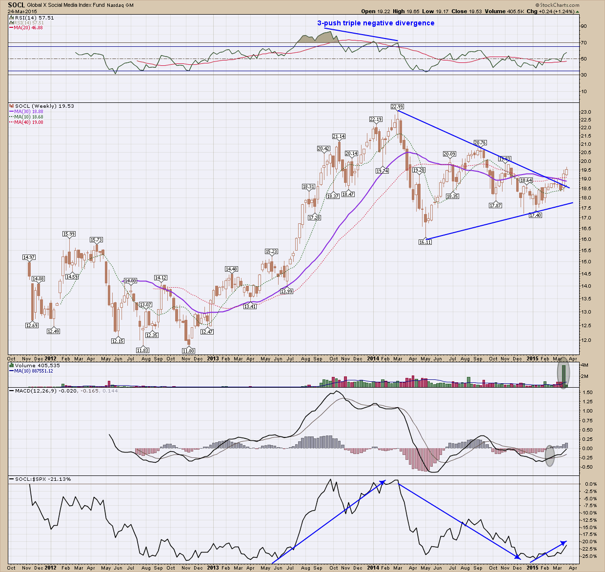
Besides the biotech sector, 2013-14 proved to be very favorable to social media as SOCL, the social media ETF, rose almost 100% from trough to peak.  On its final push higher in March of 2014, it created negative divergence which warned of a possible reversal, a correction at a minimum.  After losing 30% in that correction, price has ping-ponged for almost a year creating a sloppy looking symmetrical triangle. Triangles aren’t my favorite pattern to invest off of but the breakout last week had enough constructive indicator support to convince me this break has some legs. In the upper pane the RSI is moving higher and is above 50.  In the volume pane just under price, you can see we had an all-time volume week on the breakout which is the type of confirmation we would like to be present. Below volume the MACD has crossed over and continues to push moving higher, and just now crossing the zero line allowing for a lot more upside potential.  In the bottom pane which is the performance of this ETF as compared to the SP500 you can see the ratio bottomed and is, once again pointing higher making this a more attractive investment as compared to the index. While fundamentals aren’t something I put too much emphasis on short term, the stocks that make up this ETF such as Twitter, Facebook and Linkedin have the potential to be big long term winners.  When all the moon and stars are lining up like they are here, this is definitely worthy of consideration, depending upon your risk tolerance.

A Counter-trend Opportunity?

I have had a lot of interest over the past few months from investors wanting to invest in oil stocks because most have fallen 1/3 – 2/3 of their value from last year’s highs. To me this represents an opportunity for profit or on the flip side catching a falling knife!  It took me a while to learn that investing with the trend is the key to long term financial success. I had always felt that if I could get in at the bottom of a downtrend I was going to reap huge profits. While the logic behind the thought is true, being able to pick bottoms (or tops for that matter) may be simple in theory it is almost impossible in practice.  But there are times when the signals are numerous enough, the potential rewards great enough and the risk low enough that it is worth a try.  The key to minimizing damage of attempting to pick a bottom is to manage the risk through position size. For example, invest only ½ what you normally would.  The other key is to find an objective entry and manage it very tightly so that in case you are wrong, any loss incurred is minimized.

This blog post is going to look at how one might do this on a real-life example. The first step is to look at a longer term chart and determine direction. Oil and its related companies have been in a severe downtrend since mid-2014 as you can see in OIH (oil services ETF) chart below. I would like to call your attention to 3 things of major importance 1) all the moving averages pointing down is all the confirmation one needs to validate the current direction 2) Price reversed to the upside last week bouncing off the red horizontal line which has provided support 3 other times over the past 3 years. This tells us this price is IMPORTANT 3) since November of last year price has made 3 lower lows (marked by red arrows) while momentum has made 3 higher lows (marked by 3 green arrows). This 3 push pattern on a weekly chart is pretty rare and provides what I consider an objective reason to contemplate investing against the trend.

Once you have the longer term confirmation you need, it’s time to switch to a shorter time frame by looking at daily or hourly charts depending upon your investment time frame. On the daily OIH chart below we can see price has bottomed 3 times at the $32 level this year.  As with the weekly chart I want to draw your attention to 3 key things; 1) only two of the 4 moving averages are not pointing down (2 are moving sideways), marking the potential for a reversal; 2) price has been rejected twice at the upper red horizontal resistance $37 indicating this level of resistance is important; 3) since the most recent $37 rejection, price has formed a bullish falling expanding wedge.

For those with the appropriate risk tolerance, I find this opportunity presents an objective set of circumstances to nibble at OIH under the following conditions 1) price needs to break above the upper blue expanding falling wedge line 2) Position size should be reduced 3) a stop order should be placed at a level just under the lower red horizontal support line. On a break higher, I would expect this move to find initial resistance at the prior $37 level.  If it breaks that, there is a gap above which should create a vacuum to propel up the to $43-$44 prior congestion level.

In summary and why this is an opportunity for the nimble and risk tolerant is because you are risking ~$2 (~$33.5 entry with a $31.5 stop) to make $11.5. Any risk-reward ratio over 3:1 is worth considering and this one provides an outstanding 5:1 or more.


As always, this is not a recommendation to buy but rather an illustration on how one would, if their risk was appropriate, invest counter-trend.

Risk on - Risk off

Each time stocks go through a correction I like to check in with my Risk on - Risk off chart to see what it is telling me. The chart is just the ratio of the price of stocks (SP500) to the price of bonds (20 year treasury). It’s very basic in its premise but it tells a powerful story. Simply put, when the ratio is rising, you want to be invested in stocks, when it is falling you want to be in bonds.  When it is going sideways, you need check in regularly to watch for a break out and make the necessary changes in your portfolio.

I have lengthened the time frame of the Risk on – Risk off chart below to include more than 12 years in order to show enough data to do a comparison of the current run from the bottom of a sell off (2009) to that of a past bottom from a sell off (2003).  Let me to get you to look to the left side of the chart from 2003 to 2007 where the ratio climbed the upward sloping blue support line until the first quarter of 2007 where it peaked in May. The ratio fell back to the blue support line without crossing it and made another push higher in September but failed to make a new high and then quickly crossed below the blue support. Once below that, it quickly sliced through the red horizontal support and found a bottom in April 2008. Once again, it tried to rally, fell way short and could only make it back above the underside of the red horizontal support line (which has now become resistance).  We all know what happened after that, the stock market went into free fall losing more than 50%. Before we move on to what is happening today, note how well this ratio chart identified a time to step aside from stocks. If you would have followed the rules of exiting stocks when the ratio fell below both the upward sloping and horizontal lines (I have that time indicated with a dashed blue vertical line), you can see you would have avoided most of the stock market decline (follow the dashed blue vertical line down to the bottom pane where it crosses the price of the SP500 --- you can see how good a job it did).

Now, if you shift your focus to the most recent move from the 2009 bottom, one of the first things that should jump out at you is the fact we appear to be in a topping pattern which is occurring at almost the same exact level as the 2007 top.  Other things of note are 1) the rise is similar in slope 2) like the past move, the ratio has respected the blue upward sloping trend line 3) while it looks as if the ratio may be topping, it still sits above both the red horizontal and blue upward sloping support line allowing for an attempt at another push higher if it so desires (similar to what occurred in 2011).

The discipline of following a system (one that includes this indicator as one of many) I find extremely helpful to ensure the balance and objectivity one need to make good investment decisions. While it all may change tomorrow, this indicator is telling us stocks are still the place to be.