Follow the Leaders

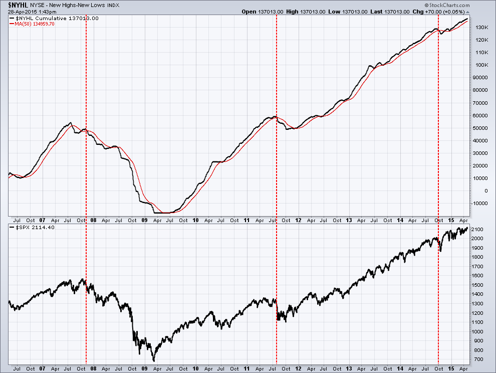
On the longer time frame, as I said in last week’s video, it looks to me as if the markets want to go higher. The biggest question for me is will that move higher start from where we are at today, or some point lower as a result of a correction.  I don’t like to keep reminding everyone how long it has been since we have had a 10-20% pullback and as such we are long overdue, but the longer we go without one the bigger it will be once it finally arrives.  Think of it as a rubber band that we continue to stretch. Eventually it either breaks or we have a nasty snap-back.  The markets are no different.

As I said in my video there are a number of negatives that I see in the market right now and wanted to present one that I am watching closely.  Regardless of whether the market is going up or down, it’s important to closely watch the market leaders as they tend to give you a clue on what to expect from the broader market. In an uptrend the leader tend to be the first into a correction. There is no question the market leader since the 2011 bottom has been biotech. The biotech index has outperformed the SP500 by more than 70% during that same timeframe as you can see in the weekly chart below. Even to an untrained eye I hope we can all agree this chart represents an investment in a strong uptrend.

Drilling down to a daily view of the investment we use as a biotech index proxy, IBB, you can see in the chart below the picture is flashing a warning sign.  What should jump out at you is the fact the market created a divergent double top.  The double top alone is a warning sign but when accompanied by divergence (this is when the momentum is falling while price is rising) it makes the warning that much more significant. Also you should notice I have annotated a red horizontal support line where price has currently tested at least 4 times (illustrated by red arrows). I point this out because it is important to remember the more times price tests a line of support the more likely it will eventually break it. In my experience rarely does price hold more than 5 times, right now we have completed 4 and the next will be #5. So it should not surprise you it is my expectation that if price goes back to retest that line one more time it likely will not hold and will continue to fall further. To where you may ask. The first projected resting point for a break would be the second, lowest (red) horizontal line which is about a 10% decline. If the decline picks up steam the next stopping point would be the lower blue trend line in the first chart above, some 20% south of where we are today.  Projections are just that, and there are no guarantees it will reach the targets or will even stop once it does. What it does do is provide a high probability based upon prior share supply and demand history.  As we all know, the market is the final arbiter of if there will be a correction and where it may end, not me. I just report on what I see at a specific point in time.  

No one wants to live through them but a correction of any magnitude is a healthy and necessary for the ongoing, long term uptrend of any market.  The biotechs, along with many of the other leaders are looking very tired at the time when stocks are beginning their weakest seasonal period. As such, pushing the limits to reach for return at this point in time is not something I find a prudent strategy and a main reason why we have been reducing client stock exposure.   Invest Safe! 

Do We Have Bad Breadth

You’ve heard it over and over again and I can tell you first hand that its true ... The trend is your friend.  While we have all heard it before what does it really mean? As a trend following disciple it means that until you have information otherwise, stay with those investments which are trending higher and avoid those that are not. While it sounds easy, it can create internal fortitude upheaval and play tricks on your mental state when upwardly trending markets goes through their normal consolidations/corrections.

As investors what we need to realize and accept is that you can’t catch a 20% move in a stock if you are not willing to lose 5-6%. This is often a normal pullback within 20% moves. Sometimes, stocks that pull back 5-6% from your entry won’t recover and you will have to sell them for a loss.  That is a part of investing. It’s ok because no one gets them all correct. Being wrong is often not a choice. Staying wrong though always is.

In the same line of thought – you can’t catch a 100% move in a stock if you are not willing to go through a 20% drawdown. Note that I say a drawdown, not a loss. They are two totally different things. If you time your entry properly, you should never let your position drop more than 5-10% below your purchase price. Once your position is profitable and on its way, 10-20% pullbacks are normal. Riding big long-term winners often requires going through deep pullbacks. Not everyone is willing or can stomach a 20% drawdown in individual positions. This is why not everyone can catch and hold 100% movers and why great returns are illusive.

While sticking with the trend sounds simple, the problem is of course, we all know trends eventually end so identifying when that occurs is critical. Since no one can predict the future and we won’t actually know when a trend ends until it can be seen in the rear view mirror (at which point it’s as clear as day) you have to rely on something other than intuition, gut or dart board.  In my case, price analysis (my process) tells me when that time is but I also rely on a number of indicators to confirm what I am seeing in price movement.  In this blog post I want to highlight one of these indicators I find extremely useful and enlightening and then look at what it is telling us today.

The NYHL is a plot of the number of stocks making new highs subtracting those making new lows (a measurement of market breadth). Intuitively it is pretty obvious the higher the number the stronger the market is. As this number starts to decline it is a sign of market weakness. Below is a 9-year chart of NYHL (upper pane) and the SP500 stock (lower pane). I have applied a 50 day moving average (red line) to the NYHL plot (black line) to use as a signal of market change. A simple, mechanical system to follow would be to reduce exposure to US equities when the NYHL (black line) crosses below the moving average (red line). In the past 9 years that signal has occurred 3 times which I have marked by the red dotted vertical lines. You can see while it is not perfect it does a great job of what it intended to do which is identify points at which a correction is imminent and when an investor should consider reducing risk.  

bay area investment adviser

With the markets overly extended and seemly running on fumes struggling to move higher, what is the NYHL telling us right now? Below is the exact same chart as above but only looking at a 2 year time frame allowing us to zoom in for clarity.  As you can see the black NYHL line is clearly above the red moving average line which tells us that the current price weakness (as of right now) is just a period of normal consolidation in an ongoing uptrend.  Since the trend is our friend and we have nothing telling us otherwise, all pullbacks should be looked at as buying opportunities.

bay area financial adviser

In spite of favorable indicators, a good investor always has their eyes on the market as a reversal can happen at any time. For this reason, now is not the time to become complacent. The Russian proverb President Reagan Russian used in his foreign policy of nuclear disarmament fits nicely in this investment environment, Доверяй, но проверяй, “trust but verify”.

Steak lovers rejoice

I remember walking into my local grocery store late last year and noticing how the price of a good steak was becoming more expensive than lobster. Beef prices rose on average 30% last year.  While it did not touch all-time highs, you had to go back to 2008 before you saw prices that were higher. But like all commodities which are at extremes (high or low), “the market” has a natural built in governor which eventually moderates prices back towards the long term average.  Beef prices are another example of when you hear me speak of the power of “reversion to the mean”.

The beauty of technical analysis is that is can be used across any market where historical values are available for analysis and beef fits that bill. In the weekly cattle price chart below we see price hit a peak back in November of last year and created a divergent high (price moved higher while price momentum in the upper pane moved lower) which was the tell-tale warning a decline was imminent. As expected, prices soon fell and eventually bottomed nicely at the prior $74 support line. From there price rebounded higher to create a lower high and form the right shoulder of a potential inverse head and shoulders pattern. In TA there are no absolutes but this pattern is warning of a short term top. If price falls below the $74 neckline the playout of the pattern projects to a $63 target, back to the May 2013 lows. 

This is definitely something to keep an eye on because I don’t know about you but I am tired of eating chicken!

Palo Alto Networks

Palo Alto Networks (PANW) has been a beast of a stock, doubling in less than a year. It's one of those stocks you wished you owned at the start of its run. As you can see in the chart below, the (red) 50 day moving average has acted as support as each time price fell (albeit briefly) below, it rallied back above it immediately. In the most recent consolidation zone (marked by my two horizontal black lines) price moved sideways for 6 weeks which allowed an unwinding of the overbought conditions and the bulls a rest, touching the 50dma once.

What is compelling about this is today price broke above the upper black horizontal resistance line which it tried but failed to break through 3x prior.  In addition, it did it on higher than average volume. This is extremely bullish activity and something a new investor into the stock would look for on an entry point.

As long as the overall market continues to push higher, this stock will likely be a strong beneficiary as all the moving averages are bullishly aligned and momentum is strongly within the bullish range. The upside target for today’s breakout is ~$165. This is a volatile stock and not appropriate for everybody, especially those who don’t have an exit strategy in case the bullish thesis is wrong. Invest safe.