You’ve heard it over and over again and I can tell you first hand that its true ... The trend is your friend. While we have all heard it before what does it really mean? As a trend following disciple it means that until you have information otherwise, stay with those investments which are trending higher and avoid those that are not. While it sounds easy, it can create internal fortitude upheaval and play tricks on your mental state when upwardly trending markets goes through their normal consolidations/corrections.
As investors what we need to realize and accept is that you can’t catch a 20% move in a stock if you are not willing to lose 5-6%. This is often a normal pullback within 20% moves. Sometimes, stocks that pull back 5-6% from your entry won’t recover and you will have to sell them for a loss. That is a part of investing. It’s ok because no one gets them all correct. Being wrong is often not a choice. Staying wrong though always is.
In the same line of thought – you can’t catch a 100% move in a stock if you are not willing to go through a 20% drawdown. Note that I say a drawdown, not a loss. They are two totally different things. If you time your entry properly, you should never let your position drop more than 5-10% below your purchase price. Once your position is profitable and on its way, 10-20% pullbacks are normal. Riding big long-term winners often requires going through deep pullbacks. Not everyone is willing or can stomach a 20% drawdown in individual positions. This is why not everyone can catch and hold 100% movers and why great returns are illusive.
While sticking with the trend sounds simple, the problem is of course, we all know trends eventually end so identifying when that occurs is critical. Since no one can predict the future and we won’t actually know when a trend ends until it can be seen in the rear view mirror (at which point it’s as clear as day) you have to rely on something other than intuition, gut or dart board. In my case, price analysis (my process) tells me when that time is but I also rely on a number of indicators to confirm what I am seeing in price movement. In this blog post I want to highlight one of these indicators I find extremely useful and enlightening and then look at what it is telling us today.
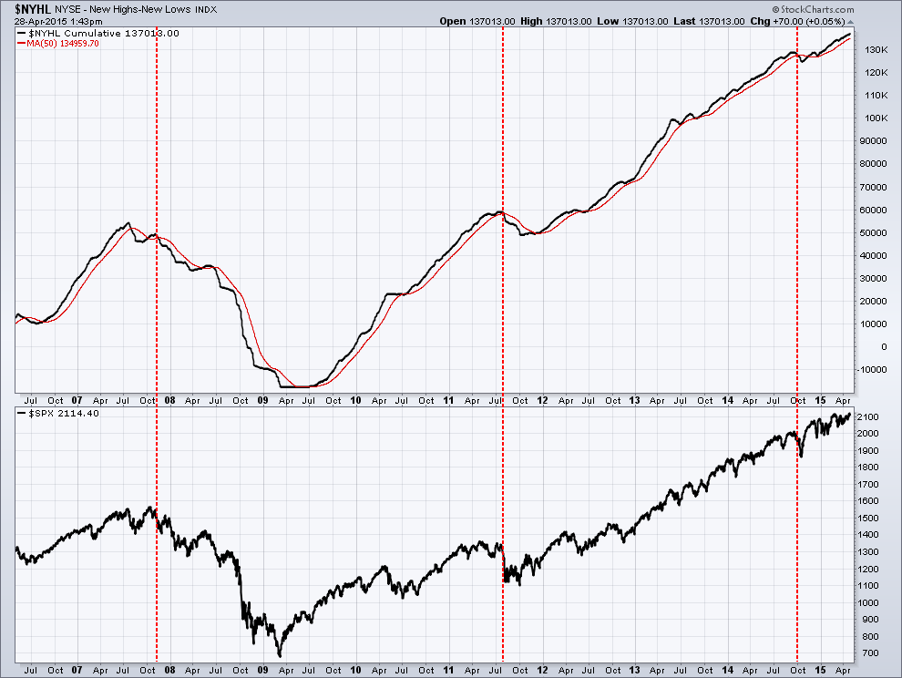
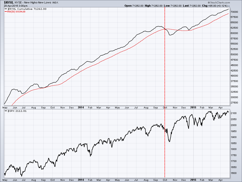
The NYHL is a plot of the number of stocks making new highs subtracting those making new lows (a measurement of market breadth). Intuitively it is pretty obvious the higher the number the stronger the market is. As this number starts to decline it is a sign of market weakness. Below is a 9-year chart of NYHL (upper pane) and the SP500 stock (lower pane). I have applied a 50 day moving average (red line) to the NYHL plot (black line) to use as a signal of market change. A simple, mechanical system to follow would be to reduce exposure to US equities when the NYHL (black line) crosses below the moving average (red line). In the past 9 years that signal has occurred 3 times which I have marked by the red dotted vertical lines. You can see while it is not perfect it does a great job of what it intended to do which is identify points at which a correction is imminent and when an investor should consider reducing risk.