Hanging by a Thread

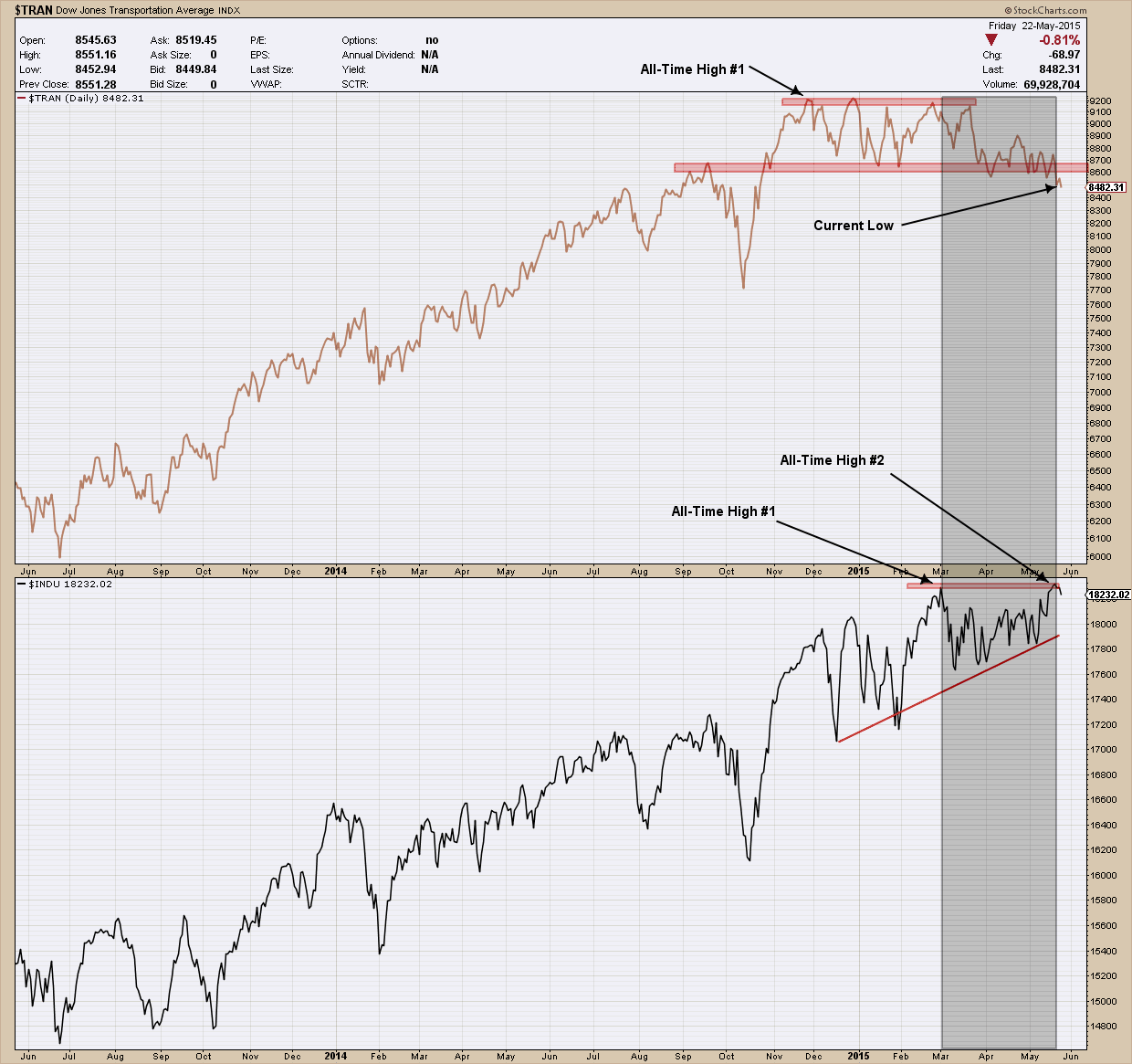
Earlier in the quarter the Dow Theory warning light started flashing as the transportation index began to fall and created divergence with the industrials which continued to rise.  I won’t spend any more time on the Dow Theory as I have beat this concept to death in the past. When a sector begins to breakdown I find it extremely useful to analyze some of the components to see what is “under the hood”. What I wanted to show you in this post is one of the components of the transportation index, American Airlines. I selected it as I couldn’t find a more textbook example of symmetry in price movement and I thought it would be an excellent teaching vehicle. Rarely are topping patterns this pretty and uniform. Presenting a sloppy image that is hard to visualize is a tough sell when trying to teach, trust me so I just couldn’t pass up the opportunity.    

You can see in the daily chart of American Airlines (AAL) below, price created a high in January of this year around $56, which I have marked by the left-most red “down” arrow. After that, price declined and bottomed near $46 (I have drawn a blue horizontal line at that level and labeled it “S1”). After bottoming, price chopped around in a $4 range for a month when the bulls once again took control in March and pushed it back up to the prior $56 high where the bulls ran out of gas creating a double top and major line of resistance. Immediately thereafter price quickly began to move lower, chopped around again and finally bottomed where?  Yup right back at $46. You’ve probably already noticed how that $46 level provided support many times as it was touched at least 4 times (highlighted by my red “up” arrows) and each time it was hit, it bounced higher.  Well that is until the middle of May where that “support” finally gave way and price blew right through proving the old adage that the more times price hits support the greater the probability it will bust through it.

bay area investment adviser  in Pleasanton

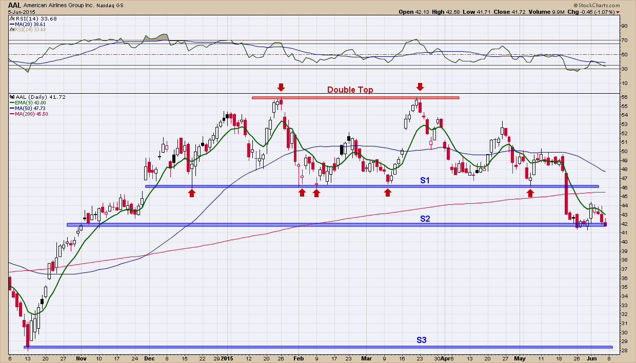
Hopefully in trying to follow price action with my explanation it is becoming easier to see how being able to recognize and use lines of support and resistance are valuable tools in investment management toolbox. If you fast forward to where we are today you can see we are sitting right on the next level of support, “S2”. If we continue to test that level and eventually break below “S2” like we did “S1” where do you think the next likely support level would be?  To find that answer you need to look left and see how price acted on the way up. You can quickly see there is really nothing until “S3” which is ~$28. So, if you still owned this investment (and did not sell on the break below “S1” which confirmed the topping pattern was “in effect”) the question you need to ask is if it breaks below “S2” are you willing to hold it in the drop from “S2” to “S3” (an additional 33% loss) as that is a likely target? Or do you cut your loss and move on to another investment that is in a clear uptrend?  Right now anyone owning this is hanging by a thread as the weight of the evidence is in favor of the bears. Hopefully this example helps to illustrate why all investors have an exit strategy in place BEFORE purchasing any investment as eventually every investment is faced with succumbing to bear market losses. Nothing goes up forever.

I can’t end this post without pointing out the beautiful symmetry of the (double) topping pattern that has formed (so far). From the first break above “S1” in December of last year, price formed two “humps” and then topped out at $56. From there it fell back to S1, and then moved almost exactly ½ the way from “S2” to “S1”. That entire move was almost 3 months. Notice how over the next 3 months price did an almost exact backwards retracement of what just happened the prior 3 months before. This is a symmetry at its finest. When symmetry happens it can provide those who recognize it a very powerful edge as it gives a potential road map of future price movement. Armed with symmetry and with a confirmed break below “S2”, the road map it is painting is clear: expect price to follow a reverse course from “S2” to “S3 as it did on its rise from “S3” to “S2” in October of last year and find a bottom.  

Summer Historical Stock Market Seasonality Patterns

Below are the seasonality stats for the S&P 500 during the Summer months:

  • June: Higher 65% of the time in the last 20yrs. Avg % return = 0% (Yes you read that right, 0% is the average return for June)
  • July: Higher 45% of the time in the last 20yrs. Avg % return = +0.4%
  • August: Higher 55% of the time in the last 20yrs. Avg % return = -0.8%

(Seasonality data from equityclock.com)

I find it interesting that the only month with a positive average historical return (July) was the one in which had the lowest probability of having a positive returns.

Finding Bottoms

Today was an ugly day in the markets as stocks dropped, volatility gapped 16% higher and bonds had one of their best days in a long time.  While there are some very disconcerting fundamentals underneath the hood of the US stock market, to put this day in perspective we are only off 1.3% from all-time highs. But because this is the Jason Bourne market (always an eye on the exit) every time these days occur I check my indicator charts to see if they can give me any insight.  One indicator I like to look at first is what I call “volume capitulation” which have presented below. Simply, it tries to identify bottoms during short term corrections by analyzing selling volume. What you see is that at or near the end of a correction everyone that wanted to sell did so (capitulation) and as such the market reasserts back into its uptrend. By looking at volume and selling patterns you can recognize the signs of capitulation. In the upper of pane of the chart is the price of my proxy for the US stock market, the SP500. In the bottom pane is the result of dividing the volume of shares on the NYSE that traded lower by the volume of shares of stocks that traded higher. Logically you would expect on days of capitulatory selling this ratio would be large. In fact that is exactly what happened today as there was more than 8x the down volume as up. What makes this number interesting is that in the past when this ratio has gotten above 8 (I have highlighted these occurrences with blue dashed vertical lines) it has been a pretty good indicator of exhaustion selling and that a bottom was near.  While it is not perfect in picking THE bottom (it turns out to be early in most cases), it does provide a nice early warning that a bottom is likely just around the corner.  Will this time be any different?

Bay area investment management investment advisor wealth manager


Is Charles Dow Sending us a Warning?

The Dow Theory, developed at the turn of the 20th century by Charles Dow is used by market analysts to determine the long term direction of the stock market. In fact, some use it as a market timing indicator as its performance has been better than a buy and hold strategy over time.  Simply put the Dow Theory states that for the markets to be in an uptrend or downtrend, both indexes — Industrials (DJIA) and transports (DJT) — must confirm each other. This means that when one of index make a new high (or falls to a new low), the other should soon follow. If this does not occur you have what is called a non-confirmation. As a side note and in case you are wondering there is no clear definition of what time period “soon” is.

Right now we have the DJIA making all-time new highs and the DJT has not confirmed by making its own new highs. In fact, as you can see in my chart below, the transports (in the upper pane) have been diverging and moving lower since the end of February when the DJIA (lower pane) made a new high. Adding to that, the fact the DJT just recently broke down below an important major level of support (bottom red line) and continues to lose strength is disconcerting.

Bay area investment adviser - dow theory

When a non-confirmation occurs, as we have right now, there are two possible outcomes: the first is the index that has not confirmed will eventually do so and by default, confirm the direction of the trend. The second outcome is the leading index changes course and eventually confirms the lagging index thereby signaling a change in direction/trend. Because the requirements for a proper Dow Theory (buy or sell) signal have not been met, combined with the divergence in the two indexes suggests a more cautionary market stance is appropriate course of action right now.