Got Junk in Your Trunk?

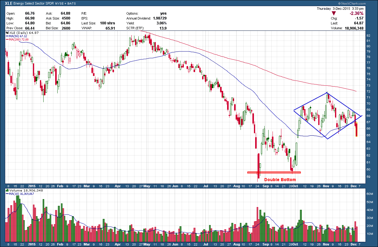
On last month’ video, I mentioned one of my biggest concerns after looking over the charts was the junk bond market. The concern was we were consolidating and once again testing the lower boundaries of the range.  A break below could not only push prices much lower but ultimately pull stocks along with them. The concern is the further oil falls and the longer the price stays depressed the greater the likelihood those companies who borrowed heavily to capitalize on the US energy boom will NOT be able to pay back their loans.  What happens then? The banks that lent the money will be on the hook. And, depending upon their leverage and exposure, could be setting up for another 2008-type crisis (that too was debt related, the difference was then it was housing debt).  We are not talking chump change as it is estimated there is 400 hundred billion of energy related junk bonds and half is now “distressed”

This past week stock market participants watched as crude continued its cascade lower pushing energy stocks even further and junk bonds joined the party with gusto. One junk bond etf I follow, HYG, broke down hard below both its rising (blue) and horizontal (red) support as I feared would eventually happen. Notice also how price is firmly below the red 200 day moving average which has now curled over and is pointing down. Volume was enormous, more than 3x times its long term average and the greatest in the history of this ETF.   

bay area financial advisor, wealth manager and retirement planner

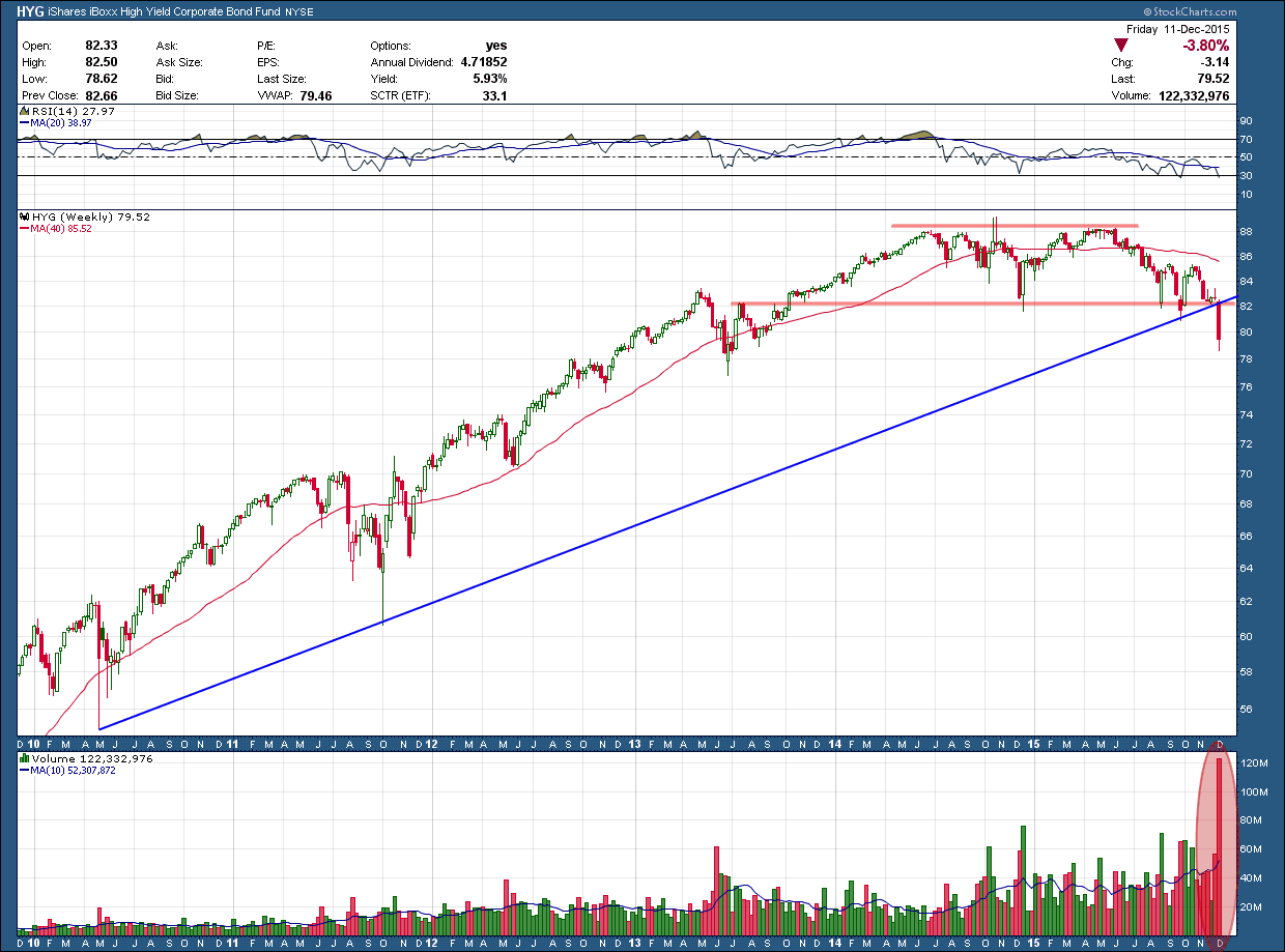
Large volume is what you want to see to confirm once price has made a move of technical significance which in HYG’s case was its break of support. This setup is indicating we will likely see much lower prices ahead. While this is a very high probability setup, I have to admit there is one element that has me somewhat cautious. A major selloff accompanied by extra ordinary high volume can be a capitulatory bottom. Meaning, if the volume was so high there are no sellers left and there is only one direction it can go …. Up.  Of course the only way we will know is at some point in the future and we can look back and say to ourselves, “What a great buying opportunity that was”

Investors love junk in a bull markets as they not only get better than average income but also can participate in stock like appreciation. Unfortunately, what goes up can come down just as far. Regardless of the chance this is a capitulatory bottom, I see no reason, to own junk bonds in an aged bull market.

Price is All That Matters

In the early years of my technical analysis training every night one of my mentors would say either, “only price pays” or “price is all that matters”.  Hearing that same thing over and over again used to frustrate me to no end. Whaddya mean only prices pays? What about earnings?  What about the FED? What about the Greece default?  What about, what about, what about? Those things matter darn it!  After finding the nerve I asked what it meant. He said it meant that as an investor the only thing I should pay attention to is price because everything else was noise. While that sort of helped it still was not complexly clear. Not until many months later did it finally click. I saw this comment on stocktwits.com yesterday and after a good belly laugh I immediately flashed back to the “price is all that matters” discussion of years past. I wished I had this then as it may have “clicked” a little sooner. 

Hopefully, if it hasn’t quite clicked yet for you, it may help you. If not, a good laugh is almost as important. Keep in mind it is about interest rates when in fact it could be about any other topic OTHER THAN PRICE.  

bay area financial advisor investment maangement retirement planning expert

The bottom line is everything, other than price, can be used to support a bullish or bearish argument depending upon which side of the fence you are on. Everything whether it is earnings, the FED, Greece (and maybe even Donald Trump) is reflected into price. Since price is all the information that exists in the market why not simplify life, ignore the noise and focus only on it because it is the only thing that matters.

Diamonds Aren’t an Investors Best Friend

Diamonds are a relatively rare pattern so I wanted to take a look at one that has recently developed on XLE. The diamond pattern is made up from two back-to-back symmetrical triangles and warn of a potential reversal ahead.  Like their triangle makeup, they are often subject to reversals after a breakout so their management can be challenging.  As you can see in the energy sector ETF, XLE, its price followed the path of lower oil prices, losing 30% from its peak in May of last year creating a double bottom. From there you can see price climbed higher and then began to consolidate which has allowed it the time to develop the diamond.

expert bay area investment advisor certified finanical planner

Price broke decisively lower Wednesday and confirmed the move with larger than normal volume. The follow through on Thursday provided additional needed to tell us this is likely not a whipsaw/fake-out and to expect lower prices ahead. The pattern target is back down at the prior double bottom lows around 59 1/2.  I would expect short sellers to jump on board and add more strength to the downside so I would not be surprised by an overshoot of the target.

There should be no surprise to expect lower prices as not only are we below the (red) 200 day moving average but it has a negative slope which is a huge red warning flag any long investor is fighting the trend.

Remember safety first. Don’t fight the Fed. Don’t fight the trend and don’t eat week old sushi!

Apple - Is it Déjà Vu All Over Again?

As one who took a hankering to chart patterns during the early years of my TA training, I have come learn the value and advantage they provide to those that know how to use them. While they can give insight to possible future moves, their unique advantage is providing risk management rules, the key to long term successful investment management.

Below is the 5-year weekly chart of Apple (AAPL). You can see at the start of 2012 it created, over the next 10 months, a head and shoulders (in blue) topping pattern. Notice how the right should could not rise above the 200 day moving average (dma) which acted as strong resistance. Also, how the moving average began to flatten out at the top of the shoulder and then point down as price broke through the neckline. The dramatic increase in selling pressure (bottom pane) pushed prices down exactly to the pattern target, just under 53 an almost 45% loss from peak to trough.

bay area investment advisor expert


Moving forward to today at the top right corner of the chart, the similarities between now and 2012 are very evident. Price has created a (red) head and shoulder pattern and finding resistance once again, just under the 200dma. And just like in 2012, the moving average has flattened out and is beginning to point down. If the pattern completes, the loss would be slightly less but still a very significant 40% decline. Based upon prior history, we know this is potentially not a good combination and this set up should be raising a warning flag.

It seems like the shrewd investor who recognized this pattern and past history might be thinking they should get ahead of the curve and sell their position right here. Unfortunately, doing so would be incorrectly applying the rules of pattern development. Granted, if the price does break down and head lower, selling now would garner the investor a greater return (by losing less). But the pattern is not complete and until price confirms a break below the neckline only then is should action be taken as the pattern is then considered complete and actionable. For now, if I were invested (and I am not) I would only this on a watch list due to its bearish potential. There is no one right set of risk management rules and every investor should be creating and following ones that fit their investment style and strategy.