Mar 17, 2014 - The ever shrinking investor time horizon

The attention span of today’s investors give ADHD a bad name and has driven an obsession with the short term.  The average mutual fund holding period has fallen by 75% over the past 16 years.  For stocks the data is even more bizarre as the average holding period has fallen from 8 years in the 1960’s to 5 days today.  One of the consequences of such a short investment time horizon is that investors have begun to fear short-term market events and volatility as much or more than the factors that shape prospects for long-term economic and profit growth that drive stocks over the longer term.

As such, investor’s patience with performance has followed the same declining trend.  While this may seem like the right thing to do, a study by the Brandes Institute showed this obsession with the short term a bad idea. Some interesting data from their study shows

Every best performing (10 year out-performance of SP>3% annually), long-run fund have had periods of major under-performance.

o   The average worst 1 year period was ~20% under-performance (6-38% range)

o   The average worst 3 year period was ~10% under-performance/year (1-20% range)

o   73% of these top performers found themselves in the lowest decile at least once

These types of results are not just unique to individuals who buy and sell mutual funds. Boyal and Wahal did a study on 4000+ decisions regarding hiring and firing of investment managers by pension plan sponsors. The results uncovered the classic hallmarks of returns-chasing behavior.  The managers the sponsors tended to hire had an average out-performance of nearly 14% in the 3 years prior to hiring. After hiring those same manager’s performance was statistically insignificant … meaning their performance matched the benchmark.  No out-performance.  In contrast, those fired for performance reasons had underperformed by ~6% in the 3 years leading up to dismissal. However, in the 3 years after the firing, they outperformed by 5%.

This helps illustrate that 1) even the best long term performing money managers run into short term difficulties 2) Investors need to insure they keep their focus on the long term as short term reactions can have long term negative effects on their portfolios.

Mar 10,2014

“A weed is but an unloved flower.” - Ella Wheeler Wilcox

We closed out 2013 with a bifurcated market. US stocks were the only place to be while the balance of the choices vying for your investment dollar were either ignored or beaten like that spider you found in your clothes drawer. As you can see in the chart below (2013 asset class performance) stocks were the only investment that ended the year higher (red). Commodities (purple) squeaked out a small loss, US bonds (pink) were shunned losing double digits while gold (light blue) was crushed.

2013 Untitled.png

A funny thing happened (at least so far) once we flipped the page on the New Year.  Through the first two months of the year it appears as if the 2013 losers have become this years darlings. Commodites and gold have outperformed stocks by almost 5x and bonds have also showed strength, doubling the returns of stocks.

Untitled.png

While 2 months is not long enough to confirm a reversal of fortune, it appears as if 2014 is suggesting a US stock over-weighted portfolio, unlike the past 3 years, may not provide the best returns.

Mar 3, 2014

It’s time again for the regular check-up on the state of retirement accounts in the US. Fidelity recently updated numbers for 2013, and while accounts have increased, the bottom-line still remains that the overwhelming majority of employees are still well underfunded for retirement.

The average 401(k) balance hit $89,300 at the end of the year, up 15.5% from $77,300 in 2012, according to an annual tally by Fidelity Investments. Most of the boost came from stock market gains as all three major stock indexes ended the year more than 20% higher.

People on the verge of retirement, ages 55 to 64 years old, saw their nest eggs grow to an average balance of $165,200 from $143,300 in 2012, Fidelity said. Savers with both a 401(k) plan and Individual Retirement Account managed by Fidelity had larger nest eggs, with an average balance of $261,400, up from $225,600 in 2012.

Even a balance of $261,000 is hardly enough for a comfortable retirement. And many Americans are much more woefully unprepared for retirement. A 2013 study by the Employee Benefit Research Institute found that nearly half of workers had less than $10,000 saved.

Here’s something I found interesting: part of the problem is that many workers are putting their retirement savings at risk when switching or leaving jobs by not rolling over the accounts to 401(k)s or IRAs. Of the roughly 800,000 workers with Fidelity accounts who left a job in the first nine months of 2013, 35% cashed out their 401(k) balances, as opposed to leaving the money in their former employer's plan or rolling it into a new 401(k) or IRA. While Fidelity said the statistic was "concerning," it was not a significant increase from previous years.

These cash-out balances averaged $15,500, and were especially common among young and low-income workers. More than 40% of participants between the ages of 20 and 39 and 50% of workers earning between $20,000 and $30,000 had opted for the cash. Unless workers use the funds to open an IRA account within 60 days, they get hit with significant taxes and a 10% penalty.

Ultimately this makes it harder for their savings to grow. For example, a 30-year-old who cashes out $16,000 could lose nearly $500 in monthly retirement income, assuming she retires at 67 and lives to the age of 93, Fidelity said. Plus, the 30-year-old would be hit with $3,200 in taxes and another $1,600 in penalties at the time she cashes out.

Such an impact is why it never hurts to reiterate that, especially for young savers with years of potential investment gains ahead, it is important to save, and save often. Though personal financial situations will be different for everyone, one literally can’t afford not to sock away for retirement.

Source: http://money.cnn.com/2014/02/13/retirement/401k-balances/index.html?hpt=hp_t2

Feb 24, 2014

Part 3 in this series, this week I wanted to look at market breadth and see what, if anything, it is telling us. Market averages such as the Dow Industrials or S&P500 indices are the most readily available barometers for market conditions. Using charts, it is relatively straight-forward to determine the current trend, and to identify how long this trend has been in place. However, what is even more beneficial is to have an understanding of not only the price trend but the underlying strength of the individual stocks as this will help substantially in determining the likelihood of the trend changing and the relative levels of market risk. Breadth (participation) indicators were developed precisely with this task in mind: to determine the strength of a market trend by looking at its constituent stocks.  Since research has shown that the majority of an average stock’s future price move is due to the direction of the overall stock market, the importance of understanding what market breadth cannot be understated.

If all this is putting you to sleep because it’s too technical, a real simple way to think of this is a stock market can only continue to rise if the majority of the stocks that make up that market are rising. The converse is true too when the market is falling.  Since this series of blog posts is about analyzing market tops if you apply that understanding logically you would not expect a top to be reached until the majority of the stocks in the market are no longer rising and instead falling. While there are many different ways analysts slice and dice the internal market breadth data I am not going to go into detail here rather state that what is most important is trend of that data not each exact value.

The chart below shows the SP500 US stock index (in black) on the top and three different breadth indicators (in blue, green and red). In order to get a good level of confidence in interpreting market participation, I like to look at a few different breadth measurements in hopes they are all telling the same story. If they are, a yellow flag is raised and tells me more intense and frequent monitoring is required. In the case of the chart below, you can see the trends of all three measurements are declining. You should also notice the SP500 price trend is pointing UP. This is divergence and it is warning of the potential for lower stock prices. Either the trend of breadth continues to decline and the SP500 will eventually follow suit or we will need to see greater participation here in the coming weeks.

An interesting observation you can make about the chart is that during the recent correction over one third of SP500 stocks dropped below their 200 MA. This was the first time breadth readings dropped below 75% since late 2012. This shows just how strong the recent bull market has been. The question is, was this sell off an indication of something bigger to come or was it just another correction in the uptrend?

While this is a warning sign it does not mean to me it is time to get out of the market.  This is just one of a many indicators I watch. When the majority of them turn yellow or red and tip the scales convincingly to the side of the bears that becomes my trigger to take evasive action. Until then it doesn’t mean you shouldn’t consider taking some risk off the table due to the increased uncertainty and warning flags that are popping up. But, for now the trend is still up and until it changes it is important to respect it.

Equity-Market-Breadth1

Feb 17, 2014

Part 2 in this series, this week I wanted to dig into price reversal patterns that typically appear during market tops. Rising Wedges

The rising wedge is a bearish reversal pattern formed by two converging upward lines. To confirm a rising wedge, price must move between top and bottom lines and touch them each at least twice to confirm this pattern.

This pattern marks the shortness of buyers. This one is characterized by a progressive reduction of the amplitude of the waves. We would like to see trade volume confirm as each successive wave would bring lower volume such that at the end of pattern there are almost no buyers left confirming a bearish reversal.

Here is a graphical representation of a rising wedge:

And a real life example of how they can play out.

Here are some statistics about rising wedges:

- In 82% of cases, there is a downward exit - In 63% of cases, the target of the pattern is reached once the support broken - In 53% of cases, a pullback occurs - In 27% of cases, false breakout occur

Head and Shoulders

The head and shoulders pattern is one of the most common reversal formations. It is important to remember that it occurs after an uptrend and usually marks a major trend reversal when complete. While it is preferable that the left and right shoulders be symmetrical, it is not an absolute requirement. They can be different widths as well as different heights. Identification of neckline support and volume confirmation on the break can be the most critical factors. The support break indicates a new willingness to sell at lower prices. Lower prices combined with an increase in volume indicate an increase in supply. The combination can be lethal, and sometimes, there is no second chance return to the support break. As the pattern unfolds over time, other aspects of the technical picture are likely to take precedence.

Here is a graphical representation of a head and shoulders pattern:


And a real life example of how they can play out.


Here are some statistics about the head and shoulders pattern:

- In 93% of cases, there is a downward exit - In 63% of cases, the target of the pattern is reached once the neckline broken - In 45% of cases, a pullback occur on the neckline

Double (and Triple) Top

The double tops is a bearish trend reversal pattern that often marks the end of an uptrend and the start of a down trend. It consists of two consecutive peaks that reach a resistance level at more or less the same high value, with a valley separating the two peaks. The low of the valley is important for price projection purposes, but the shape that the peaks take is not important. Volume is also of importance, with the volume on the second peak preferably lower than the volume on the first peak. At times, the double top pattern can form a third top, creating a triple top pattern.

Here is a graphical representation of a double top pattern:

And a real life example of how they can play out.

Here are some statistics about the double top:

- In 75% of cases, there is a bearish reversal - In 71% of cases, the target of the pattern is reached once the neckline broken - In 61% of cases, a pullback occur
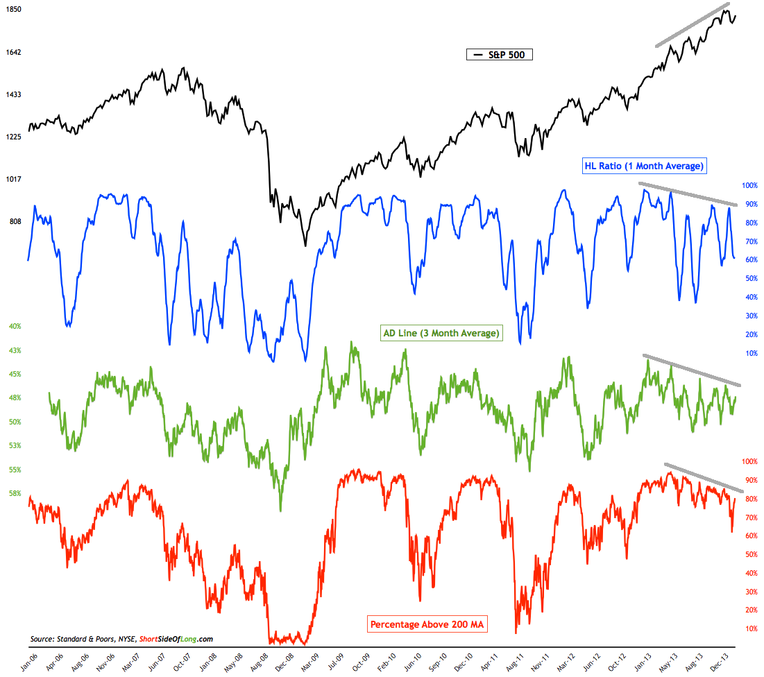
Where are we today?

From a longer term view, I had been closely watching the rising wedge form and noticed 2 weeks ago we broke down outside the pattern (see below) but subsequently have moved back inside.

On a shorter term view, the head and shoulders pattern I saw developing once we broke out of the wedge has since been invalidated since the symmetry between the right and left shoulders has been lost. Instead what you now see developing (in the chart below) is the possibility for a double/triple top.  You are never sure when patterns begin to form so it is important to follow them as the can morph over time. Exactly what just occurred over the past two week where we moved from a head and shoulders to double top.  The good thing is that double tops are one of the easiest patterns to manage because it becomes apparent very quickly whether or not it is valid, unlike head and shoulders where the pattern takes time to develop and be confirmed. We will likely know in the next couple of weeks, if not sooner, because once price moves above the prior high (the green dotted line in the chart below), the double top pattern becomes invalid as we have then created a higher high. As a result, near term concerns about a larger correction will have been significantly reduced and we are back to the prior bullish trend.