Health Care Checkup

Knowing markets only do two things, the first thing I want do before I take a position in an investment is to determine if it is trending or consolidating.  The goal is to find something in a trend, hop on board and ride it as long as it continues to rise.  That sounds great in theory and when put in practice is easier said than done because of the finite time periods of trends.  The hardest part is to find a balance between entering a trend early to capture the most out of the eventual move against getting in too early and find it wasn’t a new uptrend at all, rather just a corrective move in a downtrend.  I find the most effective way to determine if something is trending is to look at a weekly chart of the investment as the longer time frame tends to smooth out daily price noise and presents a much clearer picture.  A good example is the chart below of the health care ETF, IYH.  Even if you are not a technician or have much experience looking at charts it should be pretty easy to look and say this has been in a very nice uptrend since the August, 2011 low where it has since gained nearly 150%.  Just because a stock is trending up does not necessarily make it a good use of your investment dollar. What I find helpful is to look at its performance and compare it against say a broad market index like the SP500 or the US total Stock market index.  If it is not outperforming the index, why not just invest in the index? The bottom pane of my chart shows the ratio of IYH’s performance against the US broad market (SP500) and shows a similarly attractive uptrend reflecting a significant out-performance against the index.

Since this meets the criteria I have laid out is now a good time to buy? When entering a long term position once I have determined it is trending up I look at shorter term daily charts and wait for either the breakout from a short term consolidation or pull back. Entering then provides a better risk/reward than just randomly buying. Additionally on that pullback I would like see it be confirmed with an increase in volume to prove that there are others who are seeing this as a buying opportunity too, not just me.  While that always does not present itself, when it does, it is icing on the cake.

Taking a look at a second, shorter term daily chart of IYH below you can see we created a double bottom pullback buying opportunity back in the 3rd week of October.  Notice how the (blue) uptrend line that acted as support in December of last year and April of this, provided it once again as prices trampolined higher once hit. Also, note the massive volume increase which provided that confirmation I desire (it was more than 10x the average volume).

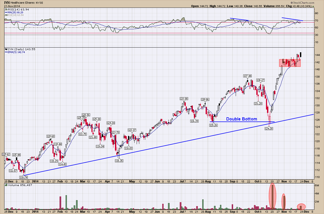
One final note, you can also see how price has consolidated these past few weeks (red box) and the bulls once again won control as prices are pushed higher.  While I am not a buyer here (it’s too far away from the support line and the negative momentum divergence is a red flag to me) this is an excellent example of a very strong stock in an uptrend that when pullbacks and consolidation occur, have provided excellent buying opportunities.

Gold - Is it Deja Vu all over again?

At the risk of raising the ire of the gold bugs and a bombardment of hate mail, I wanted to check in with how the golden shiny metal has been doing since past looks at the precious metals sector focused only on silver.   

Below is a (very busy) weekly chart of the spot price of Gold since the end of 2008.

If you follow the strong move up from the 2008 bottom, you can see gold peaked in mid-2011 just above $1920/oz. Once it topped it consolidated for nearly 20 months staying above the $1550 red horizontal support level.  You can see it tested that level 4 times at which point on that final 4th touch, the support gave way and began an impulsive move downward.  This is a good example of the more times price touches a specific support level the greater the chance that level eventually gives way. Typically this occurs on the 3rd or 4th touch and this time was no different.  

When these consolidation patterns develop and finally breakdown, you can estimate where the final end of the breakdown will finish. For this pattern that calculation is simply done by taking the height from the peak to the support line (blue vertical line (A)) and subtracting that amount from the breakout level (A’). As you can see this estimate actually worked out to be very, very close to the actual ending price.

Now fast forward to today.  Interestingly, what has set up is almost exactly to what happened in 2011 and should look very similar even to those who don’t want to believe another leg down is possible … a consolidation pattern and 4 touches of the support level.  Using the same methodology as we did in the first break of support (A) above to calculate an estimated target where gold may actually find its next bottom if it should break it works out to be ~$770. Just as it happened in the first breakdown (A), I would price would initially take an impulsive move down and then slow the angle of its decent as it nears its next support level. From a timing aspect and were this to happen I would expect it to take months to reach its final level wherever that may be. One thing will most likely also occur is it wont be a straight line down but ebb and flow frustrating both the bulls and bears along the way. 

From a risk/reward ratio, that lower price objective is a very big drop and something I personally would not want to be long precious metals in my investment account if it were to occur.  If the breakdown does not occur and before i would consider a bottom is in and worth adding to my investment account, i would want as a minimum to see gold make successive higher highs and lows but also a confirmed break above the blue down-trending resistance line. Unless and until this happens, the prevailing trend (down) is in control and needs to be respected.

What do politics and Santa have in common?

In spite of recent end of quarter (q3) volatility and ~10% correction, I have been telling investors to expect a good ending to the year for US stocks (and likely early part of next year too).  Its not that I can see into the future, rather there is a 2-pattern seasonality alignment which provides investors a high probability bullish outcome for US stocks over the next quarter or so. The first pattern is the traditional year-end (“Santa Claus”) rally that customarily begins sometime in October of each year. This is caused from sentiment changes the joys of the holiday season brings and optimism that typically abounds as the year winds down and a new one is christened. The chart below is a historical look at performance on the 3 major US stock indexes by month during the period of 1950-2012 and clearly reflects these year-end rallies. 

The second pattern is that the sixth year of 2-term presidents have traditionally been very good for stock market returns, but typically don’t manifest until the 4th quarter. The chart below which represents the SP500 US stock index returns by month since 1950 unmistakably reflects the historical out-performance during this time.

Two patterns aligning up at the same time (the 4th quarter of this year) provides a potential huge edge for investors (successful investing is all about investing at times when the odds/probabilities are in your favor).  This edge combined with the fact that stocks just recently endured an ~10% have gone on to put it in the rear view mirror in very short order, should be the impetus for investors to stay the course and for those who may have reduced their risk, to consider adding some. There are of course no guarantees and only time will tell if this year-end will turn out to be as bullish as I expect but until proven otherwise I am looking to take advantage to what appears to be a short-term very favorable investing environment.

Charts courtesy of Stocktradersalmanac.com

Looking Under the Hood

It’s been an unbelievably crazy, hectic and demanding last 6 months for me and the old voltmeter is telling me it’s time to recharge my batteries. So this will be my last post for a few weeks. I was going to just signoff this week but after doing my weekly check-in with those few trusted technicians I trust and follow, I felt compelled to leave you with a very thin slice of an excellent article “The 2014 Stealth Bear Market – A Transition or a Top?” written by Chris Puplava of financialsense.com.  He has some compelling statistics if you look under the hood of today’s market that confirmed what I believed was happening.  The market has a way of not only challenging even the most experienced but humbling us too.

Looking Under the Hood

While the small cap space is feeling the pain of this transition from high liquidity and low growth to higher growth and low liquidity, the Dow Jones Industrial Average and the S&P 500 aren’t showing the same level of volatility. While the Russell 2000 was down 4.4% through the third quarter, the Dow was up 4.6% and the large cap S&P 500 Index was up 8.3%; the NASDAQ as well was up 8.6% on a total return basis. However, the headline numbers don’t tell the full story for there is greater deterioration beneath the surface than what the major indexes performance numbers tell.

For example, the S&P 1500 is up 4.96% year-to-date (YTD) as of 10/23/2014 while the median stock in the index is down 0.15%. The NASDAQ Composite is up 6.61% YTD while the median stock within the 2557 member index is down 5.65%. The Russell 3000 comprises roughly 98% of the entire U.S. market capitalization and is up 4.55% YTD while of the 3000 members within the index the median stock is down 1.96%.

Looking at the figure above clearly shows that 2014 has been a rough year as the markets grapple with a less accommodative Fed and the prospect of rate hikes in the coming year on the back of an improved economy. Transitional years are difficult to navigate and the performance numbers from large cap active managers bear this out as nearly 85% of active managers are under-performing the S&P 500. Again, this comes down to stock picking and when the median stock is down 1.96% in the Russell 3000, while the index itself is up 4.55% YTD, beating your benchmark is hard to do.

This was made evident by a recent study done by The Leuthold Group in their October “Perception Express” in which they measured the percentage of stocks within the S&P 1500 beating the S&P 500 over a trailing 12-month basis. As of the end of Q3, only 30.2% of the 1500 stocks in the S&P 1500 were beating the performance of the S&P 500, indicating active managers had a 70% chance of under-performing the S&P 500; this was the worst reading since the technology bubble burst in 2000.

If you would like to read Chris’ entire article (which I would highly recommend) you can go here.

I look forward to seeing you back here in a few weeks fully recharged, enthusiastic and as always, ready to go.

The Dow Theory

As I sit getting ready for my exam, one of the areas I will be tested on is the Dow Theory, one of the cornerstones of technical analysis.  It is one of the oldest and best known methods used to determine the major trend of stock prices derived from the early 1900 writings of Charles H. Dow.  If the name doesn’t ring a bell, Mr. Dow is the founder of The Wall Street Journal and who created the first index/averages such as the Dow Jones Industrials, Transportation and Utilities. 

Even in today’s volatile and technology-driven markets, the basic components of Dow Theory still remain valid more than a century later. Developed by Charles Dow, refined by William Hamilton and articulated by Robert Rhea, the Dow Theory addresses not only technical analysis and price action, but also market psychology. While there are those who may think that it is different this time, a read through The Dow Theory will attest that the stock market behaves the same today as it did a 100 years ago.  It’s not about the market it’s about the people who make up the market.  The market may change but the people don’t.

Without going into the depths of the Theory as it would require an entire book to cover, one of the major values it provides is market buy and sell signals. While I am no Dow Theory expert, my interpretation is that a sell signal triggered last Monday.    

While there is no foolproof and perfect indicator, the Dow Theory included, it does have a very good long term track record.  The website thedowtheory.com compiled some excellent data regarding the success/failure of the Dow Theory past market signals and I would highly recommend those who would like more detail to check it out as I believe it is the premier source.

Market results after “SELL” signals were as follows:

Original (Traditional) Dow Theory SELL Signals and the further S&P500 Loss to the final Bear Market Lows*:

What their data shows is since 1953 the Dow Theory provided 25 Sell signals and 24 were followed by market declines, the average loss being 14.3%. The one signal that did not decline, that being in 2012, ended exactly where it started.

In today's uniquely managed markets, Dow Theory signals may be of little or no worth, but considering its past performance (yes, yes I know past performance is not indicative of future results) investors should heed at their own risk. As a minimum it should be used in conjunction with other analysis to determine a course of action based upon the weight of all the evidence. Right now the evidence is piling up for the bear camp.