Asian Stocks Breaking Support

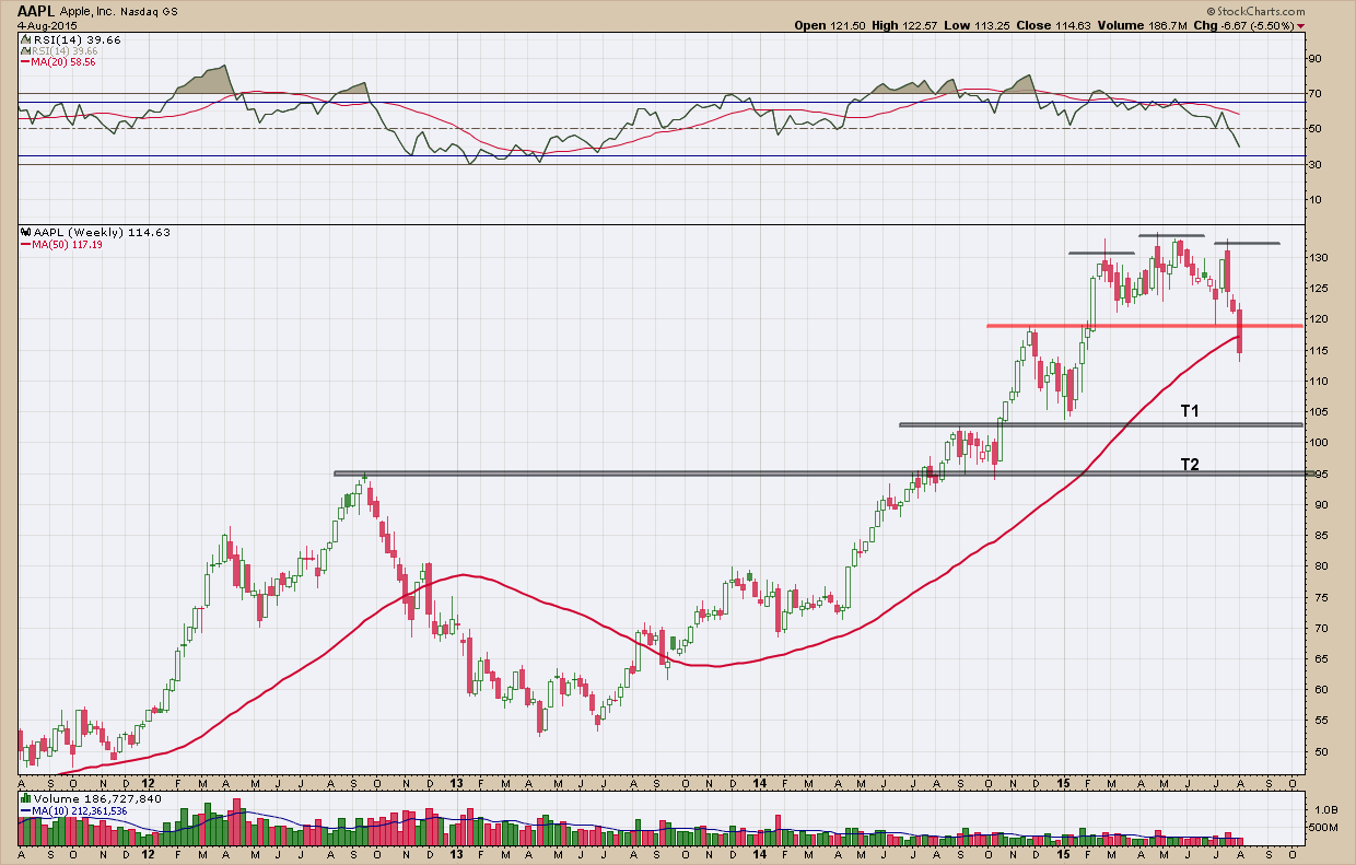
I have mentioned many times in the past about the problems with diversification in the current investing environment. We all have likely read the studies and have been preached to by Wall Street on its value and importance. Unfortunately, for the past 5+ years, a diversified portfolio of stock holding has substantially underperformed one concentrated here at home. Most Asian stock markets, like Europe’s have lagged their US brethren by more than 60% since 2010. So it makes for a tough argument to hold on to them in one’s portfolio even if they are in an uptrend.

Taking a look at our ETF proxy, AAXJ, for the Asian (excluding Japan) stock markets it appears as if there may be bigger troubles ahead beyond underperformance. In the upper pane you can see we created bearish momentum divergence at the most recent high warning of a potential reversal ahead. In the middle pane of price, we have been in a nice upward channel since 2011 until 3 weeks ago when price broke below the lower blue up-trend line. More importantly, this week we closed below the major black horizontal support line that has been tested many times from above and below (testing marked by red arrows) confirming its significance as it now flipped from support to resistance. If in the next couple of weeks we cannot retake this line, further downside to the $52-$54 range is likely.

bay area investment advisor & certified financial planner retirement

If we were invested in this (thank goodness we are not), our model would have triggered a sell signal weeks ago telling us to step aside. As with all corrections/retracements after a new high has been created the reaction bounce from the subsequent low will tell us if a new down trend has be begun.  Either way and until we see a change in direction of its performance relative to the SP500 (see bottom pane of chart), I see no reason to own it.

As an aside, I continue to scour and monitor world markets and am finding fewer and fewer investment opportunities with good risk to reward ratio’s regardless of whether they are stocks, bonds or (especially) commodities. Cash is looking more attractive every day.

Does One Bad Apple Spoil the Whole Bunch?

There is no one company that is covered by the media more than Apple. Anything you want to know about them you can find on the internet. As such, I tend to shy away from talking about them as it has likely been covered by someone somewhere at some time before.  I do make exceptions when something of technical significance occurs which brings me to today's post.

Apple has grown to be such a large part of the US stock market as they constitute almost 15% of the Nasdaq 100 index and almost 4% of the SP500 index despite being only 1% and .2% of the number of companies within the index respectively. So it’s easy to understand, how Apple goes, so goes the markets and why it is covered in such depth.  

As I was scanning my charts yesterday I noticed AAPL printed a very ugly, big red down candle on big volume. It also closed right on a very important support/resistance line making today’s action very important. It would either need to bounce higher and get the bulls back in control or breakdown setting up for a bigger fall. In the daily chart of AAPL below, you can see it gapped lower (which typically occurs when there is a breach of a major support line) today and sold off hard on even larger volume than yesterday’s. You can also see this move should not have been too much of a surprise as both momentum indicators, RSI and MACD, have been trending lower, since February even reaching bearish levels. If we get follow through in the coming days, the breakdown target is slightly above $104, about a 10% loss from its high. As you would expect and because of AAPL’s significance to the indexes, they too, closed lower today mostly due to AAPL's demise.

bay area financial advisor and retirement planner

Taking a look at the a longer term, weekly look at the chart of AAPL below you can see the head and shoulders pattern which pierced through its neckline this week giving us downside target and matching up with the daily at around $104.  If it were to overshoot and extend lower, there is a lot of support at the $100 level where it would likely bounce and find a swarm of buyers.

bay area investment advisor and financial planner

It will be interesting over the next few weeks to see this unfold right in front of our eyes with a stock that has almost a cult following and many worshipers. If I were a betting man and because of this, I would expect the stock would likely fall short of its downside targets as I expect the BTFD (buy the dip) crowd to be out in full force. That combined with the fact the 4th has historically been the worst day for a normally very boring stock market in August going back to 1950 has me leaning wherever this “retracement” ends will likely be a good buying opportunity.  Either way this 10 round fight between the AAPL bears and fanboi’s is an interesting distraction that doesn’t require pay-per-view to watch.  Grab some popcorn and get comfy.

A Fundamental View

As a market technician my investment decisions are driven mostly by technical analysis.  That is not to say I do not use fundamental analysis, because I do. For me fundamentals reinforce rather than drive investment decisions. With that being said, I want to provide a rare fundamental chart that I am watching closely, that of stock prices and earnings. Investors have been told and conditioned to invest in stocks as long as earnings keep rising. The chart below illustrates how powerful the correlation is.

Bay area investment advisor - pleasanton financial planner

What should jump out at you is the path of corporate earnings (purple line).  Since the oversold 2009 bottom and the subsequent parabolic rise of both off their bottoms, earnings have followed a stair-step path higher. They step higher, level off, step higher, then level off. Wash, rinse, repeat. What should also be evident is that stocks lead earnings meaning stocks find tops and bottoms first. Since the beginning of this year when earnings took their last step up, stocks and earnings have gone in opposite directions. Earnings have declined slightly while stocks have gone (ever so) slightly higher.  

The bottom line here is we have a short term divergence in stocks and earnings which indicates the increased likelihood a correction for one of the two is in our future if this correlation is to hold. The question is which one?  Will stocks fall to synch with earnings or will earning beat estimates and confirm stock prices? Without question,n now that much of the uncertainties have been resolved (at least temporarily) surrounding Russia, China, Greece and the FED hiking rates, you have to believe this is an extremely important metric investors are now concentrating on.

What do you think?

Who Remembers 1904?

While the overall market continues to chop in a sideway range, when looking underneath the hood at individual stocks within the US Stock market it gets me concerned. As I wrote in April here we continue to see fewer and fewer stocks making new highs and an increasing number of stocks making new lows.  Unless this changes soon, we are headed for a correction (not a top or reversal) as the market is being held up by a minority of stocks (ie, Amazon, Netflix, Starbucks, etc).  In my daily analysis I monitor hundreds of stock charts and continue to see a similar story and as time goes on, with greater frequency … topping patterns followed by breakdowns.  Not every stock has topped or broken down but their numbers are dwindling.  Two weeks ago I wrote about Green Mountain (GMCR) here that had already topped and had fallen more than 40%. This week I wanted to show you a couple more charts that are in the beginning stages of their declines. I have been watching both of these for months seeing the short opportunity develop in slow motion.

My first chart is that of Franklin Resources (BEN). Franklin is a well-run asset management holding company providing equity, fixed income, balanced, and multi-asset mutual funds through its subsidiaries. You can see the stock rose more than 110% from the bottom in 2011, topping in Jan 2014. Since then the stock has been bouncing between the top and bottom red horizontal lines ($49-$58) over the past 18 months creating a triple top with negative momentum divergence.  This was a huge warning that a potential decline was in the cards. Friday it broke down below its bottom red support line and the bears pounced hard. If it does not reverse here soon, price will target T1 and, if weakness continues T2. For now, that is its targeted move. But, depending upon what happens forward, a much bigger bearish, head and shoulders topping pattern is developing with a more ominous target down to the lows of 2011.

San Francisco East bay area certified financial planner adviser

My second and last chart is that of American Express (AXP). As I am sure you all know American Express provides charge and credit payment card products and travel-related services. AXP rose 160% from its 2010 bottom topping in May of last year and like BEN above, has been bouncing between the red support and resistance lines and creating negative momentum divergence. Unlike BEN, it has formed only a double top and has yet to break down below its major support.  If there is follow through to the downside from here, T1 is my first target with T2 providing a likely home if the correction were to gain steam.

Pleasanton certified financial planning advisor

Stocks topping are nothing new as it happens in bull markets and bear markets so there is no underlying message here other than we have more data points to keep us cautious. Reviewing what they look like and recognizing them as they develop is a powerful skill that aids in preserving capital. Right now there is much to be bearish about but with every bull market there is always a wall of worry to climb. And this bull is no different. I continue to say, you need to give the benefit of the doubt to the current trend (which is up) and let your investment process, not a WAG, determine your market exposure.  Keep in mind you top-picking, semi-hibernating bears --- the S&P 500 did something in the first half of 2015 that it has not done since 1904 —it posted two consecutive (back to back) quarters of 0% gains. This has happened only one other time in the past 125 years, for either the Dow or the S&P 500 and the last time it did stocks surged 43% over the next two quarters.