India ... on the Ropes

Below is a chart of India’s Bombay Sensex index. You can see they broke out of a sideways consolidation in October of 2013. For the next 2 ¼ years, price rose almost 50% topping out in March of this year. Since peaking, it has been a choppy downward move creating negative momentum divergence and eventually gapping down through the 3 year (blue) uptrend line.  Currently the moving averages are bearishly configured, pointing down and signaled a death cross in early May. Two months later it found at least a short term bottom stopping exactly where you would have expected, at the upper red horizontal support line. Looking to the left of where we are today we see that price has essentially gone nowhere over the past 19 months and has formed multiple different bearish topping patterns telling us there is a lot more downside if this support does not hold. 

Like so many investments I am watching, this is do or die time. Will price bounce off current support and move higher or will it consolidate for a few more weeks or months and then finally give way under its own weight with an ultimate target at the lowest red horizontal support line some 20% below?

bay area investment advisor wealth manager

Again, if you look left to the left side of the chart just below the upper support line you will notice there exists very little supply of buyers who might be available to step in and cull any move to the downside until you reach the target zone. As such any confirmed close below the 25000 level will likely be followed by a swift and intense move lower. While I like India’s long term outlook, the short to intermediate term has me leaning neutral to bearish.

Risk On - Risk Off

It’s time to blow the dust off my “risk on/risk off” chart as it’s been a while since I have shown it. For those that have not seen it before, in the upper pane of the chart is a 20 year look at the SP500 stock index to 30 year US Treasury bond price ratio. In a “risk on” environment (where investors want to own stocks) the lines on this chart will be moving higher. When investors become risk averse money moves into bonds (or cash) and out of stocks as they are perceived as a safer haven and the direction of the line will move lower. This illustrates the concept that investment dollars are always rotating, moving from one investment to another. Most of the time money moves to where investors believe will provide the best returns. I said “most of the time” because there are times where investors become fearful and when that occurs it’s not about return “on” capital but rather return “of” capital (capital preservation).

In the bottom pane is a plot of the SP500 index price.

The beauty of this long term view is that it goes far enough back to include the past 2 major bear markets (2000 and 2008) and as such provides an analog of what the chart may look like the next time a bear market arrives. What should stand out is that in the past two bears this ratio did an excellent job of identifying stock market tops and provided a heads up to investors to reduce risk and lighten up on equity exposure. As you get with most long term moves that are running out of gas, divergence forms which cements the bearish story as the ratio rolls over and begins its decent. The one thing I find very interesting is that tops in this ratio have preceded actual tops in the stock market, in other words it has been a leading indicator

Investment advisor bay area certifiied financial planner

If you are struggling interpreting the chart the main thing you should take away is that we are at a decision point. Starting very soon, the stock market needs to outperform bonds otherwise this indicator is warning of the potential for a much deeper equity selloff. As always, no one knows where prices go in the future and indicators and charts can only provide potential paths. As investors, we need to make decisions based upon a weight of the evidence and this chart provides one more piece that shows the markets are at a crossroads. Until I get additional confirmation (in either direction) I continue to believe erring on the side of conservatism is the prudent path. 

Post FOMC Market Closing Commentary

A rare 2 post day but I thought I would give a quick update since all eyes were on the FED's announcement today.

bay area investment advisor certified financial planner

Apparently the markets did not want to hear the Fed was not going to raise rates. You see the markets hate uncertainty and the FED provided nothing today to answer the question of “whither now”. Initially the market powered higher on the release of the FED minutes but faded strongly into the close creating a very bearish shooting star candle on the SP500.

The shooting star is made up of a candle with a small lower body, little or no lower wick, and a long upper wick that is at least two times the size of the lower body. The long upper wick of the candlestick pattern indicates that the buyers drove prices up at some point during the period in which the candle was formed but encountered selling pressure which drove prices back down for the period to close near to where they opened. As this occurred in an intermediate term uptrend, the selling pressure is seen as a potential reversal sign.  The longer the candle's wick the greater the potential reversal. As always, you need volume to confirm price action and we saw the number of shares traded more than 2x the average.

investment advisor bay area

Because these patterns require 3 days to form and confirm, we need to see either a gap down and/or close tomorrow for a loss in order to validate the pattern and reversal signal. If that were to occur it is likely additional selling pressure would be on the immediate horizon. If not and the market powers higher, consider it a blessing and use the rally to sell into strength if you are still overweight equities.

No one knows where we go next but market action is telling us to be careful here.

Have a great evening.

Not Another Post on Apple

Can’t you find something different to write about, Chuck?

I received an inquiry on what my thoughts were on buying Apple stock right here and I thought I would put them into a blog post because Apple is a great proxy for the broader indexes.  And because the market is at a crossroad however Apple goes, so goes the rest of the market. Or so they say.

I know this post is bad timing being that the FED FOMC is later this morning and most likely whatever they say will drive the markets, potentially trumping what is in the charts. Even if the markets don’t get rattled as I expect, the analysis is still worthwhile as it can be used as a learning tool.

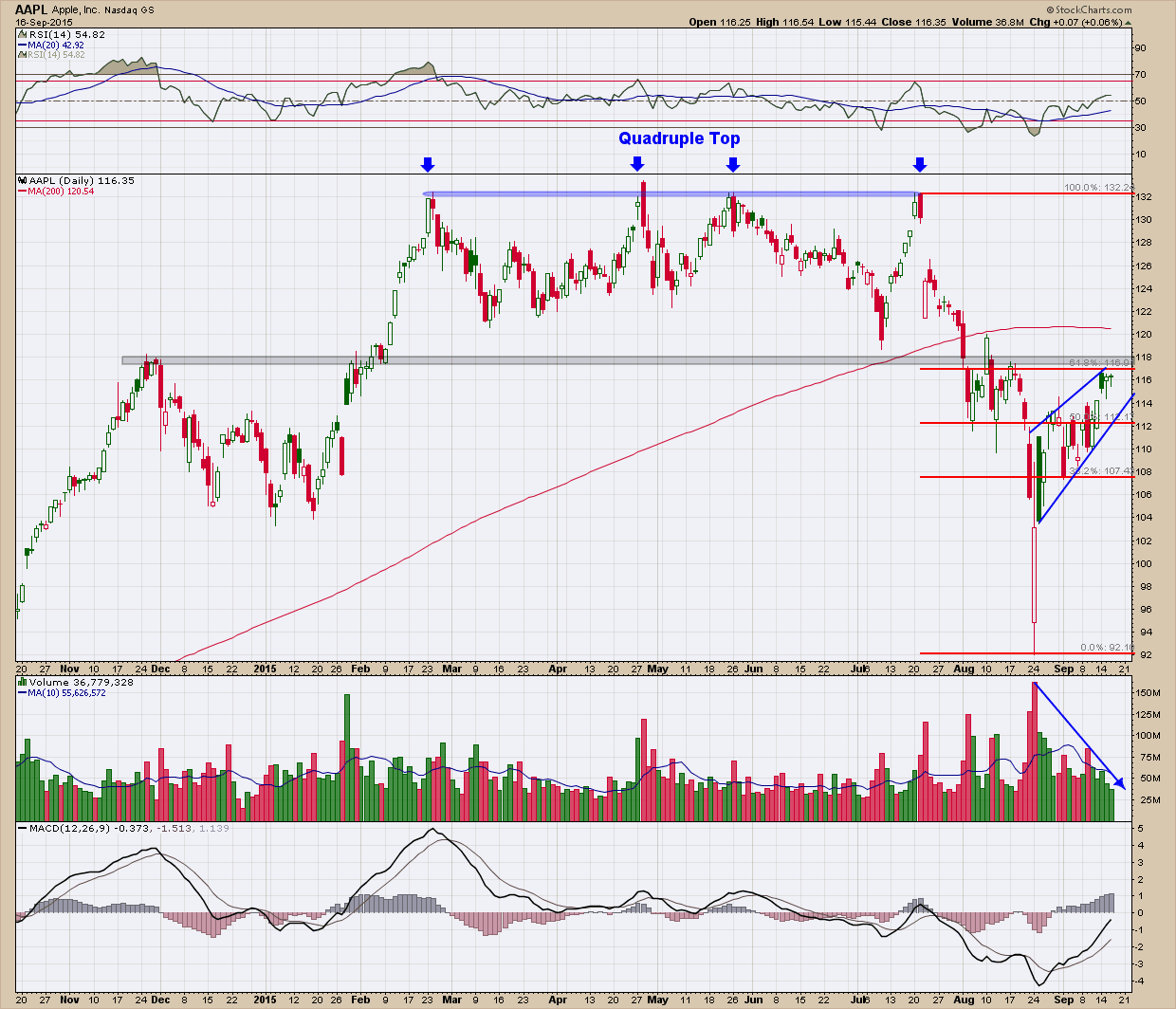
Below is the daily chart of AAPL showing a rare quadruple top (~$132) that formed just before the big sell-off last month where it bottomed at ~$92. You can see we have rallied up to the 61.8% Fib retracement (in red) which coincides almost exactly with the $118 (black) line of resistance. For those unfamiliar with Fibonacci retracements, the 50-61.8% levels are where retracements can peter out and die. The horizontal resistance line represents a ton of potential overhead supply where trapped buyers are looking to get out “even” if given the chance. Additionally a rising wedge (in blue) has formed which are typically bearish setups. RSI momentum in the upper pane while above 50 and pointing higher is constructive, it has changed from ranging in the bullish zone and moved lower and is now within the bearish zone. The MACD in the bottom pane, like RSI is constructive in that it is moving higher, it still sits below zero. As buyers we want to see volume confirm price movement but that has not happened, in fact just the opposite. As you can see, volume has declined significantly on the current retracement higher. Finally and very importantly, not only is price below the 200 day moving average, the 200 dma has now flattened and begun to point down, just the opposite of what you desire to see if you expect price to move higher.

bay area investment adviser wealth manager

When using technical analysis there is no one indicator or type of analysis that provides you a definitive answer, rather it is the weight of ALL the evidence. Right now with the confluence of either neutral or negative evidence, I don’t find AAPL an interesting buy right here. And by correlation, I am just as disinterested in the broader market until, like Apple, it can convert most of the existing “negatives” into positives. And who knows, maybe the FOMC meeting may be the impetus the market needs to turn this around.   …… Or not.  Stay tuned, we will likely know real soon!

In Case There Was Any Doubt …

A new academic study finds that the stock recommendations made by analysts using technical analysis have outperformed those using fundamental analysts.  Over investment horizons ranging from one month to one year, top technicians come out well ahead of leading analysts.

In fact, according to the academic study that reached this conclusion, it’s not even close: While the average buy recommendation from well-known technicians outperforms the broad stock market by 8% over the subsequent nine months, the average stock recommended by leading fundamental analysts underperforms the market.

This groundbreaking study, which just began circulating in academic circles, was conducted by Doron Avramov and Haim Levy, finance professors at the Hebrew University of Jerusalem; and Guy Kaplanksi, a finance professor at Bar-Ilan University. The focus of their study were a thousand pairs of recommendations made between November 2011 and December 2014 on the TV show “Talking Numbers”  as it provides an ideal laboratory for comparing the relative worth of the two investment approaches. The first half of each pair was a recommendation from a top technician about a stock in the news; the second half was a recommendation about that same stock from a leading fundamental analyst.

The researchers measured the performance of each recommendation beginning with its closing price on the day the show first aired. That’s a crucial methodological detail, since that means the researchers are excluding the price impact of the recommendations in the first minutes after the show airs.

bay area investment adviser

Consider first the stocks that the technical analysts identified as strong buys. They on average proceeded to outperform the overall stock market by 7.9% over the subsequent nine months, while the stocks they recommended as strong sells underperformed by 8.9%.

That spread of 16.8 percentage points is highly significant from a statistical point of view. As the professors put it in their study, it means that “technicians display rather impressive stock-picking skills.”

Contrast that with the performance of the fundamental analysts. The researchers found that their strong buys proceeded on average to underperform the market over the nine months following recommendation — though not by enough to conclude at the 95% confidence level that these analysts were actually worse than random. Even worse, the stocks that these analysts rated as strong sells did not perform appreciably differently than those they considered strong buys.

It won’t be easy for fundamental analysts to wriggle out from underneath the weight of these results. Since the TV show creates a head-to-head comparison on the same stocks over similar time horizons, the usual escape valves have been closed off.

Still, when it comes to forecasting the direction of individual stocks over the next several months, this new study definitely shows that top technicians deserve our attention more than leading analysts.

While I am sure this will not be the end of the debate it is nice to see actual proof that technical analysis can provide statistically significantly better returns than random. But even as important, fundamental analysis not only underperforms technical analysis but is no better (and maybe worse) than random selection.