Housing Starts - Lumber’s Message

The abbreviated Thanksgiving holiday trading week (US equity markets closed Thursday & ½ day on Friday) are notoriously plagued with erratic price swings that tend to trigger false buy & sell signals so instead of talking about them I will turn your attention to the latest free post from McLellan Financial. This week Tom writes an excellent analysis on lumber prices being a leading indicator and what they are currently saying about the economy. I have sung the praises on Tom (and before him, his parents) work in the past and would recommend anyone to check his site out as his work is both unique, compelling and a great resource from which to learn.

the bay area expert investment advisor certified financial planner

There are a lot of leading economic indicators in use these days, but the one I like the best is lumber futures prices.  Perhaps this is because almost no one else seems to pay attention to them as an economic gauge.  Lumber prices tell us pretty reliably and ahead of time about what is going to happen to real estate prices and activity, plus interest rates.  They can even tell us about what unemployment is going to do.

This week we got the latest update on U.S. housing starts, data which are gathered and published by the Bureau of the Census.  The latest numbers are for October 2015, and they are showing the lowest rate of activity in 7 months.  This is a downturn which I have been expecting to see arrive now, based on the message from lumber prices.

This week’s chart shows how the movements in lumber prices tend to be echoed about 10 months later in the housing starts data.  It is not a perfect relationship; it is merely very good.  10 months ago, lumber prices were rolling over and heading downward, and so the message going forward from here is that we should expect to see a continued stair-step down move in the housing starts data.  Lumber prices appear to have made some type of bottom back in September 2015, and so counting forward 10 months from there, that says we might see a bottom for the housing starts data around July 2016.  But it is far from clear right now what sort of lumber price bottom that was in September, a temporary one or a more permanent one. 

Lumber also tells us about what the data on weekly jobless claims are going to do:

the bay areas expert finanicial advisor

This chart looks at the seasonally adjusted data on weekly jobless claims, compared to lumber prices but with a twist.  In order to see the correlation better, I have inverted the data plot for lumber prices.  And it is also shifted forward by 42 weeks, which is about the same as the 10-month forward shift in the first chart on housing starts. 

The downturn in lumber prices is reflected in this second chart as an upturn for the green line.  We have not yet seen much response in the weekly jobless claims data, but it is hard to imagine the jobs data refusing to show some sort of reaction to the dramatic action in lumber prices. 

I have never heard a Fed official make reference to lumber prices as a leading indication.  Maybe it is something that they just don’t follow (but should).  Maybe it is not a glamorous topic to talk about. 

Here we are, facing a likely start to Fed rate hikes at the Dec. 15-16, just as lumber is saying that a downturn in economic activity is coming.  We know from watching the 2-year T-Note yield that the Fed should have started this process a long time ago.  So now they appear to be finally getting around to doing the right thing, at the wrong time

Have a great Thanksgiving!

You End Up with More by Losing Less

Below is a 20-year chart of the Europe 600 stock index. In the top pane is RSI momentum indicator and in the bottom pane is the index price. Notice how the 400 level in the middle pane has so far acted as a market top three times. In 2000 and 2008 when price hit this level, it rolled over and began a waterfall decline, eventually losing almost 60% each time. Despite the good news that we are still above the blue uptrend line, even to the untrained eye this chart should raise concern. Is the top in for European stocks and will history repeat or will this time be different?  Armed with just this information, what do you think comes next?

Bay area investment advisor and retirement planning expert

Interestingly, European stocks are following an eerily similar path the US stock markets did, but offset by about 2 ½ years. The chart below is a look at the US stock market via the SP500 index from 1996 through April 2013.  Notice any similarities?

bay area financial advisor investment expert

In case you did not know how it all resolves, my next chart completes the entire historical perspective for the SP500 through last Friday’s close. We blew right through the upper resistance and sit some 30%+ higher today.

expert wealth manager retirement planner

If you add this information into the mix would you change your opinion to the question I asked above? I think a strong case for either a bullish or bearish outcome can be made for European stocks right here. This "crossroad" is no different than what investors face every day. So, what’s an investor to do? Investment markets can and will do anything and the most probable outcome will be that which frustrates and loses money for the majority. Having a predetermined bias of what will happen can have a negative impact on your investment account. The markets don't care what we think or believe. Through the school of Hard Knocks, I have learned the most successful approach to the markets is to have a process that invests with the prevailing trend but is flexible enough to recognize when it is wrong. Being wrong is normal and expected as we are human. Staying wrong is not when it comes to your money. Over the long term, you end up with more by losing less.

China Bears

I think the most interesting part of market analysis is human behavior because so much of what happens in the markets can be explained by human emotions. One of the more fun elements (fun is relative here considering I am talking about investing) is the “Magazine Cover Indicator created by Legg Mason strategist Paul McRae Montgomery.  What he found was when it came to the markets, magazine covers turned out to be a contrarian indicator. The logic behind it goes like this: By the time a particular investment trend reaches the cover page of a major publication, it is so widely embraced by the public that “everyone is in” – i.e., there is no one left to perpetuate the trend. Therefore, the trend is close to reversing… often with a vengeance.

Based upon a story reported by Freemarketcafe.com (now nondollarreport.com), Bloomberg Businessweek holds title to the most infamous cover story ever. In August of 1979, the cover of Businessweek proclaimed “The Death of Equities.” As it turned out, equities were far from dead. In fact, they were on the verge of a major rebirth. Stocks bottomed early in 1980, before taking off on the biggest bull market in history. Just three years after this cover story appeared, the S&P 500 index had doubled. And three years after that, the S&P 500 had tripled.

But in the dark days of the late 1970s building up to the infamous Businessweek cover, the stock market had gone nowhere for more than a decade, most investors believed that stocks were a dud.

“The masses long ago switched from stocks to investments having higher yields and more protection from inflation,” the Businessweek article observed. “Now the pension funds – the market’s last hope – have won permission to quit stocks and bonds for real estate, futures, gold, and even diamonds. The death of equities looks like an almost permanent condition – reversible someday, but not soon.”

Twenty-three years after the “Death of Equities” cover story, Businessweek cemented its “indicator” credentials for all time by running a cover story titled “The Angry Market.” During the two years that preceded this story, the stock market had been very angry indeed. An epic bear market had erased nearly half the S&P 500′s value. But during the two years that followed this story, the S&P soared more than 40%. Three years later, it was up 60%, and five years later, it was up 100%. In fact, the S&P hit the exact low of its 2000-2002 bear market on the day “The Angry Market” cover story hit the newsstands!

Businessweek does not corner the market in being a timing expert. In September 1977, Time Magazine’s cover story warned, “Sky-High Housing.” And while it’s true that American home prices had doubled over the preceding decade, home prices would double again over the following decade… and would quintuple by 2005!

Then, in June of 2005, just as this once-in-a-lifetime housing boom was ending, Time hit the newsstands with a cover story titled “Home Sweet Home: Why we’re going gaga over real estate.”

“Ah, the blistering real estate market,” its story gushed, “where dreams of big bucks come wrapped in aluminum siding… Your house is now your piggy bank, ATM and 401(k)… Folks brag about having bought their home in the ’90s the way they used to brag about having bought Microsoft in the ’80s. Even if you’re not contemplating buying or selling anytime soon, the amazing lift in home values is changing the way we think about the roofs over our heads. Real estate isn’t so much about nesting today as it is about nest feathering.”

But at that very moment, the spectacular American housing boom was already on its way toward an equally spectacular bust. Condominium prices topped out in the identical month this Time cover story appeared – June 2005. Single-family home prices topped out shortly thereafter.

“Homebuilding stocks went a bit higher during the month or so subsequent to that cover story,” Paul MacRae Montgomery relates. “[But] from that point, they crashed 78%-90%… Housing prices [fell] a more modest 28%… But this drop was still enough to constitute the worst drop ever in home prices – worse than in the Great Depression.”

Not content to be dead wrong twice about the housing market, Time went back to the well one more time. On the cover of its September 6, 2010, issue, the magazine declared, “Rethinking Homeownership: Why owning a home may no longer make economic sense.”

“Homeownership has let us down,” the cover story lamented. “For generations, Americans believed that owning a home was an axiomatic good… A house with a front lawn and a picket fence wasn’t just a nice place to live or a risk-free investment; it was a way to transform a nation… [But] The dark side of homeownership is now all too apparent: foreclosures and walkaways, neighborhoods plagued by abandoned properties and plummeting home values… If there ever were a time to start weaning America off the idea that homeownership cures all our ills, now… would be it.”

There are dozens of examples, the above are but just a few. With that as a background I would like to show the August 31, 2015 cover from Bloomberg Businessweek regarding the headline story “The China Bears”.

fee only retirement planning bay area investment advisor

Below is a chart of ASHR, the American ETF that tracks the Chinese stock market. So far it looks like we can say Businessweek, once again, nailed it.

Investment advisor bay area certified fianncial retirement planner

Whether that week continues to mark the bottom, only our future will know, but in the meantime some things never change.

The Analog Channel

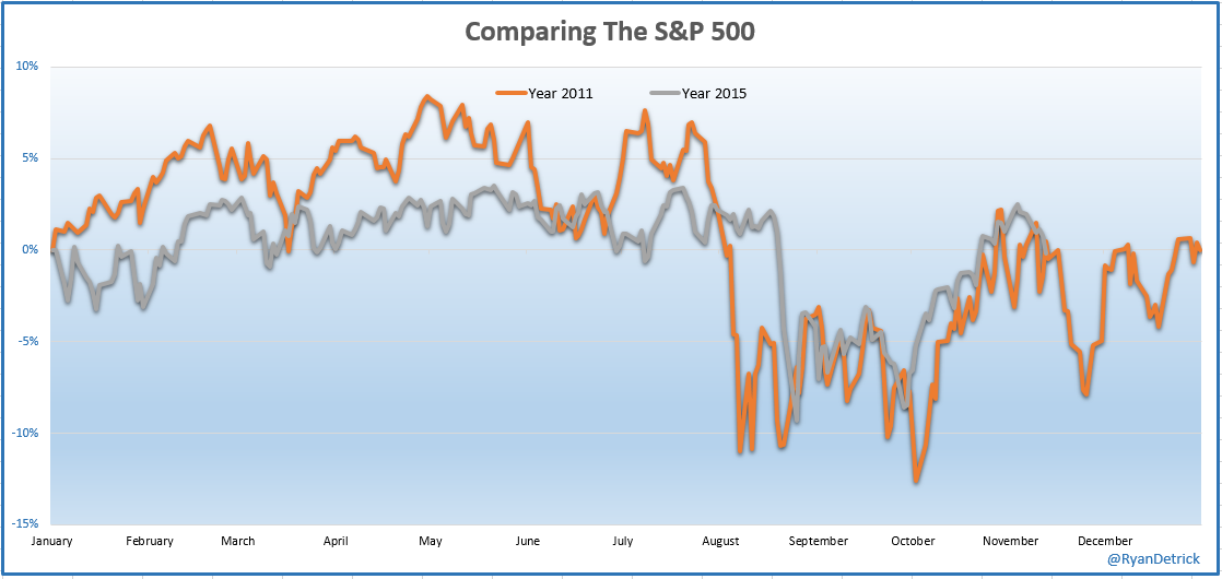
Mark Twain said “History does not repeat but it does rhyme”. You can take this truism about history and extend it to the investment markets. In fact, part of the basis for Technical Analysis is that the markets, which reflect the actions of all its participants, tend to repeat. Recognizing this and understanding how to use it can provide a significant advantage to its users. I must admit I have never found that analogs provide me any significant investment advantage but I do find them fun and entertaining (kind of like CNBC). Ryan Detrick, who I find to be one of the best market data analyst alive, posted this analog of 2015 stock market action against that from 2011.   Maybe it’s my brain that makes me want to see patterns that may not really be there, but I find the similarity pretty uncanny.

bay area investment advisor expert retirement planning

For those who may not remember, 2011 was the first (and last) bear market (more than 20% decline) since the end of the 2008-09 financial crisis.  After bottoming in 2011, prices chopped around for more than 6 months before we blasted off to new highs.  I remember thinking at the time the 2-year rise from the ’09 bottom was nothing more than a bear market rally. I couldn’t have been more wrong and later learned valuable investment lessons regarding 1) not predicting the future and 2) only pay attention to price!

Like 2011, we are stuck in the middle of a trading range. Breaking above the May high means we are once again back in a bull market and it’s time to expand our equity exposure. A piercing and close below last month’s low means it’s time to hunker down and get defensive. Until one of those two happens, I am going to grab some popcorn, find a soft, comfy chair and enjoy the analog channel.

A Cup of Hot Chocolate

Cup and handle formations, if formed correctly, are potentially a very powerful bullish continuation patterns. They start as a consolidation period in an uptrend followed by a breakout to new highs. As its name implies, there are two parts to the pattern: the cup and the handle. The cup forms after an advance and takes the shape of a bowl or a U. As the cup is completed, price is rejected at or near prior highs, a trading range develops on the right hand side and forms the handle. A subsequent breakout from the handle's trading range signals a continuation of the prior advance. During the formation, you would ideally 1) like the handle to not move lower than 50% of the depth of the cup; 2) see volume decreases during formation of the handle and 3) volume increase on its breakout.

After making new highs in October 2014 from the breakout of a 2013 W-bottom, cocoa is currently in the process of forming a very nice cup and handle pattern and the potential for an intriguing investment opportunity. It is never wise to jump ahead and project that a pattern in development is going to actually complete. First off patterns don’t always complete, even those with the best setups and secondly the little bit you gain in getting in early before its completion is not worth the risk if the pattern fails. I find waiting for the additional confirmation greatly increases your success rate. In addition to the pattern setup, notice how right now price is above the faster moving average which is above the slower moving average which is pointing up.  This bullish alignment is confirmation we are in an uptrend and is exactly the setup we would like to see before we enter any long position, not just cocoa.

bay area fee only investment advisor certified financial planner

If Cocoa decides to actually follow through and complete the cup and handle by breaking above the rim of the cup (red horizontal line), the opportunity is quite attractive as the pattern projects to a 25% increase over the coming months.