Diamonds Aren’t an Investors Best Friend

Diamonds are a relatively rare pattern so I wanted to take a look at one that has recently developed on XLE. The diamond pattern is made up from two back-to-back symmetrical triangles and warn of a potential reversal ahead.  Like their triangle makeup, they are often subject to reversals after a breakout so their management can be challenging.  As you can see in the energy sector ETF, XLE, its price followed the path of lower oil prices, losing 30% from its peak in May of last year creating a double bottom. From there you can see price climbed higher and then began to consolidate which has allowed it the time to develop the diamond.

expert bay area investment advisor certified finanical planner

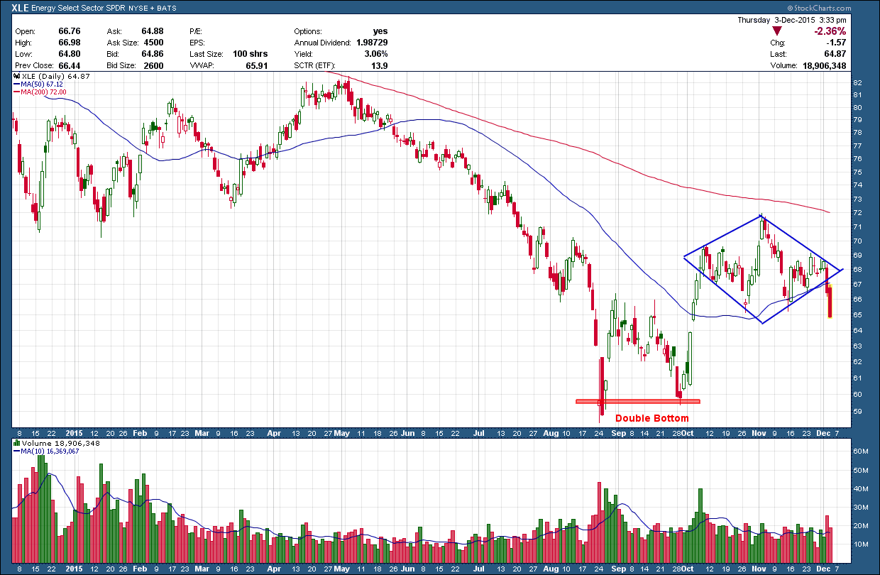
Price broke decisively lower Wednesday and confirmed the move with larger than normal volume. The follow through on Thursday provided additional needed to tell us this is likely not a whipsaw/fake-out and to expect lower prices ahead. The pattern target is back down at the prior double bottom lows around 59 1/2.  I would expect short sellers to jump on board and add more strength to the downside so I would not be surprised by an overshoot of the target.

There should be no surprise to expect lower prices as not only are we below the (red) 200 day moving average but it has a negative slope which is a huge red warning flag any long investor is fighting the trend.

Remember safety first. Don’t fight the Fed. Don’t fight the trend and don’t eat week old sushi!

Apple - Is it Déjà Vu All Over Again?

As one who took a hankering to chart patterns during the early years of my TA training, I have come learn the value and advantage they provide to those that know how to use them. While they can give insight to possible future moves, their unique advantage is providing risk management rules, the key to long term successful investment management.

Below is the 5-year weekly chart of Apple (AAPL). You can see at the start of 2012 it created, over the next 10 months, a head and shoulders (in blue) topping pattern. Notice how the right should could not rise above the 200 day moving average (dma) which acted as strong resistance. Also, how the moving average began to flatten out at the top of the shoulder and then point down as price broke through the neckline. The dramatic increase in selling pressure (bottom pane) pushed prices down exactly to the pattern target, just under 53 an almost 45% loss from peak to trough.

bay area investment advisor expert


Moving forward to today at the top right corner of the chart, the similarities between now and 2012 are very evident. Price has created a (red) head and shoulder pattern and finding resistance once again, just under the 200dma. And just like in 2012, the moving average has flattened out and is beginning to point down. If the pattern completes, the loss would be slightly less but still a very significant 40% decline. Based upon prior history, we know this is potentially not a good combination and this set up should be raising a warning flag.

It seems like the shrewd investor who recognized this pattern and past history might be thinking they should get ahead of the curve and sell their position right here. Unfortunately, doing so would be incorrectly applying the rules of pattern development. Granted, if the price does break down and head lower, selling now would garner the investor a greater return (by losing less). But the pattern is not complete and until price confirms a break below the neckline only then is should action be taken as the pattern is then considered complete and actionable. For now, if I were invested (and I am not) I would only this on a watch list due to its bearish potential. There is no one right set of risk management rules and every investor should be creating and following ones that fit their investment style and strategy.


What a Strange World We Live In

Imagine a bank that pays negative interest. Yup, that means depositors are actually charged to keep money in their accounts. I was always taught the borrower was supposed to pay interest, not the lender. As crazy as it sounds, many European central banks have cut key interest rates below zero. For some, it’s a bid to reinvigorate an economy with other options being exhausted. Others want to push foreigners to move their money somewhere else. Either way it’s an unconventional, unproven choice that distorts the financial markets and could have deleterious economic effects if it backfires. In order to keep this post brief I will limit my discussion on the “why’s” but if you want to learn more there is a good article in “The Economist” here

san francisco bay area retirement planning and investment management expert

In a world of beggar thy neighbor and a race to see who can devalue their currency the fastest in an attempt to invigorate growth, the US dollar is king. For now, there is little reason to see it abdicating its throne any time in the near future. As such, it continues to play a prominent role in our investment strategy.  How about yours?


Housing Starts - Lumber’s Message

The abbreviated Thanksgiving holiday trading week (US equity markets closed Thursday & ½ day on Friday) are notoriously plagued with erratic price swings that tend to trigger false buy & sell signals so instead of talking about them I will turn your attention to the latest free post from McLellan Financial. This week Tom writes an excellent analysis on lumber prices being a leading indicator and what they are currently saying about the economy. I have sung the praises on Tom (and before him, his parents) work in the past and would recommend anyone to check his site out as his work is both unique, compelling and a great resource from which to learn.

the bay area expert investment advisor certified financial planner

There are a lot of leading economic indicators in use these days, but the one I like the best is lumber futures prices.  Perhaps this is because almost no one else seems to pay attention to them as an economic gauge.  Lumber prices tell us pretty reliably and ahead of time about what is going to happen to real estate prices and activity, plus interest rates.  They can even tell us about what unemployment is going to do.

This week we got the latest update on U.S. housing starts, data which are gathered and published by the Bureau of the Census.  The latest numbers are for October 2015, and they are showing the lowest rate of activity in 7 months.  This is a downturn which I have been expecting to see arrive now, based on the message from lumber prices.

This week’s chart shows how the movements in lumber prices tend to be echoed about 10 months later in the housing starts data.  It is not a perfect relationship; it is merely very good.  10 months ago, lumber prices were rolling over and heading downward, and so the message going forward from here is that we should expect to see a continued stair-step down move in the housing starts data.  Lumber prices appear to have made some type of bottom back in September 2015, and so counting forward 10 months from there, that says we might see a bottom for the housing starts data around July 2016.  But it is far from clear right now what sort of lumber price bottom that was in September, a temporary one or a more permanent one. 

Lumber also tells us about what the data on weekly jobless claims are going to do:

the bay areas expert finanicial advisor

This chart looks at the seasonally adjusted data on weekly jobless claims, compared to lumber prices but with a twist.  In order to see the correlation better, I have inverted the data plot for lumber prices.  And it is also shifted forward by 42 weeks, which is about the same as the 10-month forward shift in the first chart on housing starts. 

The downturn in lumber prices is reflected in this second chart as an upturn for the green line.  We have not yet seen much response in the weekly jobless claims data, but it is hard to imagine the jobs data refusing to show some sort of reaction to the dramatic action in lumber prices. 

I have never heard a Fed official make reference to lumber prices as a leading indication.  Maybe it is something that they just don’t follow (but should).  Maybe it is not a glamorous topic to talk about. 

Here we are, facing a likely start to Fed rate hikes at the Dec. 15-16, just as lumber is saying that a downturn in economic activity is coming.  We know from watching the 2-year T-Note yield that the Fed should have started this process a long time ago.  So now they appear to be finally getting around to doing the right thing, at the wrong time

Have a great Thanksgiving!

You End Up with More by Losing Less

Below is a 20-year chart of the Europe 600 stock index. In the top pane is RSI momentum indicator and in the bottom pane is the index price. Notice how the 400 level in the middle pane has so far acted as a market top three times. In 2000 and 2008 when price hit this level, it rolled over and began a waterfall decline, eventually losing almost 60% each time. Despite the good news that we are still above the blue uptrend line, even to the untrained eye this chart should raise concern. Is the top in for European stocks and will history repeat or will this time be different?  Armed with just this information, what do you think comes next?

Bay area investment advisor and retirement planning expert

Interestingly, European stocks are following an eerily similar path the US stock markets did, but offset by about 2 ½ years. The chart below is a look at the US stock market via the SP500 index from 1996 through April 2013.  Notice any similarities?

bay area financial advisor investment expert

In case you did not know how it all resolves, my next chart completes the entire historical perspective for the SP500 through last Friday’s close. We blew right through the upper resistance and sit some 30%+ higher today.

expert wealth manager retirement planner

If you add this information into the mix would you change your opinion to the question I asked above? I think a strong case for either a bullish or bearish outcome can be made for European stocks right here. This "crossroad" is no different than what investors face every day. So, what’s an investor to do? Investment markets can and will do anything and the most probable outcome will be that which frustrates and loses money for the majority. Having a predetermined bias of what will happen can have a negative impact on your investment account. The markets don't care what we think or believe. Through the school of Hard Knocks, I have learned the most successful approach to the markets is to have a process that invests with the prevailing trend but is flexible enough to recognize when it is wrong. Being wrong is normal and expected as we are human. Staying wrong is not when it comes to your money. Over the long term, you end up with more by losing less.