Solar Guy

I am a big fan of solar energy and as an investor watch it closely. For the most part it has not been a great long term investment (but can be a good trading vehicle) as it is a commodity business and as such tends to put limits on upside potential. First Solar (FSLR), one of the leading solar manufacturers has had an impressive run rising more than 500% from its 2012 bottom, peaking in March of 2014 near $74. Since then it has been consolidating sideways in a $35 channel and has retested the $74 resistance 5 times and been rejected each time.

fee only investment advisor bay area independent wealth management

My take on the chart is that it is presenting a very attractive setup here as

1.      Price is above a rising 200 day moving average.

2.      RSI momentum is in the bullish range and is rising with plenty of more room on the upside if it wants to run.

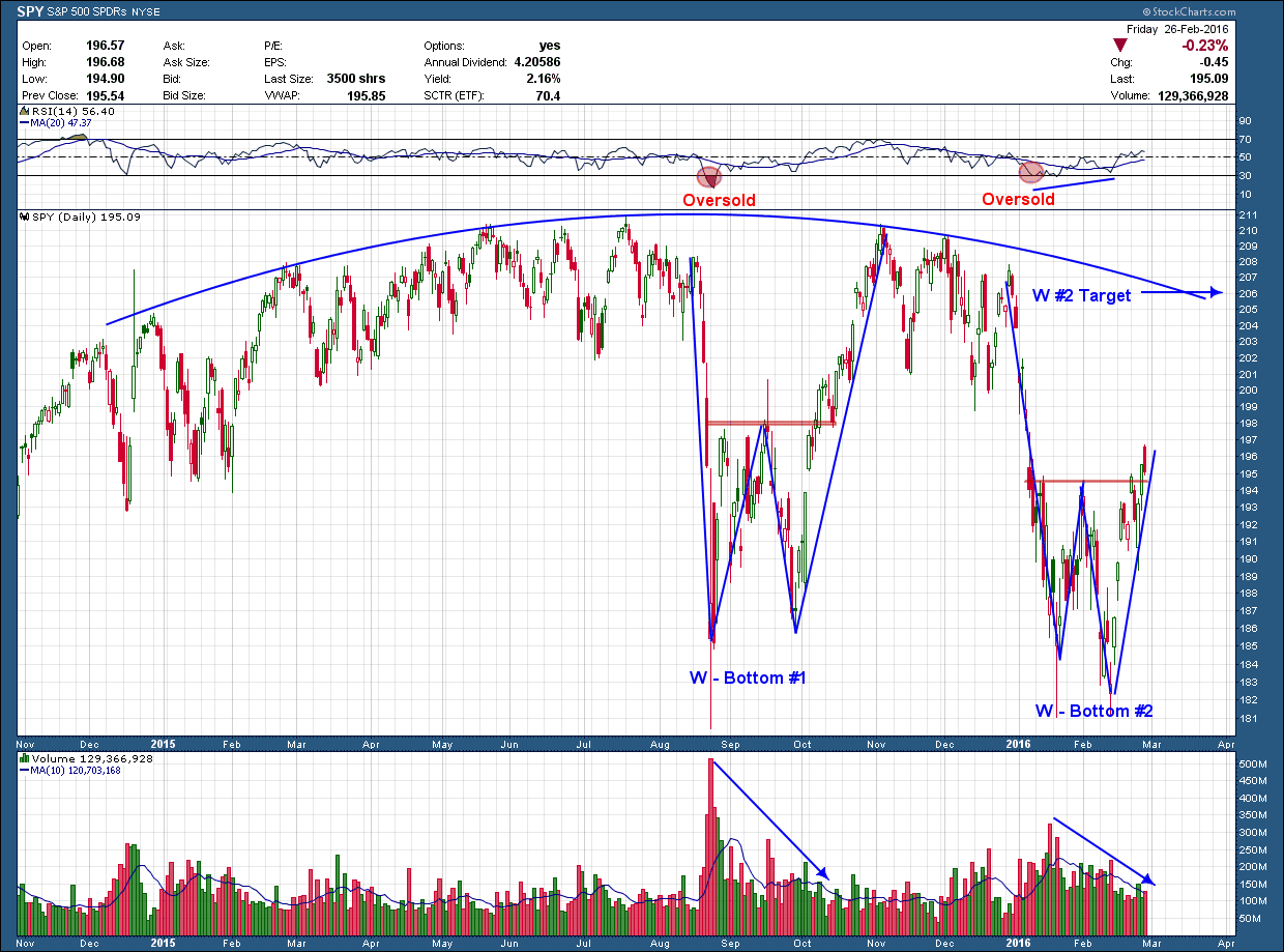
3.      While not a reversal, it has formed a bullish W pattern

A technician’s adage is the wider the base the higher in space which is relevant to FSLR here. Put simply it means the longer a stock consolidates the bigger the move once it breaks out of that consolidation. With more than 2 ½ years of sideways chop this stock is setting up for a big move. Of course, they never make it easy as the market never tells you which way the move will be (up or down). But as of now the signs point to it being higher.

While the setup is in my opinion excellent and the upside it may have is very attractive, it has not yet provided a buy trigger. For me that would come on a confirmed (which includes many things, not the least of which is on significant volume) breakout above horizontal resistance so don’t mistake my bullishness as a recommendation to load up here.

I can’t end this post without the reminder that all opportunities have the chance to fail and it is imperative a plan based upon your risk tolerance and time frames on how you will manage the position should that occur be in place BEFORE you enter.      

Double You

In spite of Friday’s ugly close, the bulls took control of the market last week as the SP500 gained a bit more than 1.5% and closed above major resistance.

I talk about patterns repeating themselves and wanted to use today’s post to point out an example that is unfolding in front of us right now in the US broad market index. Notice in the chart below of the SP500, the first correction that started in August of last year formed a W bottom.  The first leg of the W created an oversold condition in RSI momentum. The upside target of a W pattern once confirmed is the height of the W underneath the (red) neckline added to the neckline. Using the right leg of the W to calculate the target, price eventually came within 5 cents of hitting its target. Once the target was hit price began to consolidate. But notice that during consolidation, instead of making higher highs like it did to during the consolidation (reflecting strength) to the left of the W, price struggled as each successive high was lower than the previous. A sign of weakness

Eventually strong selling again overtook the market and the second correction began in earnest as we welcomed in the New Year. Like the first correction, this one formed another W bottom. A couple of significant and important differences that needs to be pointed out with this W is

1)      The bottom of the pattern started from a lower point and

2)      The second leg of the most recent W pattern started from a lower point than the first leg whereas the in the first W, the second leg started from a higher point than the first leg. Again, another sign of weakness

independent financial advisor bay area fee only CFP

On a positive note this week, price broke out on higher volume and closed above its (red) neckline. If the bulls retain control I would expect a repeat of the path of the first W and we move higher. I have indicated the target of where that pattern projects but expect it to fall short of fully reaching it. Even if it reaches its target or slightly beyond as long as it stays below the end of December's high, it will again have made a lower high which is confirming the thesis we are in a downtrend and caution is warranted as we would expect to see lower prices later this year.

No More Tears

With virtually every stock market around the globe either already broken down or sitting precariously on a ledge of support there are times when it makes sense to press down on the gas pedal of risk but this is not one. Scouring hundreds of charts this week I could find little on the long side (plenty of shorts though) that interest me except for a scant few, one being Johnson and Johnson (JNJ).

It’s likely everyone has heard of JNJ and have used one of their products in their lifetime (Tylenol, Listerine, Bandaid, Visine and Baby Shampoo to name a few). An American bellwether, they continually rank as one of America’s most trusted and admired companies from their first product release in 1886.

Unlike most stocks, instead of faltering and creating a lower high after last September’s correction, its price has powered higher and is sitting just a few pennies under its all-time high. In addition to constructive price movement it has formed a cup and handle pattern, the (red) 200 day moving average is positive and RSI momentum (in upper pane) is above the mid line and rising. These are all signs of bullish strength.  In a positive investment environment I would be a buyer on a confirmed break above the red horizontal resistance line. I am convinced though if the broader markets were to continue to exhibit weakness and go on to establish lower lows, JNJ would be drug down alongside.

independent certified financial planner, wealth management CFP, NAPFA

I could be wrong and JNJ powers higher while the broad market chops around trying to find a trend or declines. A nimble trend following trader should find this setup potentially very attractive. But if your main goal is to preserve wealth, I have learned in conflicting situations like these, the odds favor those who sit on their hands and demonstrate patience. Sure, sitting on your hands may have you forego potential profits. But when the broad market decides it’s time to turn higher there will be plenty of opportunities and you will have a rising market as a tailwind rather than a falling one in your face. 

The Other Side of the Boat

Market sentiment in all its various flavors, while not used by many, can be a very powerful tool providing investors an edge. Retail investors have the odds stacked against them as the professionals and computer algorithms are lurking looking for pockets to pick so tools (like sentiment) can help to level the playing field. Like most indicators they are not always right and as such should be used in conjunction with other tools to confirm price. As a standalone tool I have found the more extreme the reading on sentiment the higher the probability it will follow a contrarian path.  An example is when a sentiment survey show most investors are bullish, the high probability next move will likely be in the other direction. Similar to when everyone is on one side of a boat the safest place to be is on the other.

The chart below from Sentimentrader (which provides some of the best, unbiased sentiment research available) caught my attention and I thought it worthy of reposting. I had not seen their “smart money” measurement before but find it very compelling because it is based upon price movement not the normal secondary effect of other indicators such as momentum.  

Fee only Financial Advisor bay area CFP NAPFA

The data in the chart is pretty self explanatory as it shows the movement of “smart money” and how it has related to tops (and bottoms) in the stock market. Clearly the most recent movement should have the bulls taking pause. This is one more indicator that supports our belief the longer term trend is likely lower, in spite of any strong short-intermediate counter-trend rallies that may occur.  For now it appears as if the smart money has shifted to the other side of the boat.