The stock market dropped 5.2% over the past two weeks, the first such correction in almost 4 months. It appears as if the bears have awakened from their winter slumber. The question on everyone’s mind should be was that it and are they going to hit the snooze button and fall back asleep. A 5% decline is normal and happens very regularly as do 10%, 15% and even 20% corrections but while we accept the fact they are certain, no one likes the effect they have on our portfolios. As you can see by the chart below, we are very stretched from the average correction for all periods (except for the 5% which completed last week)  The other big concern any time you have a decline is whether that last high was “THE” top and have started a new cyclical bear market. The fact is we don’t have enough data to make that call without guessing so we need to closely watch for more signs. What finally determines whether it was “the” top is what I call hind-site-itis. The ability to look back in the rear view mirror and say for sure.
While markets do not repeat exactly, they do rhyme. After all, stock prices are driven by human emotions and resultant behaviors to those emotions are what create repeatable patterns. No, unfortunately the patterns repeat exactly otherwise investing would be easy. But because many patterns are analogous to the past, an experienced market technician should be able to recognize them. Knowing what they are and closely monitoring them is the key and then assessing whether taking defensive action is warranted.
What I thought I would do over the next few weeks is take a look at past market tops and see if we can see any indication today’s market looks like anything we have experienced in the past. Obviously, the sooner we can figure it out the sooner action can be taken to minimize any impact to portfolios. Since there are dozens if not hundreds of variables to look at I will be covering just what I consider to be the most important.
In Part 1 of the series this week I will be looking at price structure.
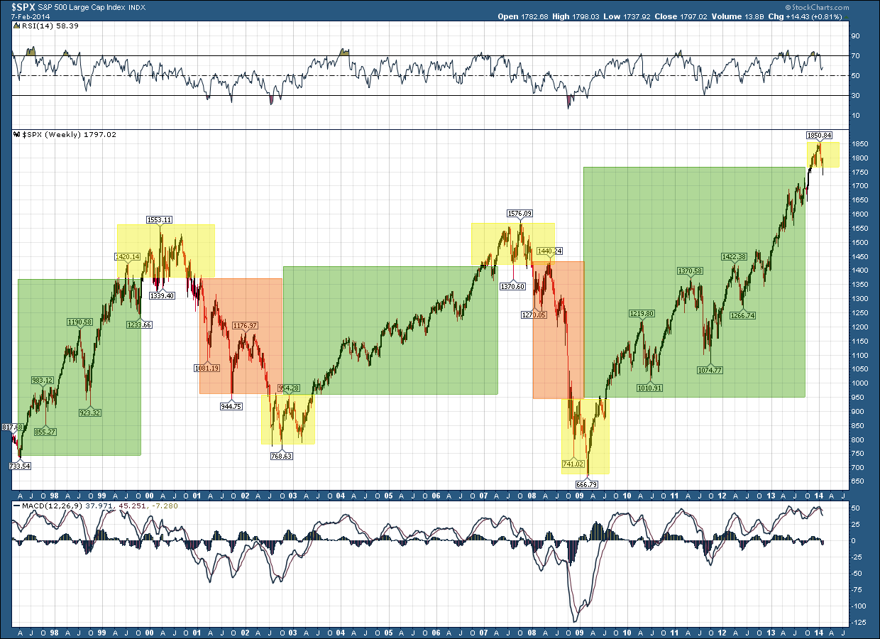
Let’s take a look at the long term stock prices through the 2 recent complete secular bull and bear cycles. It’s vital to understand that prices only have 2 actions. They either 1) trend or 2) consolidate. The chart below helps to demonstrate this as the areas in green and red represent trends (up and down, respectively) and the areas in yellow are the periods of consolidation. 
A trending market is one that goes in one direction or another. A bull market trends upwards, while a bear market trends downward.
A consolidating market is one whose price movement is confined within a set of boundaries or a channel with little or no ultimate change. Consolidation is generally regarded as a period of indecision. It is either the result of exhaustion on the part of market participants or broad market uncertainty. The key to consolidations are once they have completed they are followed by a breakout in one direction or the other.
The ability to correctly discern and ultimately recognize the type of market you are in (consolidation or trending) and invest accordingly can have a substantial impact on investment returns.
Some of you very astute observers of the above chart will have recognize there were time prices consolidated during the trending periods too and may be wondering why didn’t highlighted those in yellow. For this discussion I only highlighted those consolidation areas in yellow when the trend reversed.
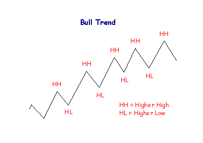
To understand when a reversal occurs it’s important to understand the following: An uptrend is determined by higher highs and higher lows
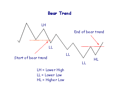
while a downtrend is just the opposite with lower highs and lower lows.
 If we are looking for a reversal to a bull market as we are in today, price would have to put in a series of lower highs and lower lows. That’s it! The concept is quite simple but its interpretation in a real life environment can really muck up the simplicity.
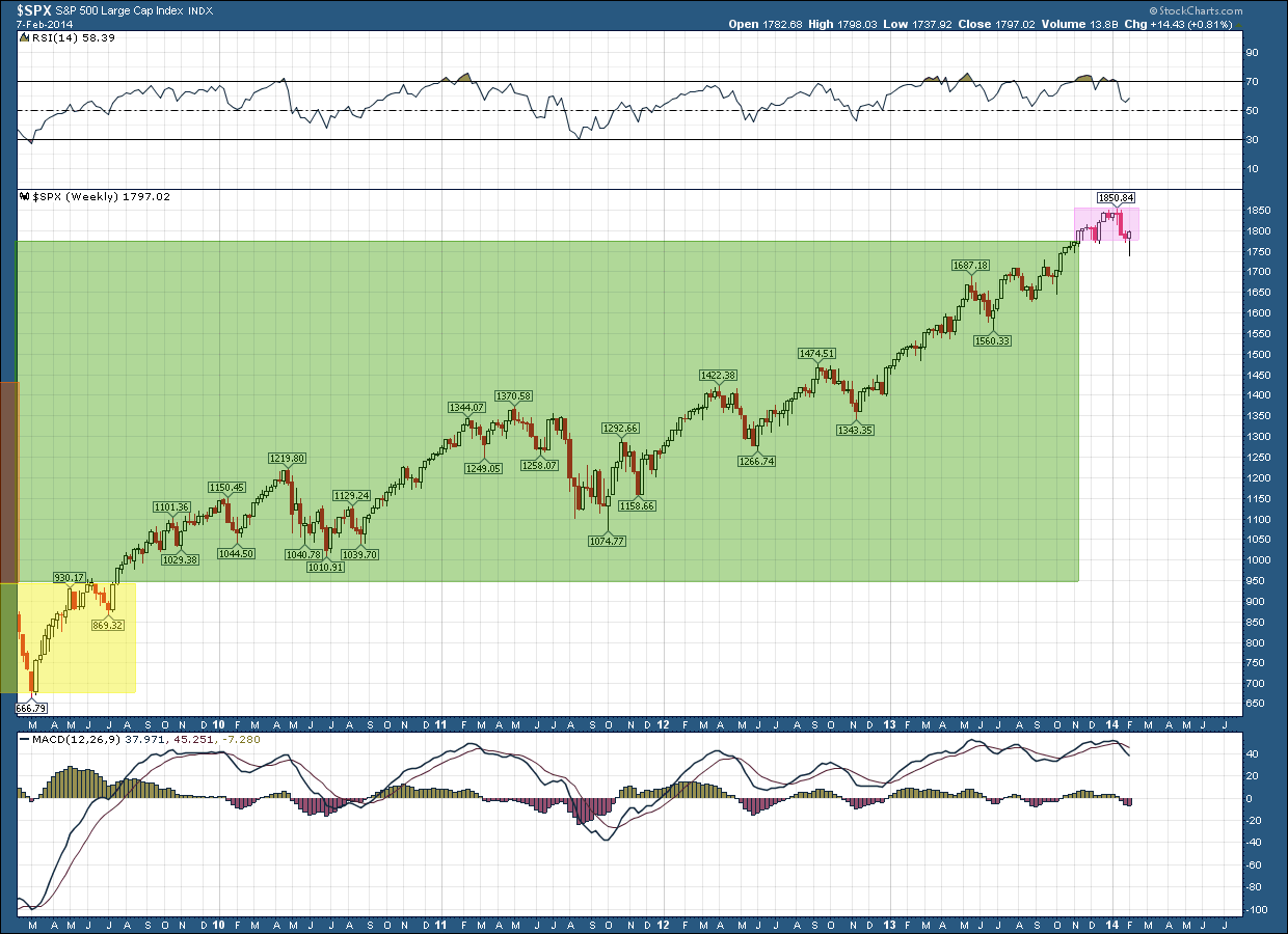
Where are we today? – The chart below is a close up view of the current bull market run from the bottom in 2009. You can see we are in an area of consolidation which I have highlighted it in magenta for illustration purposes (rather than yellow) because we do not yet have a trend reversal. Prices have not yet put in a series of lower highs (none yet established on this daily chart) and lower lows (just one – we need at least two for confirmation). So as of right now, based upon last week’s closing prices, the price structure of the US stock market is still bullish.
Part 2 in this series will cover price patterns that form during tops.

