Economy

April 7, 2014 - Energy strength


The energy sector has had a strong week and has been the strongest sector in the S&P 500 over the past month.  A look at the Energy SPDR ETF (XLE) chart below shows the sector breaking out to new all time highs.  You can see the area highlighted in red has, up until now, provide strong resistance as each time it has been reached in the past prices have fallen. This area was breached on March 28th in the form of a gap followed by a large move up.  This type of action is usually indicative of the potential for continued strength.    One other important thing to note in this move is the lack of divergence in our momentum oscillator which is something we look to avoid (or sell into).

For those that missed the breakout, there is always the chance of a retracement back to levels of support. If that occurs and it holds, that could provide an excellent opportunity. Since resistance that has been broken through becomes support, investors who caught and bought the breakout needs to keep a close eye on the red area in case we get a correction.  Any breakdown below that support is your warning of potential bigger problems ahead.

Jan. 27, 2014

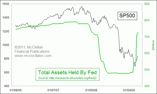
At the start of every year I like to take the time and sketch out a game plan for the year.  Part of that includes identifying major areas of risk and creating a mental game plan on how to respond.  Two weeks ago, I identified interest rates as being one of my major concerns.  When I speak of interest rates I am really speaking of the FED as their open market operations add or subtract to the economic liquidity which helps set interest rates. Its this liquidity (either too much or little) not only has the effect they desire by controlling interest rates but an unintended consequence is its indirect effect on the prices of other assets, such as stocks. So when I hear the FED is reducing liquidity I become concerned as this move in the past has been the catalyst for a market correction. An article from one the Fathers of technical analysis, Tom Mclellan, came across my inbox recently where he does a wonderful job at capturing this relationship and I thought it worthy of presenting its highlights. There are a lot of different indicators and studies that technical analysts use, and all of those tools came into usage due to some degree of merit.  But the one factor which seems to be trumping everything else lately is what the Fed is doing with its QE program.

The chart below compares the SP500 to the total assets held by the Fed.  The plot is made up from the total of the Fed's Treasury holdings and its mortgage backed securities (MBS), which are sometimes referred to as "agency" debt products.  The agencies which that title refers to are Fannie Mae, Freddie Mac,
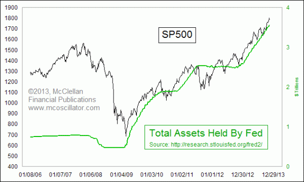
Putting the chart together this way helps us see just how important the Fed's purchases have been to the task of sustaining the bull market for stocks.  Whenever the Fed has decided to change the slope of the green line, the slope of the SP500 has also changed in a dramatic way.  That makes it such an important question to contemplate a "tapering" off in the rate of growth of Fed assets, or even an outright end to quantitative easing (QE).

The next chart also helps us see just how critical the Fed's actions were in bringing about the awful bear market of 2007-09.  Back then, the Fed just held Treasuries, and it did not start buying agency debt until January 2009.  The Fed's holdings of Treasury debt peaked in August 2007 at $790 billion, and over the next 17 months the Fed sold off more than $300 billion of those holdings.  That's right, in the middle of the worst liquidity crisis in decades, with banks folding and with Congress handing out tax rebates, the Fed was pulling liquidity OUT of the banking system.
When the Fed finally stopped pulling liquidity out of the system and started adding it back in again in early 2009, the market turned upward, and the banking system and economy started working their way back toward health again.

Given the now obvious importance of the Fed's actions on financial market liquidity, why did they decide in 2007 and 2008 to pull so much money out of the system by selling so much of their Treasury holdings during that bear market?  That will be a great question for the historians to uncover.  But what I can say is that the man who orchestrated and conducted those sales, the former president of the New York Fed, left that job in early 2009 to become the new Treasury Secretary.  So you can draw your own conclusions.

While the FED this month will begin slowing down the rate of stimulus (note I did not say stop completely or begin to withdrawal which has caused problems in the past) investors still must be concerned as one would expect at least some sort of impact to the economic bottom line. One reason to not be overly concerned is the FED understands it’s the rate of change that is most important and they have indicated any actions will be gradual in nature.  Since we are in uncharted territory (QE first started in 2010), knowing how the market will react to future FED changes is anyone’s guess.  As such, being prepared for anything and playing defense should be a top priority.


Jan. 20, 2014

Obviously this post is meant tongue-in-cheek but there actually are those that watch (and invest accordingly) these things … The Super Bowl Indicator holds that any NFC team winning the Super Bowl is bullish for stocks. It’s worked 80% of the time since the Super Bowl began in 1967.  But if you take a close look at the S.B.I.’s performance, you’ll see the stock market LOVES the 49ers. In fact, win or lose, San Francisco has been in the Super Bowl in four of the five best years for the stock market since the big game between the NFC and AFC champs began in 1967. The Niners’ Super Bowl wins in 1985, 1989 and 1995 were followed by annual gains of 27.7%, 27.0% and 33.5%, respectively, for the Dow industrials. From 1967 to last year, only the Pittsburgh Steelers’ victory in 1975 delivered a bigger advance.

Even in 2013, when San Francisco lost to the Baltimore Ravens, the market boomed.

So S.B.I. believers don’t want just any old NFC team to triumph over the AFC champion in the Super Bowl. Under this thinking, it’s best for your portfolio to have the 49ers beat the Seattle Seahawks in Sunday’s NFC championship — and then win the big game itself on Feb. 2. Of course, the Super Bowl Indicator is a classic example of confusing correlation with cause and effect. MarketWatch’s Mark Hulbert took the whole faulty concept to the woodshed in a column last year. As he blasted “spurious correlations,” Hulbert pointed out that Bangladeshi butter production is an even better “indicator” for stocks. Perhaps the S.B.I. should be renamed the B.S.I.

Of the nine years when the  S.B.I. has failed, four involved Super Bowl appearances by the Denver Broncos — who play the New England Patriots on Sunday in the AFC Championship. So you may want to be wary of the Broncos — and also the Patriots. The best performance in years when the Pats won it all was a 3.1% gain in 2004. The worst was a 16.8% drop in 2002. And the Patriots’ loss in 2008 to the New York Giants was followed by Wall Street’s worst year since the Super Bowl began, a 33.8% slide in the Dow.

Seattle’s only Super Bowl appearance in 2006 was a loss to the Pittsburgh Steelers.  The Dow surged that year.  (Although the Seahawks are in the NFC, the Steelers have their roots in the old NFL, and for the purposes of the indicator are deemed to be an NFC team, meaning the indicator is deemed to have held that year.)

Overall, the prediction business is tough. Just ask all those Wall Street strategists who bet that the falling hemlines in last year’s spring collection indicated a bad year for stocks.

Jan. 13, 2014

Last week I posted what Cullen Roche of Pragmatic Capitalism thought was the major risk for 2014. In today’s post I want to list one of the two major risks (excluding any exogenous shock) I see to the investment markets for this year. Because all markets are interlinked and the bond market is so big, it’s easy to think of bonds as the dog and stocks as the dog’s tail. As such, anyone holding equity investments needs to keep a very close eye on the bond market.

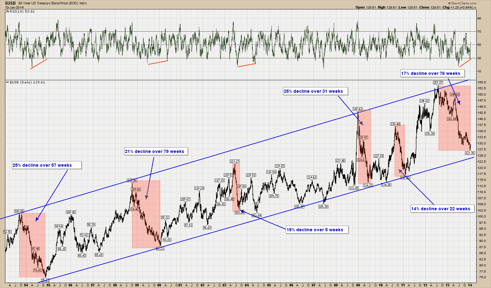
Below is a 20 year view of the 30-year US Treasury bond.  As you can see it has been in a very well defined upward (bull market) channel.  Like all investments it moves up and down but during this entire period it has respected its channel boundaries.  In the highlighted areas I have noted major price swings down (corrections) and the time it took to complete each.

An interesting aside is that an astute investor could have purchased the long bond as it neared the bottom of the channel and sold as it approached the top and been handsomely rewarded over the past 20 years with very low risk investment strategy that would have outperformed just buying and holding.

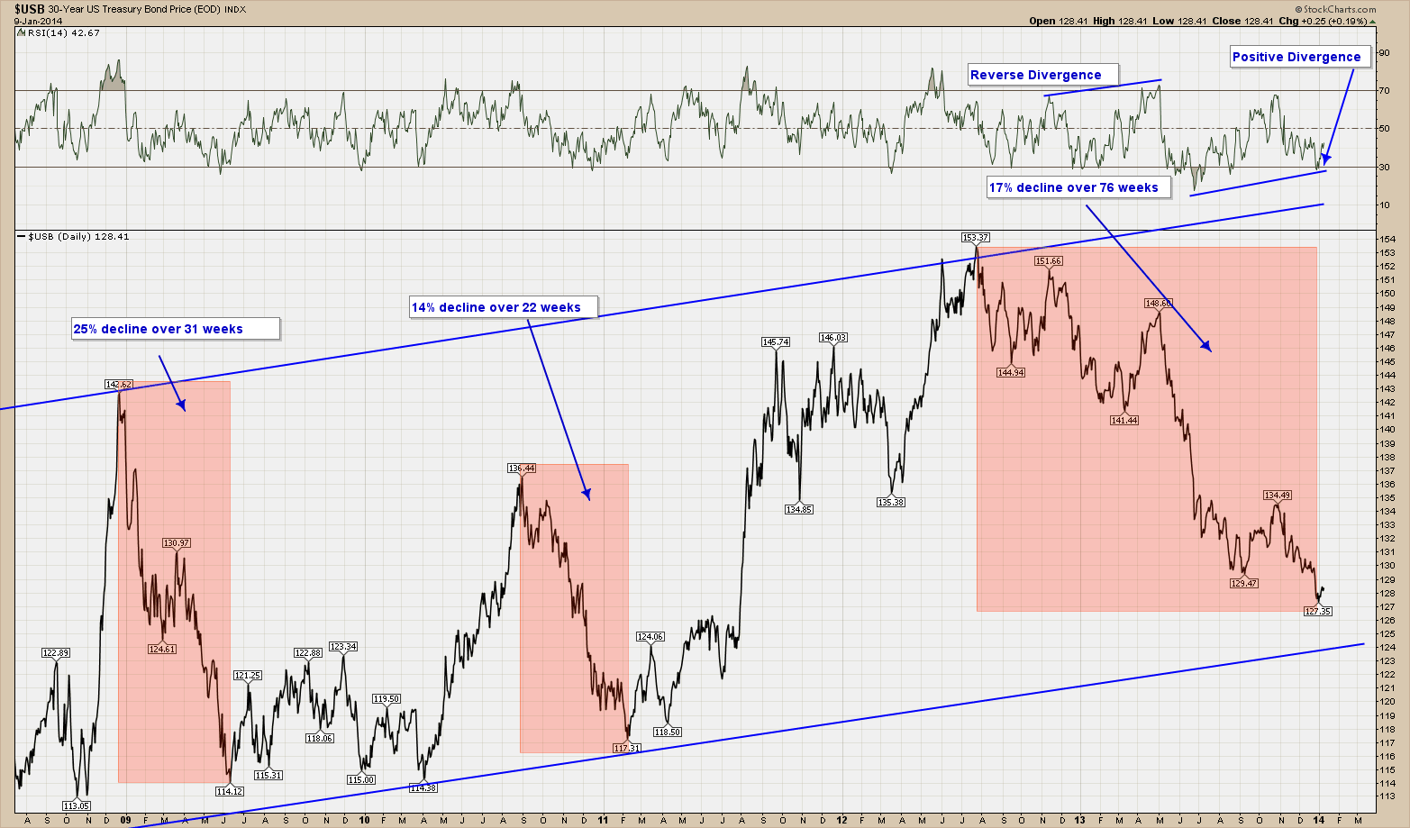
The chart below is the exact same chart as the one above except I am only showing the last 5 years’ worth of data rather than 20. As you can seek the current correction we are in has been going on for well over a year now and if history holds, either has already or is close to completion as it nears the bottom of the channel.  While I continue to stress no one can predict the future, the chart is telling me the decline is very close to being done as positive divergence has formed on our momentum indicators.  This is a heads up that momentum has changed course (up) and price should be not too far behind. While timing is never exact, if we were to fall further one could imagine a decline to the exact bottom of the channel, which is less than 3% away from where we are.

So you are probably wondering what and how this all ties back to the topic of this post, risk to the markets.  At some point the FED will either loosen their reign on interest rates (think taper) or the market will demand higher rates.  If rates rise and go high enough, history says stocks will suffer.  The reason for that is if investors have a much lower risk alternative providing a similar return, they tend to take the path of lowest risk.  If this happens, the nice, well-formed and respected price channel of the past will be breached to the downside.

Nothing lasts forever, so for now and until price tells us otherwise, the channel is still in control but watch out if/when it is violated.

Dec 16, 2013

Last week I posted about the high probability of a bullish end to the year. In an effort to be balanced and show all sides, this week I would like to provide a look at the bearish view. Cullen Roche of the pragmaticcapitalist.com wrote a nice bearish piece that is worth reposting. I know it’s not fashionable to be bearish about anything these days, but I guess I just can’t kill the old risk manager in me. Given this predisposition, I wanted to highlight some potentially bearish indicators that have been popping up lately.  I’ll highlight three such indicators:

1)  The first indicator is from Thomson Reuters.  It shows the S&P 500′s negative-to-positive guidance trend.  According to TR the current reading for Q4 of 11.4 is at its worst level since they began recording the data.  Of course, this sets the bar low for Q4 earnings, but we have to wonder how much this will filter into 2014 earnings where analysts are currently expecting double digit growth.

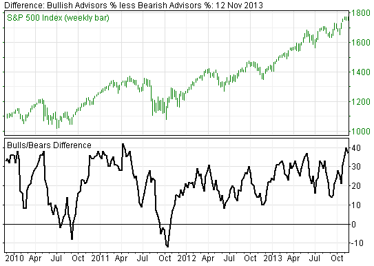
2)  The second chart is the Investor’s Intelligence bull/bear difference.  This is a sentiment reading that tends to reach extremes when sentiment is heavily skewed in one direction or the other.  The current reading just shy of 40 has not been seen since summer of 2011 before the last significant sell-off.

3)  The last indicator is a potential indication of how stretched the two above indicators have become.  It shows the S&P 500′s year-to-date return broken down by actual earnings growth and multiples expansion. Earnings growth is what the actual growth in earnings while multiples expansion represents what buyers are willing to pay for this stream of earnings.  As sentiment has soared investors have become increasingly willing to pay for a reduced share of EPS growth.

The bottom line here is that from the recent 26.5% return on the SP500, only 17% was due to an increase in corporate profits. The rest is investor enthusiasm and willingness to pay higher prices to own stocks.  I don’t know about you but being the tightwad I am I prefer to not overpay for anything …. Even stocks.

Some food for thought….