Economy

US Taxes Returning to Economy-Killing Level

I have written about him many times and posted some of his free work on this blog in the past but this week’s post by Tom McClellan is very enlightening. Tom, one of the fathers of technical analysis, takes on US taxes, US debt, US economy and the US stock market and how they are all interrelated in one fell swoop.  I have copied his insightful look below but I encourage anyone who I wants to stay tuned into the market to check in with him regularly here  

US Taxes Returning to Economy-Killing Level

The April 15 income tax filing deadline came this week, and so taxes are on the minds of a lot of Americans.  As Arthur Laffer noted 3 decades ago, it really is possible to set tax rates too high such that it actually hurts the economy.  We appear to be in such a condition now.

I wrote about this topic back in January, when lawmakers were contemplating raising the tax on gasoline.  But it is worth revisiting as we see total federal receipts creeping up toward 18% of GDP.  Whenever total federal tax receipts have exceeded 18% of GDP, the result has always been a recession for the U.S. economy.  And sometimes we can see that effect from a total federal take at less than 18%. 

The current number is 17.5%, based on total federal receipts for the 12 months from April 2014 through March 2015, and based on projected GDP for Q1 of 2015.  That is very close to the 17.7% reading we saw in 2007, just before the financial market collapse.  It is still some distance away from the all-time high reading of 19.8% seen in early 2001, and because of that some economists argue that we can safely go back to those higher levels and have the same strong economy that we saw in the late 1990s. 

There are two problems with that hypothesis.  The first is that economy of the late 1990s was not as strong as the revisionist historians would like us to believe.  The high taxation then pretty effectively killed the technology boom.  Total stock listings on the Nasdaq actually peaked in late 1996, and were in a genuine free-fall long before the bubble peak of the Nasdaq Composite Index in 2000.  That peak came about because a few large tech stocks were hogging up all of the available liquidity, and crowding out the smaller players, sort of like the biggest hippos taking up the last remaining water hole on the Serengeti during a drought.  Unemployment rates also bottomed out in early 2000 and then started upward.

The second problem with that hypothesis is that we don’t have the same demographic conditions now.  In 1999, the members of the Baby Boom generation (born 1946 to 1964) were between 35 and 53 years old, in the peak of their entrepreneurial years.  They were working hard, building companies, and pushing the economy faster than it would normally go.  Now, they are 51 to 69 years old, and are more interested in playing with their grandchildren than in starting a new company and hiring people.

The children of the Baby Boom generation make up what is known as the “Echo Boom”, which peaked in the birth year of 1990.  Those 1990 babies are now just 24 to 25 years old, and many are just now moving out from their parents’ homes.  So they are not quite at their peak of hard work and entrepreneurialism, and even when they do reach that point, their numbers are just a shadow of their parents’ generation.  So the Echo Boomers cannot absorb the same degree of a repressive tax burden that the Baby Boom generation could. 

This 18% recession phenomenon is not new.  It has worked going all the way back to World War II.  Here is the same comparison for the years 1944 to 1980:

[taxes as percentage of GDP 1944-1980]

[taxes as percentage of GDP 1944-1980]

Federal receipts got all the way up to 19.8% of GDP in late 1945, as Congress was trying to pay for WWII and pay off all of those war bonds.  And in case anyone fondly remembers the strong war-time economy then, we should remember that an economy which requires price-fixing and rationing is not a strong economy.  When people cannot find a place to live because of lumber shortages, and have to grow “Victory Gardens” to have produce, that is not a strong economy.  The effects of that taxation repression finally showed up in stock prices during the late 1940s, and only when taxes dropped back down to a less onerous level did the stock market finally start to rebound again. 

When the federal government takes a smaller portion of GDP as taxes, that leaves more money in the actual economy for real people to spend on what they want, and to spread around employing other people.  Growth is the result.  When the federal government takes too much out, it is like a farmer eating his own seed corn; he does not have as much to plant next year. 

Meanwhile, federal government spending for the latest 12 months equals 20.4% of GDP, almost 3 percentage points higher than receipts.  I keep hoping that someday we will get some leaders who realize that in order to pay off $18 trillion of debt, we have to get the spending number underneath the receipts number, and leave it there for a long time.

And we need to keep the federal receipts number well below 18% if we are to avoid the next recession, and its associated downturn in stock prices.  We may already be too late in that regard. 

Black Gold

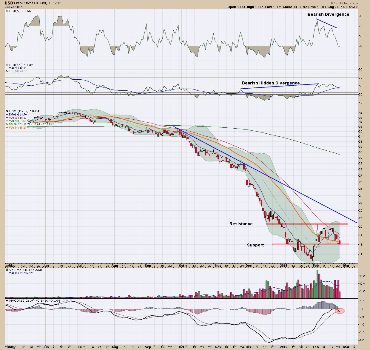
Today I wanted to look at oil chart via the ETN proxy, USO (the United States oil fund), since we all are impacted daily on its price and see if it can hold any clues on what to expect ahead.

If you were bullish on oil, this chart should immediately change your mind.

1.    Price has been in a steep downtrend and has failed to even test its resistance (blue) line since November of last year.

2.    We created an interim bottom the end of January and price has moved higher, rising almost 20% from trough to peak. Price failed to advance above the red resistance line in its 3 attempts and has now fallen back to the bottom (red) support line.

3.    The MACD (bottom pane) failed to move above the zero line and its signal line is close to crossing under the indicator line which is signaling a potential change in direction to the downside.

4.    All the moving averages are pointing down. A sustainable rally will rarely occur without all the moving averages pointing higher, moving upward with price

5.    The recent volume profile is decidedly bearish as distribution is clearly taking place.

6.    The RSI (5) in the upper pane is showing negative divergence

7.    Lastly the RSI (14) in the second from the top pane has bearish hidden divergence.

Looking at the list I cannot see one positive for the price of USO in the short term and as such expect to see new lows in the next few months. This is not a place, unless you are the nimblest of traders, you should be looking to invest.  There are never any absolutes in life (except death and taxes) so there is a scenario (or two) which could change my thesis dramatically and quickly.  When markets are small it’s much easier for the strong hands to influence and even control the direction of price so if OPEC were to cut supply tomorrow, everything I have stated above would be wiped out.  I would expect to see oil prices start to head quickly higher under that scenario. As investors, we always have to be on the lookout for those “nasty” news-driven surprises.  But barring them, the current trend is down (and must be respected) so smart investors should be avoiding (or potentially shorting) this sector until we get confirmation the bottom is in.

Some of you may be thinking to yourself USO is just a proxy and does not reflect the real price of oil. In addition, with USO you have contango and other derivative-based issues associated with ETN’s that can make their price not track the price of oil.  You are absolutely correct but remember my blog posts are intended to educate and not be used as recommendations. The oil price chart is bearish no doubt, but not quite as compellingly bearish.

Death of the Dollar

 In case its not clear, my title is said with tongue firmly planted in cheek

I wrote this post 10 days ago and while it is a bit stale, it is just as important now as it was then. For the past 2-3 years I have read so many stories about how “the dollar is dead” and how “the world’s reserve currency is history”. While that may be true at some point in time in our future, right now, as with all things in which sentiment has risen to an extreme, it is moving in exactly the opposite direction that everyone predicts.

While we were closely watching the Euro and Yen fall on hard times, the lowly and unloved dollar slyly staged a breakout of a multi-year downtrend.

While many investors don’t pay attention to the movement of currencies because they are typically not a part of most investment strategies, there are very strong inter-market relationships between investments and the dollar. For this reason, the ramification of ongoing dollar strength can play havoc with portfolios that are not positioned correctly. Some of the potential major implications of this upside breakout are:

  • US Dollar denominated yields could fall further
    • If bond yields fall, US bond prices will strengthen.
  • Foreign denominated bond prices should weaken
  • A strong dollar puts downward pressure on commodities – while not all commodities move in tandem, most commodity prices should move lower.
  • Foreign stock prices should weaken.

How far the dollar can climb is anyone’s guess but the first target that shows up on the charts is the 2013 high of 85.  Beyond that and depending upon what is driving it higher, a retest of the 2009 (88) peak or even 2007 (91.5) highs may not be out of the question.

In spite of the dollar doomsayers, the (2013) world’s largest economy (European Union) is teetering on recession, the US, while not robust, keeps chugging along. Whether this is the impetus for a continued stronger dollar no one knows for sure and regardless of your long-term feelings about the dollar, right now she is the prettiest girl at the dance.  

NIB - Chocoholics revolt

choc·o·hol·ic

noun \ˌchä-kə-ˈhȯ-lik,
A person who likes to eat chocolate very much

Sure, most food prices have been rising but when it comes to chocolate, for some, it becomes personal. Mars, the company behind the likes of M&M's and 3 Musketeers, said it was raising prices for chocolate products in the U.S. by about 7 percent to make up for higher ingredient costs. The decision followed a similar move from Hershey a week prior to Mars’ proclamation, which announced an increase of roughly 8 percent in wholesale prices.

A look at the price chart of the ETF that tracks cocoa prices (NIB) you can see prices have been on a tear since the first part of last year. After falling almost 50% in less than a year, prices bottomed in 2012 (somehow I don’t remember seeing the announcements from candy makers for a reduction in candy prices back then because of lower ingredient costs.  Hmmmm… how can that be?). For the next year prices bounced around and once again found a bottom (and note how it turned out to be) at exactly the same price in 2013 as it was in 2012.  In April 2013, price broke out of the blue down trend (resistance) line, retested that same line again in May and June and then began its comfortable, steady rise since. Prices have climbed 50% from the bottom.

Since the 2013 bottom, you can see price has been well contained and nicely bounded by the rising blue channel.   Also note the support/resistance line I drew in the 39-40 area. You can see back in 2011 that was an important area as price bounced off of it many times (it acted as support). Price eventually broke through to the downside after multiple attempts to hold. Even though price broke through that level, it still remains very important but rather than acting as support, it flips to resistance. So it should not surprise anyone that the first time price tried to move above it in April of this year it was rejected. Rarely does a support/resistance area of historical importance get penetrated on the first attempt.  After hitting that area initially, price moved back down to the lower blue channel in an attempt to build up enough energy (find more buyers) to make it through on the next attempt. Its easy to see why it was able to make it on the second attempt when you look at the huge spike in volume that occurred. The bulls stepped in with conviction. Now with price above, that line that was resistance will act as support in the case of a pullback.

With price not overly extended and all indicators bullishly configured, I would expect we see even higher price in our future. This combined with the fact cocoa prices typically peak in December (as you can see in the chart below), a retest the prior highs of 51-52 seems likely.  If this is the case, you chocoholics may want to go to Costco now and load up in bulk before the manufacturers find another reason to raise prices.

April 29, 2014 - Household debt

I was traveling and apologize for the late post but bad weather (Arkansas tornados), remote location and delayed travel hindered me from actually being even a little productive. As such this week’s blog post is not from me but rather a recent one Tom Mclellan posted which I thought was quite interesting and definitely worth watching going forward. If you have not visited his site or aware of his work, I would encourage you to dig a little deeper at www.mcoscillator.com

v\:* {behavior:url(#default#VML);}
o\:* {behavior:url(#default#VML);}
w\:* {behavior:url(#default#VML);}
.shape {behavior:url(#default#VML);}


Normal
0
false


false
false
false

EN-US
X-NONE
X-NONE


MicrosoftInternetExplor…


Debt is bad, at least for you and me.  But debt held by others can be a wonderful thing, as long as it is increasing. Debt is only a problem at the point somebody decides to do something about it.

The unfortunate fact for stock market investors is that household credit market debt as a percentage of disposable personal income has been shrinking ever since the peak back in 2007.  Normally it is bullish for stock prices to see household debt increasing, and bearish to have household debt decreasing.  But occasionally the two can go in opposing directions, which is the condition we see right now.

Historically when such a divergence has happened, the stock market eventually realized that it had wandered off track, and it worked extra hard to get back with the program.  But here we are, almost 7 years into a decline in household debt versus income, and thus far the stock market shows no sign of recognizing its off-track condition.  It is a bigger and longer divergence that we are accustomed to seeing in past episodes, such as those labeled in the chart.  The most likely explanation is that the Fed is helping to push up asset prices, in hopes that such action will eventually help push down unemployment rates and other indications of economic malady, and that this action by the Fed is continuing the divergent condition much longer than normal. 

The Fed's data on household credit market debt only extend back 62 years, which is just barely one interest rate cycle period, but is still a pretty long period of time.  And in that time, there has never been an instance of stock prices moving up while the debt to income ratio moved down that did not resolve itself by having stock prices moved hard downward to get back on track.  I do not see it as good news that the stock market is now going for its longest divergence ever in this regard.  I instead see that as a sign of trouble that will eventually have to be paid back double once the reckoning commences. 

It is understandable at this moment in history that we are seeing debt decrease, or perhaps I should specify PRIVATE debt.  U.S. government debt, on the other hand, has doubled in the past 8 years.  Through either willful action or neglect, Congress has been taking up the slack in the debt market.  But while Congress is still on a spending spree with other people's money, Baby Boomers are facing retirement from an ever closer vantage point, and realizing that piling up 2nd and 3rd mortgages on McMansions is not a great way to prepare for the day when the paychecks stop coming.  So they are doing the wholly rational action any reasonable person would do, increasing their savings and reducing their debt. 

The big problem, though, is that there are a whole lot of us Boomers trying at the same time to reduce our debt and get ready for retirement.  The "echo boomers" and millenials are not feeling any compulsion to take up the slack.  They would rather live in Mom & Dad's basement than take out their own mortgage to relieve the Boomers of those McMansions, which leaves the housing market moribund, the banking system seeking yield wherever it can find it, and the Fed trying to fill the void with free money.  So far that has not reached a trigger point that would cause the stock market and the banking system to reverse course, but I have to figure that such a reckoning day is coming.  It always has before, eventually.  And if the crude oil leading indication is right, it could take until 2018 before that reckoning point will appear and start to matter. 

Ironically, if Congress ever decides to mend its ways and step back from the ever-increasing debt levels, then history shows that the stock market could be in for real trouble.  As long as we are spending somebody else's money for whatever we want, the party goes on.  The only time that the problem manifests itself is when somebody tries to do something to solve the problem.