Trends

Another 5 Weeks, Another 10%

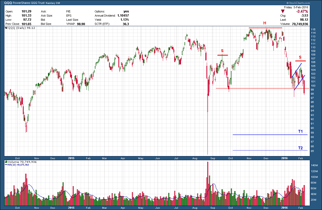
Back on Jan 10th I posted about the coming potential for a 10% move in bonds, warning of a breakout from a symmetrical triangle pattern. The big question was which way it was going to break, higher or lower. My expectation was higher but was waiting for confirmation on a breakout.

Fee only independent bay area financial advisor

We got the confirmation I was looking for just a few days later as prices broke out to the upside. Here we are just 5 weeks later and the pattern target was been met.  For those following along with me, congratulations 10% moves in bond prices don’t happen that often especially in such a short time period.

Fee only independent bay area investment advisor

So now what? The chart below is a 25 year look at 30-year US Treasury bond prices.  What should become immediately obvious is the defined (blue) rising channel price has traded within during the entire past quarter century. A very profitable strategy has been to sell at the top of the channel and buy at the bottom. While it does not look like much, a move from one side to the other can be more than a 25% which, in the context of a “safe” bond investment, makes it much more volatile than investors expect.

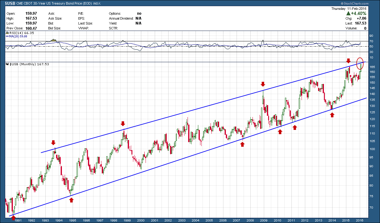
Normally this would be a slam dunk decision on what to do with my TLT holding especially considering Friday closed with a very bearish weekly shooting star candle. But with the backdrop of central banks around the world lowering interest rates into negative territory, the potential for a sustained move to the upside is possible. Could this be the ultimate flight to safety as foreign investors use Treasury bonds as a safe haven in an attempt to avoid a local currency meltdown? Or, will the top of this channel hold once again as it has over the past 25+ years? I know what I will do, how about you?

Attention Mouseketeers

Those that have owned Disney stock (DIS) have had a wonderful ride from the 2011 lows as it has risen more than 330%, peaking in July of last year. Since then, it has formed a double top and is currently sitting right on a major support level. The (red) 200 day moving average has had the chance to flatten and just recently begun to curl downward which is indicative of a weakening stock. 

I am writing this post on Tuesday while the market is open (but won’t post until later) because Disney announces earnings after the market’s close today. If the market does not like their report, because of the current weakness in the stock, I believe it will be the precipitant for the double top pattern to play out to the downside. If this were to happen, the projected target is around the $60 level, some 30% from where we are today.  A positive report would likely push the stock back up higher likely propelling it to prior highs near the $120 level.  If it makes it to that $120 level, major overhead supply sits there patiently waiting likely putting a continuation of that rise on hold.

Bay area certified financial advisor planner, CFP, independent fee only

One of the intended take-aways from this post is that charts provide a framework for risk management and not a prediction of the future.  News will always trump the charts so current Disney stock holders would do well to have a plan based upon market reaction to today’s earnings new, whichever way it turns out. Smart investors should not predict what will happen but rather react to what the market gives. Good risk management is what keeps investors in the game and able to come back to fight another day.


Looking For Trouble

The Nasdaq 100 index, QQQ, is made up of the top 100 largest non-financial stocks traded on the Nasdaq exchange. While has companies across all sectors, the bulk of its components are definitely skewed towards technology in all forms. For this reason, this index usually outperforms the broader market during bull runs and is the biggest loser when the bears come out of hibernation.

Below is an 18-year lookback on the index with RSI momentum in the upper pane, price in the middle and volume at the bottom. It should be no surprise price has stalled at this current level as we are running up against major overhead resistance. You can see the index has so far attempted to move through it 3x (red arrows) and was rejected each time. Additionally this overhead resistance was met at the same time we have formed bearish negative divergence. This is where momentum (upper pane) is falling and price (middle pane) is rising.  While it’s not a slam dunk negative divergence always turns problematic, when appearing on a weekly chart like this it is, at minimum, a yellow warning flag that things aren’t right. At worst it can be the sign of an impending reversal. You can see over the past 18 years this signal has only appeared twice. The first time at the 2000 top it appeared at the beginning of its multi-year > 80% loss. While not as dramatic, it raised its ugly head again in 2012 which signaled the start of a rather mundane (in comparison) 13% speed bump.

financial advisor bay area independent, fee only CFP

Zooming in to take a closer look at just the past year, the daily chart below indicates a couple of very ugly patterns have not only developed but have possibly just gotten under way.  Firstly, as with most tops, some sort of pattern forms and becomes clearer in its latter stages and this time is no different as a very symmetrical head and shoulders (H&S) pattern has developed. For this pattern to complete, price must fall (and hold) below its (red horizontal) neckline. This occurred last Friday. If confirmed next week, it warns of further weakness with the “T2” level near last August’s impulse low being a potential target. Not always but many times the right should portion of a H&S patterns will develop its own smaller bearish pattern. When this occurs it helps to strengthen the validity of the bigger pattern. Looking closely you can see the right shoulder formed the flag (highlighted in blue) of a bear flag. The pole of the flag is reflected by the preceding rapid decline from ~114 to ~99. If you remember your patterns, flags are validated by price breaking below its lower support, which is exactly what happened with Friday’s big red candle. The measured move for the right shoulder’s bear flag I have marked and labeled as T1. This works out to be just a tad less than 10% below Friday’s close.

fee only independent  investment advisor bay area cfp

The broader markets have been in trouble for months but the Nasdaq 100 has been one of the last bastions of strength and hope as it has done a great job limiting the broader market losses to a little more than 10%. If this index doesn’t find some footing quickly next week and continues its move down, it could be the catalyst for a much deeper flush, something I have been concerned with and been warning about for months. Unless you are very nimble or a short seller, this market is looking for trouble.

Big Bad Bear ..... Flags

Without question of all the elements of TA, chart patterns are my favorite. For whatever reason, recognition comes easy to me, in fact too easy which is probably why it’s my favorite. I wanted to introduce you to one of the prominent patterns, the bear flag.

A bear flag is a bearish signal, indicating the current downtrend may continue. It follows a steep, or nearly vertical decline in price (the flagpole), and consists of two parallel trend lines that form a rectangular flag shape. The flag can be have an upward tilt or be horizontal as is shown in my example.

financial advisor bay area, cfp, investment management expert

The rectangular flag shape is the product of consolidation. Consolidation occurs when the price bounces between an upper and lower price limit. This is a place where buyers and sellers are attempting to determine price equilibrium. A bearish signal occurs when the price falls below the lower trend line of the flag and continues downward. The break of price below the flag is considered pattern confirmation. There are other elements you want to see during the formation of the flag that add to the probabilities of success (eg, volume and period of consolidation) but for now, I just wanted to focus on price.

The target of the pattern is the length of the pole subtracted (or in the case of a bull flag added) from the price where it broke down below the lower trend. Keep in mind price does not have to go to the target. It can fall short or even extend much further. So, just because you get confirmation does not mean you can ignore investment.

This pattern is effectively a pause in a downtrend. The price has gotten ahead of itself; therefore market activity takes a break before continuing the downtrend. You would like to see this pause reflected in decreased volume. Similarly, a spike in volume will hopefully mark the resumption of the downtrend.

Armed with this understanding, I present a daily chart of the SP500.

Financial Advisor Bay area, Certified financial planner 2-3-15 - spx


If we get a breakdown below the flag trend line, the target for this move would be down at 1680 some 11+% lower than today’s close. There are no guarantees but it is something for investors to think about.

In case it doesn’t jump out at you, there was another bear flag that formed during the last decline in August. I did not highlight it on purpose to see if any readers found it on their own. You can see price broke decisively down below the (not drawn) flag with very high volume which was the confirmation validating the pattern. But notice how price stopped around 1860 and never reached its measured move of ~1750.  I believe this time may be different and have a much better probability of hitting the target on a breakdown of this flag mainly because instead of a sideways consolidation that occurred before the top of the pole that we had in August, this time we was preceded with downtrend, lower highs and lower lows.

Nobody has a crystal ball but I know where and when I will be laying my chips on the table come a break of the lower flag trend line (support).

January 2016 - Charts on the Move

January started off with a bang to the downside and ended with a one-day mother-of-all-rallies. What's ahead. Either way it appears as if volatility is back in vogue. We have seen a clear change of intermediate term leadership as the bears have taken control. This means for me that until proven otherwise, risks to the downside outweigh any upside benefit and believe any failed rallies should be used to lighten up risk.

Not in my camp? Take a look at January's Charts on the Move video (link below) and see if it gives you a different perspective.

https://youtu.be/_4K5DBq-1_U