
August was about as much fun as listening to Rozanne Barr sing the National Anthem. Me thinks the next few months are going to make up for it. What do you think?
Solar Flair
As I evaluate solar technologies and vendors for an installation in my home, I was interested to see the shift in US electricity generation in the first half of the year. It’s hard to believe that just 5 years ago coal had a 40% share in power generation. The relentless cost declines, government subsidies and capacity increases for both wind and solar are now very much a part of coal’s current declines. Combine that with the learning rate of renewables should add further downside pressure on coal, estimated to fall to the low 20-25% with wind and solar picking up the slack for a combined 15% by 2020.

The technological advances have pushed efficiency's into the low 20% making solar installations nearing a 5-6 year ROI. While solar for the home becomes more cost competitive and an increasingly better ROI, you can’t say the same for solar stocks. TAN, the solar ETF is down 90% from its inception date.

For now and until things change most of your eco-friendly investment dollars appear to be best utilized in your home rather than your portfolio.
Additional Downside Likely for Mining Stocks
For the first time since the January bear trap reversal, precious metals mining stock ETF, GDX, is showing weakness. After forming bearish divergence the index recently broke its (dotted green) uptrend line and last week created its first lower low. While not a swing sell signal, these warnings cannot be ignored and should act as a wake up call to the bulls.

If I read end of week action correctly it does not look as if this correction has run its course. If not, the first line of support below is the $24.5 level and beyond that if we get a much bigger flush, $22 seems like a very important level as both the 50% Fibonacci extension from the January bottom and the 200 day moving average reside in that area. Regardless of where price eventually finds support, our bullish outlook will only continue if, on the next bounce higher, we go on to make a higher high. If not, that will be signal to take profits in at least half the position and look for further directional clues.
Get the Door
If I asked you what company had the most successful IPO since 2004 (based upon share price increase) if you are like me the first company that came to mind would be Google or maybe some other tech giant. If so, you would be wrong like I was.
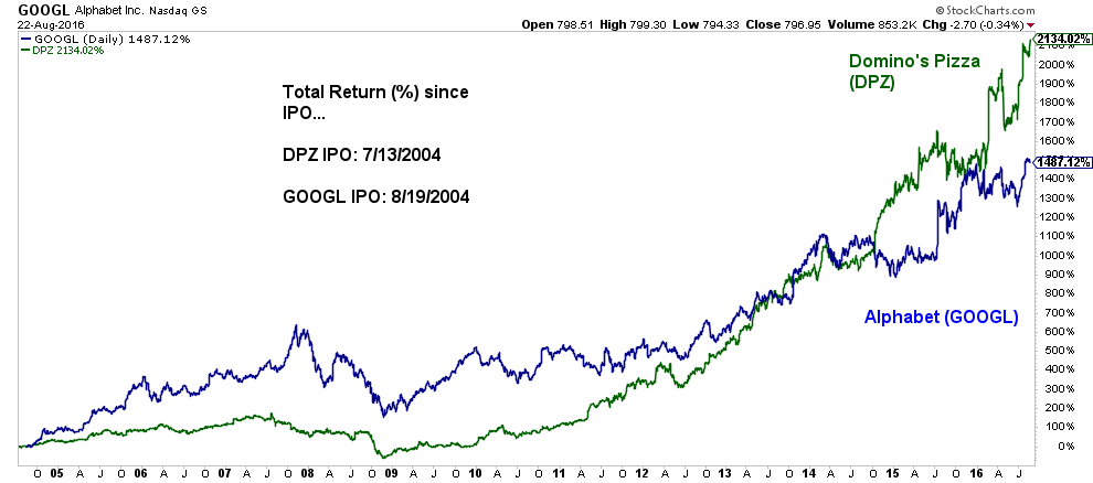
Who'da thunk? I guess I must be the only person in North America to have never had the pleasure of tasting #1.
Go Pound Sand
We all know the title of this post is an expression of disdain, much like what people feel when you mention the idea of the British Sterling as an investment. Recent Brexit, European economic collapse and Goldman Sachs doomsday free-fall concerns immediately scare investors away. But, looking at the weight of the evidence a contrarian might consider the charts, sentiment and how “smart money” is currently positioned as a sign in favor of a forthcoming rally in the currency. Let’s take a look
In my first chart. a weekly look at the British Pound ETF, FXB, you can see it formed a double bottom with positive (bullish) momentum divergence. I need to point out that there is not just one but two divergences that have formed across two different time frames. These occurred after the huge, 2 consecutive week Brexit capitulatory selloff in June. This hinted most everyone who wanted to sell already had, leaving only buyers. Aiding the bullish case, last week closed with a bullish engulfing candle hinting of further upside.

On the daily chart below, the divergences become more obvious as was the massive selling volume in the lower pane, well in excess of 10 times its norm. Since the first tag of the bottom, price has formed a nice sideways consolidation channel which, if broken, should indicate the direction of the next leg of the pound’s journey. Also, while hard to see because of my small annotations, August 15 was a one day failed breakdown below the lower support line followed by a gap higher. While reasonably infrequent, when these event occur I immediately think back to one the investing adages we should never forget…” from false breaks comes big moves in the other direction”.

Finally I like to look at COT (Commitment of Traders) data. Without boring you with all the details the Commodity Futures Trading Commission (CFTC) releases a COT Report which aggregates all the futures positions of every major player in the futures markets. The data is broken down into three sections and what is important to investors is how the “Commercial” traders are positioned. You see these are the whales, the guys with the big bucks and while not always right I have learned the hard way you DON’T want to be positioned (for very long) on the opposite side of them. In the chart below for the British pound, the pane is the price movement of the pound, the second pane is the commercial trader’ position, the third pane is the large trader and the last is the small speculator. While the chart includes only 5 years worth of data, I went back through more than 25-years and this is THE largest long position in the British pound. EVER! The smart money is positioned for a rally in the pound. How about you?

I know there are doubters as I can be included on that list. But as investors some of the best returns are those which no one expects which is why we need to remove all biases and keep our minds open to all opportunities. The weight of the evidence strongly suggests a powerful rally in the British pound is likely in our future. The downside risk is limited as an exit below the failed breakout low makes for a compelling risk to reward ratio on this opportunity