Target Met

Back on September 5th I wrote about a potential intermediate term top in the DJ internet index here. As we know by now, topping patterns in strong uptrends are likely not to complete since you are going against the longer-term trend which is why this example was only a “potential”. But, all trends eventually end so they should not be ignored. In this case, the downside target down at “T1” was significant enough to grab my attention. Not evident from my chart, the internet index was forming a topping pattern warning of a move lower while the broader market continued to move higher, pointing to clear divergence.

san ramon fiduciary cfp retirement planner fee only investment advisor 10-29-18#1 $djusns.png

Fast forward almost two months and here is what has transpired since the post. The price of the index eventually broke below the (red) support line and chopped sideways for a couple of weeks. From there it attempted a quick rally, back-tested the underside of (red) support and immediately failed.

bay area fiduciary cfp retirement planner fee only investment advisor 10-29-18#2 $djusns.png

As you can see, the index has fallen and currently sits right on the T1 target. This is an area that should act as support and as such would expect price to consolidate or possibly reverse higher. If you shorted the index on the setup, congratulations, I would be banking profits. Going forward if the index can hold support it will present a nice, reversion to the mean investment trade. If not, this index and likely the overall market is in deep trouble and set up for a larger move to the downside. In my humble opinion investors should be treading lightly here waiting for confirmation this is something other than a “potential” bottom before committing investment capital.

Semi Spotlight

Those long-term readers know by now I watch the semiconductor index closely as it tends to be the canary in the coal mine when it comes to establishing an early trend for the US stock market.  It goes without saying that “establishing early trends” goes in both directions.

Taking a look at SMH, the semiconductor ETF, the 6-year chart reveals some interesting things.

1)     It does a great job of showing market structure. Markets trend, then consolidate. Wash rinse repeat. While it has not yet happened, consolidations are areas where the trend can end and reverse course. Note to self - best I memorize for later.

2)     In 2015, SMH made a new, all-time high (1) and then went on to break below both its long-term uptrend and 200 day moving average. RSI momentum confirmed the weakness as it formed negative divergence. That break down was the start of a consolidation lasting 14 months and eventually went on to make two more lower highs (2,3). As was indicated by the consolidations declining volume, it eventually went on to gap up and break out into a new uptrend.

3)     In March of this year, SMH made a new, all-time high (1) and then went on to break both its long-term uptrend and 200 day moving average. The last time this occurred was in 2015. That break so far has gone on to make two more lower highs (2,3). RSI momentum divergence warned of an eventual consolidation.

What is different in the current consolidation that has not yet ended, instead of breaking into a new trend higher, SMH currently sits on critical support and the volume during this consolidation has increased which is a big warning sign of (smart to dumb money) distribution.

NAPFA CFP fee only registered investment advisor and certified financial planner - SMH - 10-24-18.png

You know the drill by now. If SMH stays and holds above the current levels, we can, as a minimum, expect a retest of prior highs (1,2 or 3). At best, it goes on to eventually begin a new uptrend. On the flip side, a break and hold below, lower prices are in our future. The current rounded top pattern, if it plays projects to a price that would fill the gap made back in April of last year, ~20% lower. These differences point to a higher probability the eventual direction out of this consolidation will be lower. If so, this would be the first time in a very long period of time where the risk of being in stocks outweighs their potential reward.

Either way the semi’s go, expect the broader market to follow suit and post haste.

Over-Caffeinated

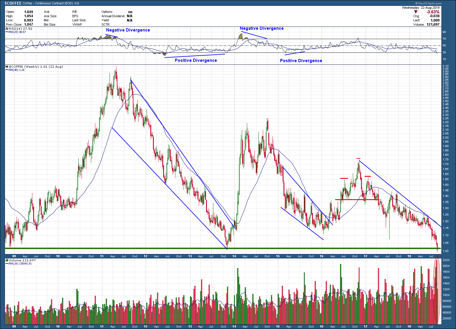
In my August 22nd post, “A Falling Knife or Opportunity of the Year”, I wrote about the possibility of “one heck of a reversion to the mean profit opportunity” setting up in coffee. What had my interest was the fact it was massively oversold condition, sitting on very important support and most importantly the smart money was long … very long coffee futures.

Here was the long-term chart of coffee futures I posted.

certified financial planning retirement expert and financial advisor cfp in Bay area - coffee 1 -10-22-18.png

My next chart is what has transpired since the post

certified financial planning retirement expert and financial advisor cfp in san ramon fee only napfa - coffee 1 -10-22-18.png

Right after the original post, coffee went on to make one lower low in price (which took a month to unfold), at the same time RSI momentum formed positive divergence before coffee’s price reversed course to the upside. What occurred next was a 30%+ rise … in just 22 trading sessions. At this point though it is overbought, run into major overhead resistance (supply), has formed negative RSI divergence and closed last week with 2 indecision doji candles, one being a gravestone. This is enough of a warning for me that the current run is tired and likely done. This type of movement is every traders/investor’s dream and when they occur are usually caused by a short squeeze. For those that are short, when the price of the investment begins to move higher, the higher the price goes, the more investors buy back shares to close out their short positions. This covering is the fuel needed to push the prices higher and higher. Every squeeze eventually run out of gas once most of the short positions have been covered and are usually followed by a big reversal to the downside. So, if you are lucky enough to be on the right side of a squeeze, try and ride it for as long as it wants to go and then get ready to get the heck out of Dodge before the rug gets pulled out from underneath you.

Paid Forward

The graphic below is a high probability snapshot into our stock returns future. The grey line is percentage (left vertical axis) of US households that own stocks. The red line is the subsequent SP500 total return (right hand vertical axis). The correlation between these two over the past 67 years has been very, very strong as you can see. The take away is the more US households that own stocks, the lower the subsequent 10-year return in the US stock SP500 index. This does make sense if you look at it from the context of supply and demand. The more people who already own stocks, the fewer households that are left to buy and drive prices higher. We are at the third highest level in the history of the dataset and at current levels, we can expect a 10 year forward return of a whopping 3%.  Ugh!

san ramon napfa cfp certified retirement investment advisor paid forward - 10-17-18.jpg

What could make this chart wrong? Not much as the correlation is too strong! But, a huge correction always takes care of too much stock ownership. Not a great solution you say? With the financial world continuing to expand globally, there are people from other nations who, in the past would not even be considered potential buyers but because of expanding worldwide wealth, are now added to the pool of potential investors in the SP500.  How much upside might that add, if any, is unknown.

The chart clearly shows that we have not yet reached other levels of extreme participation (and worse subsequent future 10-year returns) and as such we could move even higher. So, while all is not lost, the outlook for equity returns is becoming disappointingly uninspiring. We have pulled forward both demand and returns and by doing so have set ourselves up for a likely lackluster investment future.  I don’t want to be a Debbie Downer but being prepared for the high probability of the next 10 years being not a compelling investment environment should be some knowledge of great value. We either need to reset our expectations or change our investment approach if we want (or need) better returns.

A Few Questions to Ponder

The average country ETF is now down over 10% year-to-date. US large caps continue to mask global equity weakness as you can see in the chart below. Diversified global investors are likely down for the year.

San ramon retirement fee only fiduciary financial advisor.jpeg

If the take-away from this chart is a snapshot of investors global appetite for risk, what are the numbers telling you? Risk on or risk off? Do you think there is a higher probability to turn 41 countries into positive returns or 4 countries negative? With that in mind and in spite of the US holding on to year-to-date positive equity returns, this chart should be telling a tale of caution, at least for investors outside the US.