Bonds

On a Dime

Josh Brown (thereformedbroker.com) is a must follow for those who live and breathe the markets as I do. His post from last Friday says so much, so well I had to repost it. Hopefully it sounds familiar.

 On a Dime

The fundamentals of a company, a sector or an entire country’s economy rarely turn on a dime. They improve or deteriorate slowly, and often imperceptibly, over longer periods of time. And when they turn, even the turn itself can seem interminably long.*

The prices of stocks, however, can and do turn on a dime. They move faster and more aggressively than anything happening with the issuer’s fundamentals. And yes, by extrapolation, entire sectors or country stock markets do the same.

The fact that stocks and stock markets can turn on a dime is one of the most frustrating aspects of investing. Just when most investors have told themselves the same story so convincingly and memorably, the story changes. But not everyone is ready to abandon the story they’ve embraced all at once.

This turning on a dime business also makes technical analysis difficult for people to accept. If everything you thought last week is now the opposite this week, why should I listen to a word of any of it? Smart technicians speak in probabilities and not certainties regarding outcomes. They also describe their opinions in terms of if, then:

If ___ comes to pass, then ___ should be the result. But if ___ doesn’t, then ___ becomes less likely.

If that lack of conviction frustrates you, you probably aren’t cut out for markets, anyway.

2018’s market turned on a dime. The difference between momentum in January versus momentum in December was night and day – there’s no chance the underlying fundamentals of the US economy changes to the degree momentum did during the course of the last year. Here’s Jon Krinsky, looking at Relative Strength (RSI), a widely used measure of momentum – it’s my Chart o’ the Day. Readings above 70 or below 30 are considered to be above or below the thresholds of “extreme” momentum, good or bad…

What a Difference A Year Makes

In January, the SPX’s weekly RSI exceeded 90, its highest on record. In December it hit 31, the lowest since 2011. It’s easy to say that 2019 will settle somewhere in between, but a failure to hold above the 50 level on the next meaningful rally would be a negative tell for the medium-term.

san ramon napfa cfp and certified financial advisor 1-7-19.png

To have the highest RSI on record to begin a year and then end plumbing the depths of recent history – that’s quite a turn. It didn’t announce itself, it just happened. In January, there wasn’t a single indicator that could have warned you. The only preparation for this sort of thing is to be armed with historical context – and the history of markets suggests that anything can happen, at any time. Hence the need to build strategies that can endure all events, even low probability ones.

Source:

Formidable Resistance
Baycrest Partners – January 1st, 2019

* there are exceptions to this, of course. one-drug biotechs absolutely can see their fundamental outlook stop on a dime and reverse, from something like a partnership announcement, an insurance company approval, an FDA approval, etc. There are others.

Risk On is Almost Risk Off

The most important chart stock bulls want to keep a close eye on is the ratio of stocks to bonds. When rising, investors willing to accept risk, want to be heavily invested in stocks. When falling, bonds are the place to be as they are providing the best comparative returns.

san ramon east bay area fee only NAPFA financial advisor CFP - stock to bond ratio 12-31-18.png

As you can see, the ratio peaked in 2016 and in the process of changing character. Changing from an uptrend where higher highs and higher lows were the norm to one where lower highs and lower lows are occurring. All is not completely lost for stock bulls as the ratio is in a sideways consolidation and has held its key horizontal support level. Watch out though, if that level gives way that would be a strong argument it’s time to hunker down into less risky assets.

A Few Questions to Ponder

The average country ETF is now down over 10% year-to-date. US large caps continue to mask global equity weakness as you can see in the chart below. Diversified global investors are likely down for the year.

San ramon retirement fee only fiduciary financial advisor.jpeg

If the take-away from this chart is a snapshot of investors global appetite for risk, what are the numbers telling you? Risk on or risk off? Do you think there is a higher probability to turn 41 countries into positive returns or 4 countries negative? With that in mind and in spite of the US holding on to year-to-date positive equity returns, this chart should be telling a tale of caution, at least for investors outside the US.

Bonds Away

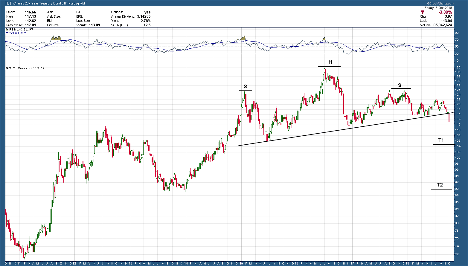
The most important development of the week (and maybe the year) took place in the bond markets. As such, it should come as no surprise that last week’s volatility in stocks was directly related to what was happening to bonds. As we see below in the chart of the 20-year bond ETF, TLT, it started the week right on the neckline (support) of the multi-year head and shoulders topping pattern. As the week progressed, the sell-off in bonds gained steam and eventually closed out firmly below support. Investors under 40 years of age, and possibly even 50 or older (depending upon when they started investing) have never experienced a declining bond market. So, for most a potential bond bear market is uncharted territory.

san ramon napfa fee only financial advisor CFP.png

As you know by now, all patterns are not relevant or meaningful until they have a confirmed close. A confirmed close we have but we need to see the neckline hold as resistance in the coming trading sessions. If so, the 20-year bond has a tough row ahead as the first target is down at T1, and the second is back at 2013’s lows, some 20% below where we started the week.

The table below shows an example of what bond holders across different types of bonds could expect with only a 1% rise in rates and why this potential breakdown is such a big deal. Not every rising rate period is exactly the same so your mileage may vary. What stays constant regardless of the period is the fact the longer the maturity, the greater the expected decline.

bay area napfa fee only financial advisor CFP.png

September 2018 Charts on the Move Video

The bulls were out in force as we closed out the third quarter. With the expected year end rally, 2018 looks to be another strong year for the market…. the US stock market. Bonds, commodities and foreign investments continue to under-perform and act as an anchor to portfolios. Mean reversion will eventually show up but, based upon the charts, Q42018 seems like more of the same.

My Q3 recap video can be viewed in the link below.

https://youtu.be/MgUbcV8Ckb8