
A quick 3 minute video on where we are with respect to the US stock market.
From the Ashes?
I haven’t written about the Millennial savior, bitcoin, in well, it seems like forever. Not because I don’t like it but rather its was in a horrendous long-term downtrend, losing more than 90% of its value in 15 short months. What’s there to talk about? But, of late its price has taken a much more constructive look as it has been trading sideways (instead of falling further) and looks as it may have found a short-term bottom while trying to clear out the remaining sellers. This, of course, is an ideal setup for a bullish trading opportunity. While it may turn out to be a long-term investment (not my belief), until it proves itself it must be viewed only as a trade.
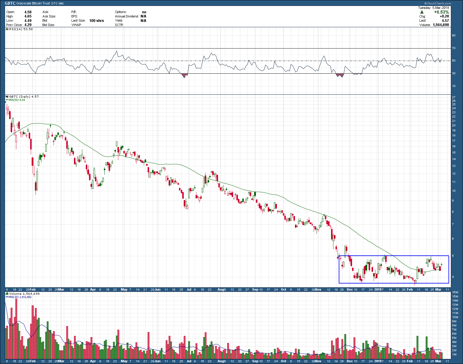
As you can see, price has been contained within the rectangular box, is now above a rising 50-day moving average while volume (bottom pane) has been shifting from large red candles (selling) to green (buyers). In spite of its potential short-term holding period, the first upside target is ~25% above the upper boundary of the rectangle. Two ways to trade this setup using this pink sheet bitcoin proxy, GBTC, is to buy the breakout of the rectangle, with a stop placed 3% below the breakout level after purchase. The second, which has a much higher upside target (>50%) but has less chance of getting filled, is to place a limit order down at the bottom of the rectangle. If the order gets filled, your stop would be placed 3% below the bottom of the rectangle. In either case, the risk is well contained (likely less than 5% depending upon the price of GBTC gets filled at) and provides either a 25% or 50% potential pattern target reward. A minimum 5:1 or best 10:1 reward to risk is a setup any investor/trader would love to have as they don’t come along that often.
Watching the Transports
A bearish engulfing candlestick pattern is a reversal pattern, occurring at the top of an uptrend. The pattern consists of two candlesticks: 1) a smaller bullish candle (Day 1) followed by a 2) larger bearish candle (Day 2). The bullish candle real body of Day 1 is contained within the real body of the bearish candle of Day 2. On day 2, the market gaps up (typically interpreted as a bullish sign) however, the bulls run out of gas and do not push price very far before the bears take over reversing price down, not only filling in the gap from the morning’s open but also below the previous day’s open. A completed pattern warns of a high probability (at least for the short term) the uptrend is over. The larger the candle body and volume on day 2, the higher the probability of a reversal.

Taking a look at the weekly chart of the Dow Jones Transportation stocks you can see last week closed with that same bearish engulfing candle. Unfortunately for the bears, while last week’s candle did engulf the prior week, it was not overly large. In addition, the weekly selling volume was just slightly above average, nothing out of the norm. If you look to the immediate left at the most recent prior peak in November of last year, it too formed a bearish engulfing pattern where the gulfing candle was not only huge but was confirmed with excessive selling volume. Notice what happened immediately following. This is why you need to take notice when these patterns appear

I have been saying for a couple of weeks the market looks tired but was not yet telling us we had reached the end of this reversion to the mean bounce from last Christmas eve. With last week’s close though, the transports have thrown out the yellow caution flag warning long-term investors to likely expect further selling pressure and short-term traders to cash in their chips or at least tighten stops.
The Return of the Doji
The “doji” (meaning the same or no change in Japanese) can be one of the most important candlesticks when viewing charts. It indicates that buyers and sellers are at equilibrium, a state of indecision and balance. Equality never persists as eventually one side will win, as such investors should desire to be on the side of the winner. When doji’s appear at the end of an extended trend (either up or down) they have the potential to be a significant warning that the near-term trend may be ending. The Japanese (who created candlestick charting) say that whenever a doji appears, investors should always take notice.
The doji is formed when price opens and the closes at or very close to the same level. In Candlestick charting, this essentially creates a “cross” formation. As the illustration below shows, doji’s take on many shapes but all have the same important implication and contain two common elements. A horizontal line which represents the open and close (occurring at or near the same level) and 2) a vertical line representing the total trading range (high and low) during the time period represented on the chart.

Below is a chart of the US Dow Jones industrial index. As you can see, the industrial’s price is approaching the high levels made last November. What should also be clear is that a doji formed Monday. I ask you to let your eyes drift left and look at what happened each time a doji (circled in blue for your convenience) occurred in an extended uptrend. Do you see a pattern that repeats? If so, we all must be wondering if it is finally time to take a breather from this over-extended counter trend bounce off of last Christmas eve’s low prices and expect a pullback? Or will this uptrend be strong enough to overpower the return of the doji?

A Nice Rounded Bottom
After being crushed by more than 60% (peak to trough) over the past year, Chinese retail giant, JD.com. JD, looks worthy of your investment dollar consideration. Not being a fan of v-shaped bottoms, those that base sideways or (preferably) in a saucer-shaped, rounded bottom pattern, have the potential of being much longer-term winners and as such, are more desirable. As you can see in the one-year daily chart of JD below, that is exactly what has taken shape. It’s not just the shape of the set-up but also the volume confirmation (bottom pane) that is occurring. On the way down, the biggest volume bars were red telling us of institutional distribution (follow the money). Eventually, the red bars begin to get smaller and then replaced by big green ones, indicative of institutional accumulation (follow the money). Protracted moves in either direction must be accompanied by institutional activity otherwise their longevity becomes suspect.
In addition to price and volume, RSI momentum is above 50 and rising. While its 200-day moving average is still declining, it is flattening. Price is currently above its rising 50-day moving average all the hallmarks of what you need to see in an early trend reversal

A confirmed break of the green horizontal saucer neckline points to a target at T1 some 25% above. A resurgence in the Chinese economy (brought on by an end to the trade-war perhaps?) could push the stock back up to last year’s highs, offering the potential for a 90% winner. With investment capital recently flowing into emerging markets, including China, a continuation or worsening of US-China relations would likely turn this potentially big winner into something quite the opposite. Invest accordingly.