Feb 24, 2014

Part 3 in this series, this week I wanted to look at market breadth and see what, if anything, it is telling us. Market averages such as the Dow Industrials or S&P500 indices are the most readily available barometers for market conditions. Using charts, it is relatively straight-forward to determine the current trend, and to identify how long this trend has been in place. However, what is even more beneficial is to have an understanding of not only the price trend but the underlying strength of the individual stocks as this will help substantially in determining the likelihood of the trend changing and the relative levels of market risk. Breadth (participation) indicators were developed precisely with this task in mind: to determine the strength of a market trend by looking at its constituent stocks.  Since research has shown that the majority of an average stock’s future price move is due to the direction of the overall stock market, the importance of understanding what market breadth cannot be understated.

If all this is putting you to sleep because it’s too technical, a real simple way to think of this is a stock market can only continue to rise if the majority of the stocks that make up that market are rising. The converse is true too when the market is falling.  Since this series of blog posts is about analyzing market tops if you apply that understanding logically you would not expect a top to be reached until the majority of the stocks in the market are no longer rising and instead falling. While there are many different ways analysts slice and dice the internal market breadth data I am not going to go into detail here rather state that what is most important is trend of that data not each exact value.

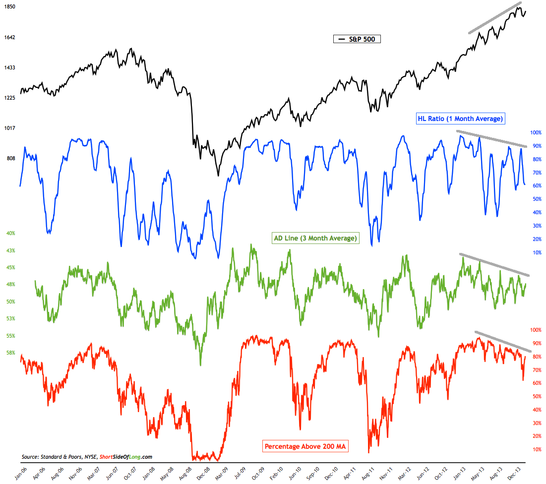
The chart below shows the SP500 US stock index (in black) on the top and three different breadth indicators (in blue, green and red). In order to get a good level of confidence in interpreting market participation, I like to look at a few different breadth measurements in hopes they are all telling the same story. If they are, a yellow flag is raised and tells me more intense and frequent monitoring is required. In the case of the chart below, you can see the trends of all three measurements are declining. You should also notice the SP500 price trend is pointing UP. This is divergence and it is warning of the potential for lower stock prices. Either the trend of breadth continues to decline and the SP500 will eventually follow suit or we will need to see greater participation here in the coming weeks.

An interesting observation you can make about the chart is that during the recent correction over one third of SP500 stocks dropped below their 200 MA. This was the first time breadth readings dropped below 75% since late 2012. This shows just how strong the recent bull market has been. The question is, was this sell off an indication of something bigger to come or was it just another correction in the uptrend?

While this is a warning sign it does not mean to me it is time to get out of the market.  This is just one of a many indicators I watch. When the majority of them turn yellow or red and tip the scales convincingly to the side of the bears that becomes my trigger to take evasive action. Until then it doesn’t mean you shouldn’t consider taking some risk off the table due to the increased uncertainty and warning flags that are popping up. But, for now the trend is still up and until it changes it is important to respect it.

Equity-Market-Breadth1

Feb 17, 2014

Part 2 in this series, this week I wanted to dig into price reversal patterns that typically appear during market tops. Rising Wedges

The rising wedge is a bearish reversal pattern formed by two converging upward lines. To confirm a rising wedge, price must move between top and bottom lines and touch them each at least twice to confirm this pattern.

This pattern marks the shortness of buyers. This one is characterized by a progressive reduction of the amplitude of the waves. We would like to see trade volume confirm as each successive wave would bring lower volume such that at the end of pattern there are almost no buyers left confirming a bearish reversal.

Here is a graphical representation of a rising wedge:

And a real life example of how they can play out.

Here are some statistics about rising wedges:

- In 82% of cases, there is a downward exit - In 63% of cases, the target of the pattern is reached once the support broken - In 53% of cases, a pullback occurs - In 27% of cases, false breakout occur

Head and Shoulders

The head and shoulders pattern is one of the most common reversal formations. It is important to remember that it occurs after an uptrend and usually marks a major trend reversal when complete. While it is preferable that the left and right shoulders be symmetrical, it is not an absolute requirement. They can be different widths as well as different heights. Identification of neckline support and volume confirmation on the break can be the most critical factors. The support break indicates a new willingness to sell at lower prices. Lower prices combined with an increase in volume indicate an increase in supply. The combination can be lethal, and sometimes, there is no second chance return to the support break. As the pattern unfolds over time, other aspects of the technical picture are likely to take precedence.

Here is a graphical representation of a head and shoulders pattern:


And a real life example of how they can play out.


Here are some statistics about the head and shoulders pattern:

- In 93% of cases, there is a downward exit - In 63% of cases, the target of the pattern is reached once the neckline broken - In 45% of cases, a pullback occur on the neckline

Double (and Triple) Top

The double tops is a bearish trend reversal pattern that often marks the end of an uptrend and the start of a down trend. It consists of two consecutive peaks that reach a resistance level at more or less the same high value, with a valley separating the two peaks. The low of the valley is important for price projection purposes, but the shape that the peaks take is not important. Volume is also of importance, with the volume on the second peak preferably lower than the volume on the first peak. At times, the double top pattern can form a third top, creating a triple top pattern.

Here is a graphical representation of a double top pattern:

And a real life example of how they can play out.

Here are some statistics about the double top:

- In 75% of cases, there is a bearish reversal - In 71% of cases, the target of the pattern is reached once the neckline broken - In 61% of cases, a pullback occur

Where are we today?

From a longer term view, I had been closely watching the rising wedge form and noticed 2 weeks ago we broke down outside the pattern (see below) but subsequently have moved back inside.

On a shorter term view, the head and shoulders pattern I saw developing once we broke out of the wedge has since been invalidated since the symmetry between the right and left shoulders has been lost. Instead what you now see developing (in the chart below) is the possibility for a double/triple top.  You are never sure when patterns begin to form so it is important to follow them as the can morph over time. Exactly what just occurred over the past two week where we moved from a head and shoulders to double top.  The good thing is that double tops are one of the easiest patterns to manage because it becomes apparent very quickly whether or not it is valid, unlike head and shoulders where the pattern takes time to develop and be confirmed. We will likely know in the next couple of weeks, if not sooner, because once price moves above the prior high (the green dotted line in the chart below), the double top pattern becomes invalid as we have then created a higher high. As a result, near term concerns about a larger correction will have been significantly reduced and we are back to the prior bullish trend.


Feb 10, 2014

The stock market dropped 5.2% over the past two weeks, the first such correction in almost 4 months. It appears as if the bears have awakened from their winter slumber.  The question on everyone’s mind should be was that it and are they going to hit the snooze button and fall back asleep. A 5% decline is normal and happens very regularly as do 10%, 15% and even 20% corrections but while we accept the fact they are certain, no one likes the effect they have on our portfolios. As you can see by the chart below, we are very stretched from the average correction for all periods (except for the 5% which completed last week) The other big concern any time you have a decline is whether that last high was “THE” top and have started a new cyclical bear market. The fact is we don’t have enough data to make that call without guessing so we need to closely watch for more signs.  What finally determines whether it was “the” top is what I call hind-site-itis.  The ability to look back in the rear view mirror and say for sure.

While markets do not repeat exactly, they do rhyme. After all, stock prices are driven by human emotions and resultant behaviors to those emotions are what create repeatable patterns. No, unfortunately the patterns repeat exactly otherwise investing would be easy. But because many patterns are analogous to the past, an experienced market technician should be able to recognize them. Knowing what they are and closely monitoring them is the key and then assessing whether taking defensive action is warranted.

What I thought I would do over the next few weeks is take a look at past market tops and see if we can see any indication today’s market looks like anything we have experienced in the past. Obviously, the sooner we can figure it out the sooner action can be taken to minimize any impact to portfolios.  Since there are dozens if not hundreds of variables to look at I will be covering just what I consider to be the most important.

In Part 1 of the series this week I will be looking at price structure.

Let’s take a look at the long term stock prices through the 2 recent complete secular bull and bear cycles. It’s vital to understand that prices only have 2 actions. They either 1) trend or 2) consolidate. The chart below helps to demonstrate this as the areas in green and red represent trends (up and down, respectively) and the areas in yellow are the periods of consolidation.

A trending market is one that goes in one direction or another. A bull market trends upwards, while a bear market trends downward.

A consolidating market is one whose price movement is confined within a set of boundaries or a channel with little or no ultimate change. Consolidation is generally regarded as a period of indecision. It is either the result of exhaustion on the part of market participants or broad market uncertainty.  The key to consolidations are once they have completed they are followed by a breakout in one direction or the other.

The ability to correctly discern and ultimately recognize the type of market you are in (consolidation or trending) and invest accordingly can have a substantial impact on investment returns.

Some of you very astute observers of the above chart will have recognize there were time prices consolidated during the trending periods too and may be wondering why didn’t highlighted those in yellow. For this discussion I only highlighted those consolidation areas in yellow when the trend reversed.

To understand when a reversal occurs it’s important to understand the following: An uptrend is determined by higher highs and higher lows


while a downtrend is just the opposite with lower highs and lower lows.

If we are looking for a reversal to a bull market as we are in today, price would have to put in a series of lower highs and lower lows.  That’s it!  The concept is quite simple but its interpretation in a real life environment can really muck up the simplicity.

Where are we today? – The chart below is a close up view of the current bull market run from the bottom in 2009.  You can see we are in an area of consolidation which I have highlighted it in magenta for illustration purposes (rather than yellow) because we do not yet have a trend reversal. Prices have not yet put in a series of lower highs (none yet established on this daily chart) and lower lows (just one – we need at least two for confirmation).  So as of right now, based upon last week’s closing prices, the price structure of the US stock market is still bullish.

Part 2 in this series will cover price patterns that form during tops.

Feb. 3, 2014

President Barack Obama used his State of the Union speech to roll out a plan to coax low- and middle-income Americans into saving more for retirement. New retirement accounts being set up by the Treasury Department would target workers whose employers don't offer retirement benefits or who haven't started saving yet for old age. The new "starter" savings program is called "myRA" — for "my IRA." Treasury expects to have a pilot program working by the end of the year. The White House does not need congressional approval to start the program.

The plan is a response to a looming retirement crisis. Companies have largely abandoned traditional pensions, which provided workers with guaranteed incomes in old age. Social Security is under strain as Baby Boomers retire. Many Americans lost their jobs or saw their wages stagnate in recent years, leaving them less able to save for retirement.

How would myRA work?

The plan is voluntary. The accounts — which are intended for people who do not now have employer-sponsored savings plans — will operate much like Roth IRA’s, according to Treasury officials. Married couples with modified adjusted gross incomes up to $191,000 and individuals earning up to $129,000 will be able to save up to $15,000 total in after-tax dollars for a maximum of 30 years. The accounts are governed by Roth IRA rules that limit annual contributions to $5,500 — $6,500 for those 50 and older. When the balance reaches $15,000, the savings would be transferred to a private sector Roth IRA.

Savers could have money deducted from their paychecks and put into a retirement fund that pays the same variable interest rate as a retirement fund available to federal workers. They would contribute after-tax dollars into the accounts, starting with as little as $25, or could opt for contributions as low as $5 a paycheck.

Savers can withdraw what they've contributed tax-free at any time. Although the money would be deducted from workers' paychecks, employers won't have to administer the program or contribute to it. Savers could take the accounts with them when they change jobs and could roll the savings over into another private-sector retirement account at any time.

Is this a safe investment?

There will be only one investment option: The Treasury will create a security fund modeled after the federal employees’ Thrift Savings Plan Government Securities Investment Fund, which pays a variable rate.

For the year that ended in December 2012, it had an average annual return of 1.74 percent. It posted an average annual return of 2.69 percent for the five years that ended in December 2012. There are no fees, the Treasury said.

The accounts would be backed by the U.S. government; the principal would be protected from loss. Still, unlike in 401(k) plans, workers also will not have the benefit of potentially higher returns when investing in a diversified portfolio of stocks and bond funds.

What problem is myRA designed to solve?

Americans aren't saving enough for retirement. Boston College's Center for Retirement Research estimates that 53 percent of Americans won't have enough money to maintain their lifestyle in retirement. The National Institute on Retirement Security puts the retirement savings shortfall at a staggering $6.8 trillion — or higher. More than half of workers do not have retirement plans at work, the White House says. Obama's plan is designed to get workers into the habit of saving for retirement by giving them an easy-to-use option that protects their principal.

How much will myRA help Americans prepare themselves for retirement?

It's just a start. It is by no means a solution on its own. The program is voluntary for employers too. And the Obama administration acknowledges that it doesn't yet have a commitment from any employers to offer the program.

Another problem: Most workers won't save adequately for retirement unless they are automatically enrolled in savings programs and forced to opt out if they don't want to save. MyRa is completely voluntary. Moreover, the plan allows participants to withdraw contributions without penalty; the possibility that savers will deplete the accounts before retirement makes MyRa still seem an underwhelming response to the retirement crisis.


Jan. 27, 2014

At the start of every year I like to take the time and sketch out a game plan for the year.  Part of that includes identifying major areas of risk and creating a mental game plan on how to respond.  Two weeks ago, I identified interest rates as being one of my major concerns.  When I speak of interest rates I am really speaking of the FED as their open market operations add or subtract to the economic liquidity which helps set interest rates. Its this liquidity (either too much or little) not only has the effect they desire by controlling interest rates but an unintended consequence is its indirect effect on the prices of other assets, such as stocks. So when I hear the FED is reducing liquidity I become concerned as this move in the past has been the catalyst for a market correction. An article from one the Fathers of technical analysis, Tom Mclellan, came across my inbox recently where he does a wonderful job at capturing this relationship and I thought it worthy of presenting its highlights. There are a lot of different indicators and studies that technical analysts use, and all of those tools came into usage due to some degree of merit.  But the one factor which seems to be trumping everything else lately is what the Fed is doing with its QE program.

The chart below compares the SP500 to the total assets held by the Fed.  The plot is made up from the total of the Fed's Treasury holdings and its mortgage backed securities (MBS), which are sometimes referred to as "agency" debt products.  The agencies which that title refers to are Fannie Mae, Freddie Mac,

Putting the chart together this way helps us see just how important the Fed's purchases have been to the task of sustaining the bull market for stocks.  Whenever the Fed has decided to change the slope of the green line, the slope of the SP500 has also changed in a dramatic way.  That makes it such an important question to contemplate a "tapering" off in the rate of growth of Fed assets, or even an outright end to quantitative easing (QE).

The next chart also helps us see just how critical the Fed's actions were in bringing about the awful bear market of 2007-09.  Back then, the Fed just held Treasuries, and it did not start buying agency debt until January 2009.  The Fed's holdings of Treasury debt peaked in August 2007 at $790 billion, and over the next 17 months the Fed sold off more than $300 billion of those holdings.  That's right, in the middle of the worst liquidity crisis in decades, with banks folding and with Congress handing out tax rebates, the Fed was pulling liquidity OUT of the banking system.

When the Fed finally stopped pulling liquidity out of the system and started adding it back in again in early 2009, the market turned upward, and the banking system and economy started working their way back toward health again.

Given the now obvious importance of the Fed's actions on financial market liquidity, why did they decide in 2007 and 2008 to pull so much money out of the system by selling so much of their Treasury holdings during that bear market?  That will be a great question for the historians to uncover.  But what I can say is that the man who orchestrated and conducted those sales, the former president of the New York Fed, left that job in early 2009 to become the new Treasury Secretary.  So you can draw your own conclusions.

While the FED this month will begin slowing down the rate of stimulus (note I did not say stop completely or begin to withdrawal which has caused problems in the past) investors still must be concerned as one would expect at least some sort of impact to the economic bottom line. One reason to not be overly concerned is the FED understands it’s the rate of change that is most important and they have indicated any actions will be gradual in nature.  Since we are in uncharted territory (QE first started in 2010), knowing how the market will react to future FED changes is anyone’s guess.  As such, being prepared for anything and playing defense should be a top priority.