
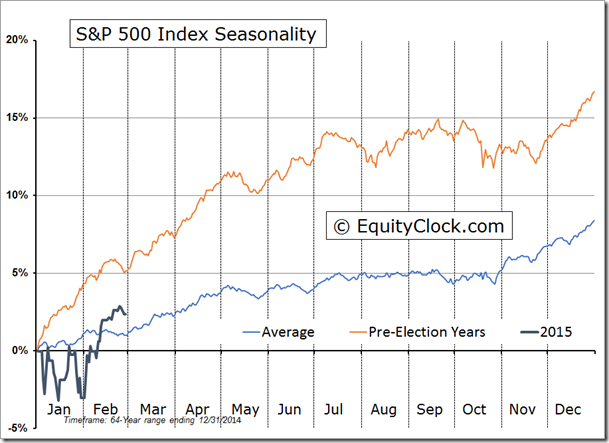
If longstanding seasonality patterns unfold as they have over the past 65 years we should expect 2015 to be another good hear for stocks because pre-election years are typically the strongest of the 4-year presidential cycle. That doesn’t mean it is going to be smooth sailing the whole way, though. I expect some bumpy times. Through the end of Feb 2015, the performance of the US equity market, as measured by the SP500, was slightly better than the seasonal average but performance to historical pre-election years lagged. The average return for the S&P 500 at the end of February during pre-election years is 5.1%, almost 3% greater than the 2015 year-to-date return. As you can see below, stock strength during pre-election years historically continues to climb into July where it flattens out after which the pre-arranged Wall Street bonus errr I mean Santa Claus rally routinely closes out the year.
Black Gold
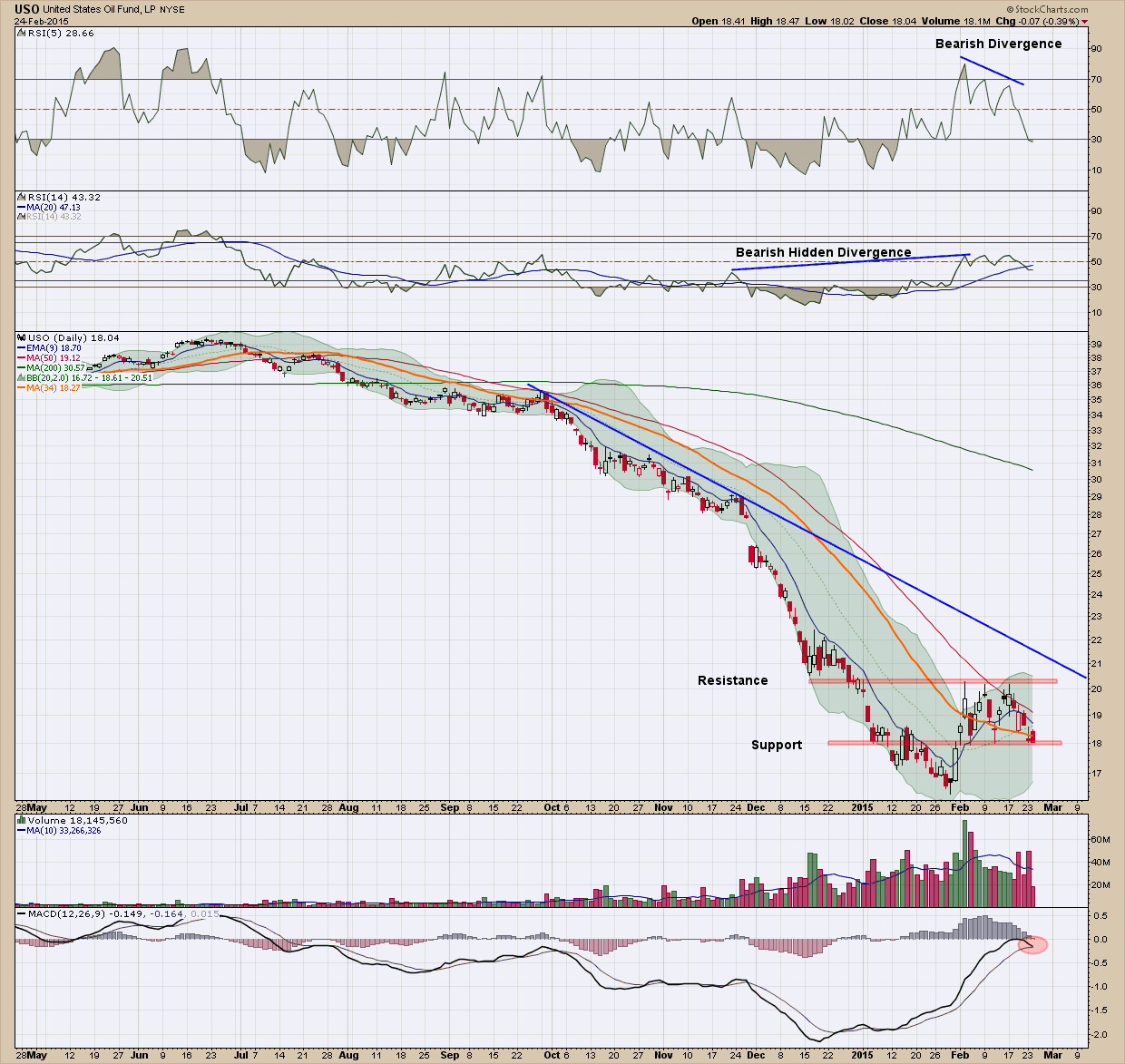
Today I wanted to look at oil chart via the ETN proxy, USO (the United States oil fund), since we all are impacted daily on its price and see if it can hold any clues on what to expect ahead.
If you were bullish on oil, this chart should immediately change your mind.
1. Price has been in a steep downtrend and has failed to even test its resistance (blue) line since November of last year.
2. We created an interim bottom the end of January and price has moved higher, rising almost 20% from trough to peak. Price failed to advance above the red resistance line in its 3 attempts and has now fallen back to the bottom (red) support line.
3. The MACD (bottom pane) failed to move above the zero line and its signal line is close to crossing under the indicator line which is signaling a potential change in direction to the downside.
4. All the moving averages are pointing down. A sustainable rally will rarely occur without all the moving averages pointing higher, moving upward with price
5. The recent volume profile is decidedly bearish as distribution is clearly taking place.
6. The RSI (5) in the upper pane is showing negative divergence
7. Lastly the RSI (14) in the second from the top pane has bearish hidden divergence.
Looking at the list I cannot see one positive for the price of USO in the short term and as such expect to see new lows in the next few months. This is not a place, unless you are the nimblest of traders, you should be looking to invest. There are never any absolutes in life (except death and taxes) so there is a scenario (or two) which could change my thesis dramatically and quickly. When markets are small it’s much easier for the strong hands to influence and even control the direction of price so if OPEC were to cut supply tomorrow, everything I have stated above would be wiped out. I would expect to see oil prices start to head quickly higher under that scenario. As investors, we always have to be on the lookout for those “nasty” news-driven surprises. But barring them, the current trend is down (and must be respected) so smart investors should be avoiding (or potentially shorting) this sector until we get confirmation the bottom is in.
Some of you may be thinking to yourself USO is just a proxy and does not reflect the real price of oil. In addition, with USO you have contango and other derivative-based issues associated with ETN’s that can make their price not track the price of oil. You are absolutely correct but remember my blog posts are intended to educate and not be used as recommendations. The oil price chart is bearish no doubt, but not quite as compellingly bearish.
Beaming with Pride
After almost 3 years of intense study and enormous commitment of time I am incredibly thrilled to let you know I have just received acceptance by the MTA Board of Directors as a Member of the Market Technicians Association (MTA). Along with this acceptance came the award of the prestigious CMT (Chartered Market Technician) designation which is considered the gold standard for technical analysis. To put this in perspective I am one of less than 1900 people worldwide to have been issued this since its founding in 1989.
I do have to admit that without question that this was the most challenging, demanding and humbling educational/learning experiences I have been involved in. If you look at the list of my credentials this is saying a lot. As such, it is the one I am most proud of.
The CMT is the only technical analysis training designed by professionals, for professionals. While there are countless technical analysis training programs available, only the CMT is designed to provide broad exposure to the classic literature in the field while emphasizing state-of-the-art analytical techniques. Over the past year while preparing for the final, level 3 exam, we have been working hard behind the scenes revamping both our investment methodology and process to incorporate the new found knowledge and expertise. In my opinion it could not come at a better time as the investment world is rapidly changing and advisers who don’t recognize it and adapt will likely be woefully unprepared for what I believe is likely ahead.
A Penny for your Thoughts
Come on, admit it. You’ve done it, maybe not as much as I have but you have done it. What I am talking about is saying something and then regretting it later. Well, instead of actually saying it I am going to write about it and have to deal with the consequences later.
Today’s blog post is about the bullish setup on JC Penny’s (JCP). Yah, I am speaking of that Penny’s. The company who can’t close their stores fast enough to stop the flow of red ink. The one who have tried to remake and modernize their stores so many times but without success. The one where your mothers (that includes me) took us as kids to shop for clothes for the new school year and they seem to have not changed their inventory since then. Yah, that Penny’s.
It’s clear from the longer term chart Penny’s has been in a heap of trouble as it has declined almost 80% from its high in early 2012. Since bottoming in January of last year it has been consolidating within the highlighted rectangle, bouncing from top to bottom. From this perspective, I would find it compelling as an investment only if it moved above the shaded rectangle on higher volume (and of course if I forgot which company it was).
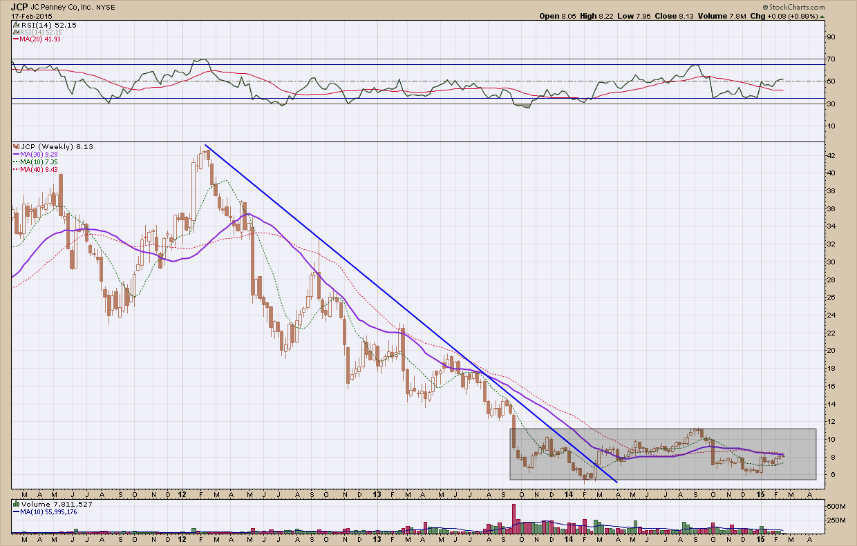
The daily chart is definitely more compelling than the weekly vantage point. After peaking in September of last year, it was cut almost in half by the time it bottomed in December, 3 months later. Since then it has clawed its way back and has formed an inverse head and shoulders pattern that, if plays out, projects back up more than $3 higher to the highs back in September. While $3+ doesn’t sound like much, it is a very nice move on a percentage basis, ~40%. Now, that is something that grabs my attention. The only negative here is there is a gap just underneath the right shoulder that will eventually need to be filled. That may be now or much later but it too, grabs my attention and provides a cautionary splash of cold water to this setup.

I am sure if this does not work out (no, nothing is guaranteed), the haters will be sure to never let me forget this post. The good thing about this blog is anything I present is just an idea and informational in nature and not a recommendation. Even the best investment idea can turn out badly if managed incorrectly. Remember, it’s your system that makes you successful, not the investment
As with all my opportunity screens I try to be agnostic as to the company and look only at price. I have found that biases or predetermined beliefs about a company or industry can have a negative impact on returns. So while I have attempted to remember that with this idea all I need to close this post with is ... “yah, that Penny’s”.
(Denim) Tops and Bottoms of the SP500
A company we have loved for a long time has been VF Corporation, VFC. It has everything going for it (except a memorable name) as it is very well run, pays a dividend and has tens of millions of customers around the world. As you can see in the chart below its share price has risen more than 450% over the past 4 ½ years. In the bottom pane, which is a performance ratio against the SP500, you can see how it has outperformed the US broad market index by more than 120% over the same time period. The funny thing is when I ask most people, they say they have never heard of the company. The common response when I show them the chart is “it must be a high growth technology or biotech company”. As it turns out it is neither, here is a quick summary of what they do and some of their more notable brands, some of which you likely have heard of (and quite possibly own) …
The company offers outdoor apparel, footwear and equipment, sports and adventure footwear and apparel, handbags, luggage, backpacks, accessories, merino wool socks, women’s activewear, packs, and travel accessories under the The North Face, Vans, Timberland, Kipling, Napapijri, Jansport, Reef, Smartwool, Eastpak, lucy, and Eagle Creek brands. It also provides denim and casual bottoms, and tops under the Wrangler, Lee, Lee Casuals, Riders, Rustler, and Timber Creek by Wrangler brands
The chart is a thing of beauty as the stock’s price has not violated the blue uptrend line since it started in 2010. Each time it has tested that the line (red arrows) it has bounced nicely higher consistently acting as support. Seeing this happen again last week we put this on the radar to add to our model portfolio.

Jumping to the daily chart and using a shorter timeframe in an attempt to optimize our entry, we see price was in a (blue) corrective down channel for almost a month, after peaking in the middle of January. On Feb 9th we got an ideal bullish hammer reversal candle that formed after bouncing exactly off the red horizontal support. While that was a great early buy signal, because we are investor on a longer timeframe, we want to see some form of confirmation before committing client’s investment dollars. 3 days later that confirmation triggered as price moved out of the (blue) downtrend channel. Notice how, at the same time, the RSI crossed above its moving average while the MACD bottomed and crossed its signal line. That was more than enough as we quickly took action buying before the end of the day close. You can see what happened next on Friday (the 13th - the last candle on the chart), priced gapped and closed up 6%.

With price now approaching all-time highs, I do expect it to take at least a short term breather for its eventual push higher. As long as the stock market wants to go higher and the fact that there is no resistance above $77, where this finally tops out is anyone’s guess but my first upside target is $81 followed by $85. While breakouts are not all this clean and play out this ideally, hopefully you can see the value Technical Analysis can bring to improving returns.