Risk on - Risk off

Each time stocks go through a correction I like to check in with my Risk on - Risk off chart to see what it is telling me. The chart is just the ratio of the price of stocks (SP500) to the price of bonds (20 year treasury). It’s very basic in its premise but it tells a powerful story. Simply put, when the ratio is rising, you want to be invested in stocks, when it is falling you want to be in bonds.  When it is going sideways, you need check in regularly to watch for a break out and make the necessary changes in your portfolio.

I have lengthened the time frame of the Risk on – Risk off chart below to include more than 12 years in order to show enough data to do a comparison of the current run from the bottom of a sell off (2009) to that of a past bottom from a sell off (2003).  Let me to get you to look to the left side of the chart from 2003 to 2007 where the ratio climbed the upward sloping blue support line until the first quarter of 2007 where it peaked in May. The ratio fell back to the blue support line without crossing it and made another push higher in September but failed to make a new high and then quickly crossed below the blue support. Once below that, it quickly sliced through the red horizontal support and found a bottom in April 2008. Once again, it tried to rally, fell way short and could only make it back above the underside of the red horizontal support line (which has now become resistance).  We all know what happened after that, the stock market went into free fall losing more than 50%. Before we move on to what is happening today, note how well this ratio chart identified a time to step aside from stocks. If you would have followed the rules of exiting stocks when the ratio fell below both the upward sloping and horizontal lines (I have that time indicated with a dashed blue vertical line), you can see you would have avoided most of the stock market decline (follow the dashed blue vertical line down to the bottom pane where it crosses the price of the SP500 --- you can see how good a job it did).

Now, if you shift your focus to the most recent move from the 2009 bottom, one of the first things that should jump out at you is the fact we appear to be in a topping pattern which is occurring at almost the same exact level as the 2007 top.  Other things of note are 1) the rise is similar in slope 2) like the past move, the ratio has respected the blue upward sloping trend line 3) while it looks as if the ratio may be topping, it still sits above both the red horizontal and blue upward sloping support line allowing for an attempt at another push higher if it so desires (similar to what occurred in 2011).

The discipline of following a system (one that includes this indicator as one of many) I find extremely helpful to ensure the balance and objectivity one need to make good investment decisions. While it all may change tomorrow, this indicator is telling us stocks are still the place to be.

I Pledge Allegiance

When I was growing up every morning in school, actually before class started we were required to stand up, pledge allegiance and give respect to the US flag. I think schools have since moved away from this practice for whatever reason.  In technical analysis flags are patterns we have similarly high esteem for.  Flags are usually continuation patterns that occur after price has moved up strongly over a short period of time (creating a “pole”) and then takes a breather by consolidating (creating the flag) either sideways or down.

The reason they are revered from a technical analysis standpoint is:

1.       Once the consolidation is over there is a high probability they continue in the direction of the trend prior to the consolidation.

2.       Their price objective from the breakout of the pattern is easily identified allowing you to have a more accurate assessment of your risk / reward ratio before you invest.  The upside target is calculated by adding the length of the pole to the breakout price.  The longer the pole, the more attractive the opportunity.

3.       Because there are no guarantees, if you are wrong and price reverses course after a breakout,  a stop order can be placed back inside the consolidation zone, allowing you to exit the investment with a very small loss (remember the key to long term success is keeping losses small and letting your winners run)

4.       These patterns are easy to manage as you can just place a buy stop above the breakout high not having to commit or risk investment capital until the breakout occurs.

Below are a couple of examples I have been stalking, waiting patiently to potentially enter.

The first is Costco (COST) a stock which I wrote about in July of last year when I warned it was ready to breakout at $118/share. It did that and has run up nicely to near $150, a nice 27% gain thus outperforming the SP500 which has risen less than 6% during that same time period.  As you can see in the chart below, price moved up quickly from ~135 to ~$150 where it has been consolidating sideways over the past month creating a bull flag pattern.  If/when this eventually breaks out to the upside the target will be ~$165.

The second opportunity we are stalking is Linkedin (LNKD) which has a better upside target of about $55.  It, too, has been consolidating for about a month preparing for its next move.

One thing that is common in these types of opportunities that needs to be mentioned is during their initial quick moves up which create the “pole”, most often they will also create an overbought condition on their momentum indicators. It’s hard for price to move higher without relieving this condition, which is why it consolidates allowing the bulls a breather in order to prepare for the next move up.  In both charts you can see (in the upper pane) RSI becomes initially overbought and then as price moves sideways, the overbought condition moves back into the normal bullish range. What makes these two examples unusually compelling is the fact price is moving sideways during the consolidation period. As we know consolidations can be either sideways or down and sideways is reflective of strength and the potential for a bigger move up, if/once it begins.

Higher or lower? - What to expect from stocks for the remainder of 2015

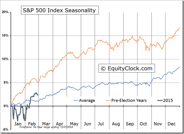
If longstanding seasonality patterns unfold as they have over the past 65 years we should expect 2015 to be another good hear for stocks because pre-election years are typically the strongest of the 4-year presidential cycle. That doesn’t mean it is going to be smooth sailing the whole way, though. I expect some bumpy times. Through the end of Feb 2015, the performance of the US equity market, as measured by the SP500, was slightly better than the seasonal average but performance to historical pre-election years lagged. The average return for the S&P 500 at the end of February during pre-election years is 5.1%, almost 3% greater than the 2015 year-to-date return. As you can see below, stock strength during pre-election years historically continues to climb into July where it flattens out after which the pre-arranged Wall Street bonus errr I mean Santa Claus rally routinely closes out the year.

Black Gold

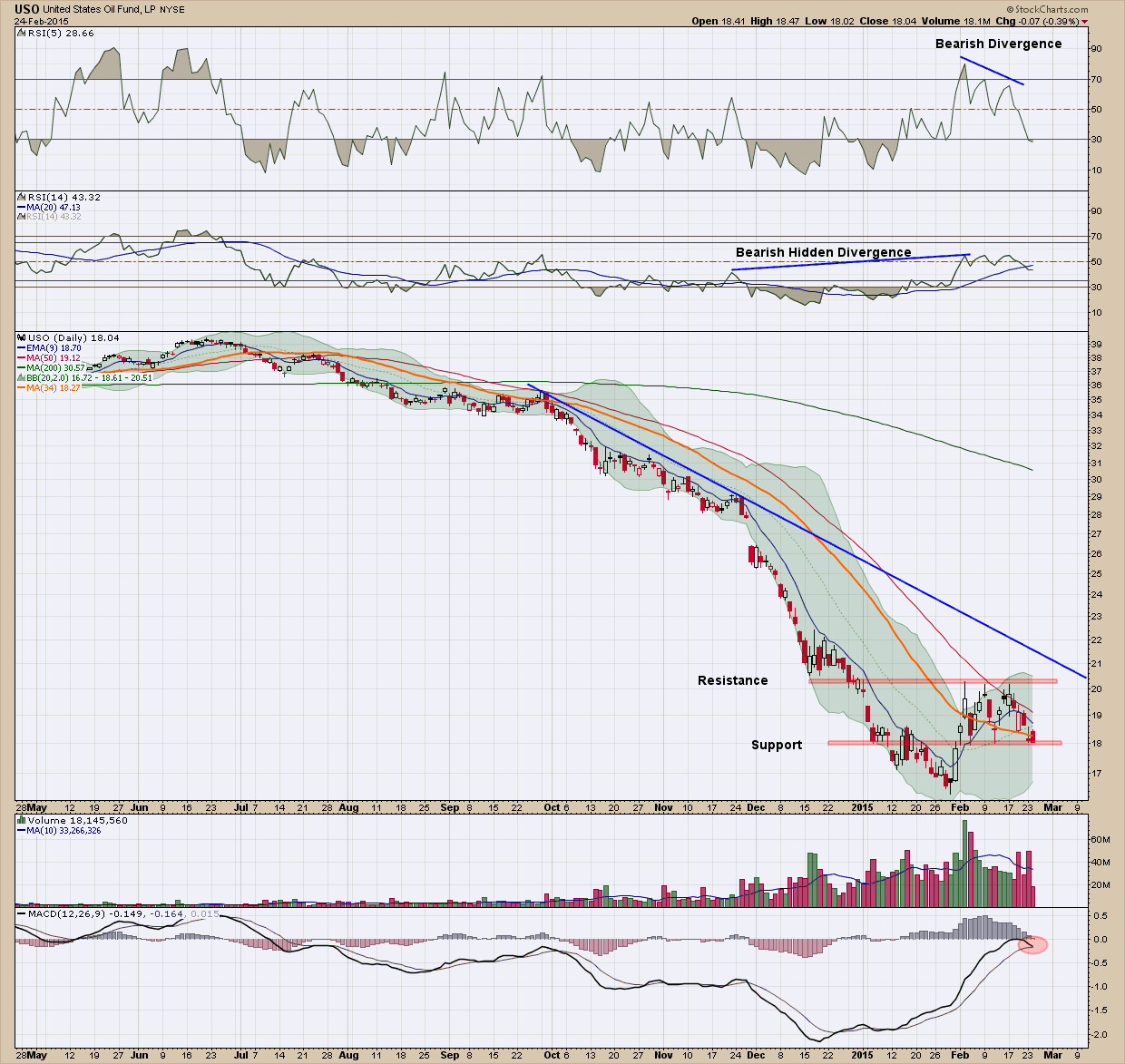
Today I wanted to look at oil chart via the ETN proxy, USO (the United States oil fund), since we all are impacted daily on its price and see if it can hold any clues on what to expect ahead.

If you were bullish on oil, this chart should immediately change your mind.

1.    Price has been in a steep downtrend and has failed to even test its resistance (blue) line since November of last year.

2.    We created an interim bottom the end of January and price has moved higher, rising almost 20% from trough to peak. Price failed to advance above the red resistance line in its 3 attempts and has now fallen back to the bottom (red) support line.

3.    The MACD (bottom pane) failed to move above the zero line and its signal line is close to crossing under the indicator line which is signaling a potential change in direction to the downside.

4.    All the moving averages are pointing down. A sustainable rally will rarely occur without all the moving averages pointing higher, moving upward with price

5.    The recent volume profile is decidedly bearish as distribution is clearly taking place.

6.    The RSI (5) in the upper pane is showing negative divergence

7.    Lastly the RSI (14) in the second from the top pane has bearish hidden divergence.

Looking at the list I cannot see one positive for the price of USO in the short term and as such expect to see new lows in the next few months. This is not a place, unless you are the nimblest of traders, you should be looking to invest.  There are never any absolutes in life (except death and taxes) so there is a scenario (or two) which could change my thesis dramatically and quickly.  When markets are small it’s much easier for the strong hands to influence and even control the direction of price so if OPEC were to cut supply tomorrow, everything I have stated above would be wiped out.  I would expect to see oil prices start to head quickly higher under that scenario. As investors, we always have to be on the lookout for those “nasty” news-driven surprises.  But barring them, the current trend is down (and must be respected) so smart investors should be avoiding (or potentially shorting) this sector until we get confirmation the bottom is in.

Some of you may be thinking to yourself USO is just a proxy and does not reflect the real price of oil. In addition, with USO you have contango and other derivative-based issues associated with ETN’s that can make their price not track the price of oil.  You are absolutely correct but remember my blog posts are intended to educate and not be used as recommendations. The oil price chart is bearish no doubt, but not quite as compellingly bearish.

Beaming with Pride

After almost 3 years of intense study and enormous commitment of time I am incredibly thrilled to let you know I have just received acceptance by the MTA Board of Directors as a Member of the Market Technicians Association (MTA). Along with this acceptance came the award of the prestigious CMT (Chartered Market Technician) designation which is considered the gold standard for technical analysis. To put this in perspective I am one of less than 1900 people worldwide to have been issued this since its founding in 1989.

I do have to admit that without question that this was the most challenging, demanding and humbling educational/learning experiences I have been involved in. If you look at the list of my credentials this is saying a lot. As such, it is the one I am most proud of.  

The CMT is the only technical analysis training designed by professionals, for professionals. While there are countless technical analysis training programs available, only the CMT is designed to provide broad exposure to the classic literature in the field while emphasizing state-of-the-art analytical techniques. Over the past year while preparing for the final, level 3 exam, we have been working hard behind the scenes revamping both our investment methodology and process to incorporate the new found knowledge and expertise. In my opinion it could not come at a better time as the investment world is rapidly changing and advisers who don’t recognize it and adapt will likely be woefully unprepared for what I believe is likely ahead.