Will History Repeat?

A 20-year look in the rear view mirror at the European 600 Stoxx Index shows the current level being one of major resistance as it has failed each of the 3 other times it reached this price. The first two times it did so, this level signified “the top” was in, the index rolled over and fell ~60% from top to bottom. The 3rd and most recent time it reached this level, price hit resistance, rolled over and fell a bit more than 25% and then found support. Since that time, n it has rallied back to the underside of the resistance line looks like it wants to breakout.

san ramon investment advisor CFP fee only retirement planner 11-1-17 STOXX600.png

It is said, the more times price tests a level, the more chance it will eventually break through. This combined with 1) the resiliency of this bull market and the fact 2) we have not formed negative RSI divergence like the prior two instances and 3) the most recent decline was more of a minor pullback rather than a major decline (as compared to the prior falls), the higher probability move points to this index eventually breaking out to all-time highs. Either way, it would be best to exhibit patience as I expect to see a period of consolidation and indecision in order to shake out all the sellers before the index actually shows us its hand and answers the question of where to next?

October 2017 Charts on the Move Video

The markets look tired and even though we are continuously making fractional new highs, there is a clear lack of broad based participation. Instead we are seeing sector rotation. In spite of that, seasonality patterns still are a tailwind for risk assets through the balance of the year.

My latest Charts on the Move video can be viewed at the link below

https://youtu.be/w1_pn1SpM8Q

Staples Not Holding

As you can see in the weekly chart below, for the first time in eight years the consumer staples ETF, XLP, has breached its long-standing uptrend support line. The good news is first time breaches typically indicate nothing more than a correction/consolidation is taking place with the uptrend still intact. I like to look at a shorter term time frame to see if the finer granularity helps provides some clues on what may be in store.

san francisco east bay area retirement planning and investment advisor CFP wealth manager -  XLP weekly 11-1-17.png

Inspecting the daily chart of XLP below, we can see price is below a still rising 200-day moving average, has reached an oversold RSI momentum condition and created a series of intermediate term lower highs and lower lows, all markers of a short-to-intermediate term downtrend. Those with pattern recognition experience will note price formed a head and shoulders topping pattern. Friday’s gap down and close below the neckline was the confirmation needed the pattern was “in play”. It is normal with these patterns that price rallies and tests the neckline from the underside which is exactly what is occurring right now.  It’s what comes from that retest that is crucial.

san ramon retirement planning and investment advisor CFP wealth manager -  XLP Daily 11-1-17 .png

A retest and failure of a break back above the neckline suggests a continuation lower and downside target in the T1 support zone. A retest, break above and hold above the neckline would be a very bullish sign and provide an excellent risk-reward entry point for those who want to be long consumer staple stocks.

Target Met! Now What?

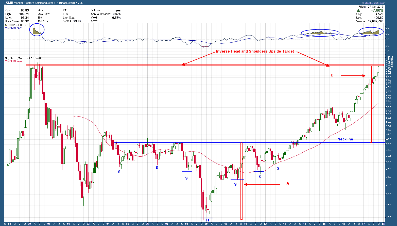
After falling more than 85% from its 2000 peak, the Semiconductor ETF, SMH, finally bottomed in Q4 of 2008.  On its rally back from the low, it formed an inverse head and shoulders bottom reversal pattern as you can see in the 20-year monthly chart of the ETF below.  The measured target from any H&S pattern is the distance from the head to the neckline added to the neckline. In this case the vertical bar “A” is the distance from the low to the neckline, while bar “B” is just “A” added to the neckline. Its interesting, but not unusual, for these pattern targets to end at or very near prior important levels. In this case the pattern target fell right at the 2000 high. The exact high this ETF has EVER reached. Prior highs usually act as resistance and provide a headwind to higher prices. Most of the time price will either take a breather and consolidate (like 2015-2016) or reverse course (like it did in 2000).

San Ramon east bay areas best fee only independent financial advisor and retirement planning expert CFP - SMH -10-30-17.png

I have cleared out the chart to include only the price of the ETF in the bottom pane and one indicator, RSI momentum in the upper pane. RSI momentum above 70 is considered an overbought condition, which has occurred only two other times  over the past 20 years. Overbought conditions are not sell signals (no signal from an indicator is as it must be confirmed by price) but rather the sign of a very strong market.

When more than one signal from different indicators appear with the same message in the same price area like we have here, the message should be given more significance. As such I would expect semiconductors, as a minimum to take a breather in this area. Because each candle on the above chart is equivalent to one month it could take many months for a breather or something worse, to register its intent.  On the flip side, if price does not consolidate, we are clearly in such a strong market that a confirmed break higher would be an important buy signal to consider if one was not already an SMH owner.

Is a Pending Dollar Boom Ahead?

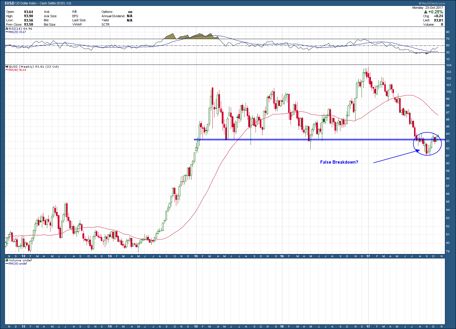
The US Dollar has been beaten up since peaking in December of last year, as it has lost more than 12% since then.  I have been a strong dollar bull advocate since its breakout in 2014 but the recent consolidation with a breakdown below horizontal support at $92, forced me to throw in the towel. From a technical standpoint you can see in the weekly chart below how one could draw the conclusion $92 was the last bastion of support before a complete breakdown was imminent. Well, as it turns out that is not completely correct. As I mentioned in my video, when prices breakout (up or down) from major areas of support or resistance, one needs to be aware of the possibility it turns out to be a fake out. A false break. False breaks usually bring powerful rallies in the opposite direction.

Bay area fee only wealth advisor and retirement planning CDP -10-25-17 - USD weekly.png

 Using longer term weekly charts help identify direction and POSSIBLE reversals but it is imperative to use shorter term views to zero in on for early confirmation and better entry/exist points. As you can see in the daily chart below, the dollar has formed (but not yet confirmed) an almost perfect symmetrical inverse head and shoulders reversal pattern while printing a divergent RSI momentum low. The pattern, if confirmed and plays out, points to an upside target at T1.

Bay area fee only wealth advisor and retirement planning CDP -10-25-17 - USD daily.png

The bottom line here is if the dollar begins an intermediate term rally, investors need to understand the potential negative ramifications a rising dollar has on owning investment that typically move inversely such as commodities, other currencies, precious metals and foreign investments. But because at this point the current setup is nothing more than a warning shot, it warrants keeping a very close eye on and keeping an open mind to a resolution in either direction.