Island Reversals

There are many recognizable patterns that prices develop in technical analysis but few are as important as island reversals (also known as an “abandoned baby” in Japanese candlestick lingo). An island reversal is a reversal pattern that forms with two gaps and price action in between the two gaps. These gaps tell us that the island reversal marks a sudden, and sharp, shift in direction. Even though they are relatively uncommon, island reversals are potent patterns that warrant our attention. The islands can be formed either at the top or bottom of a stock’s price movement, both indicate the prior trend is done and price has reversed.

The alignment of the gaps holds the key. First, note that a bullish island reversal forms with a gap down and then a gap up. A bearish island reversal forms with a gap up and then a gap down. These gaps overlap to create an island of price action, hence the term “island reversal”. The island is above the gaps on a bearish reversal, and above the gaps on the bearish reversal.

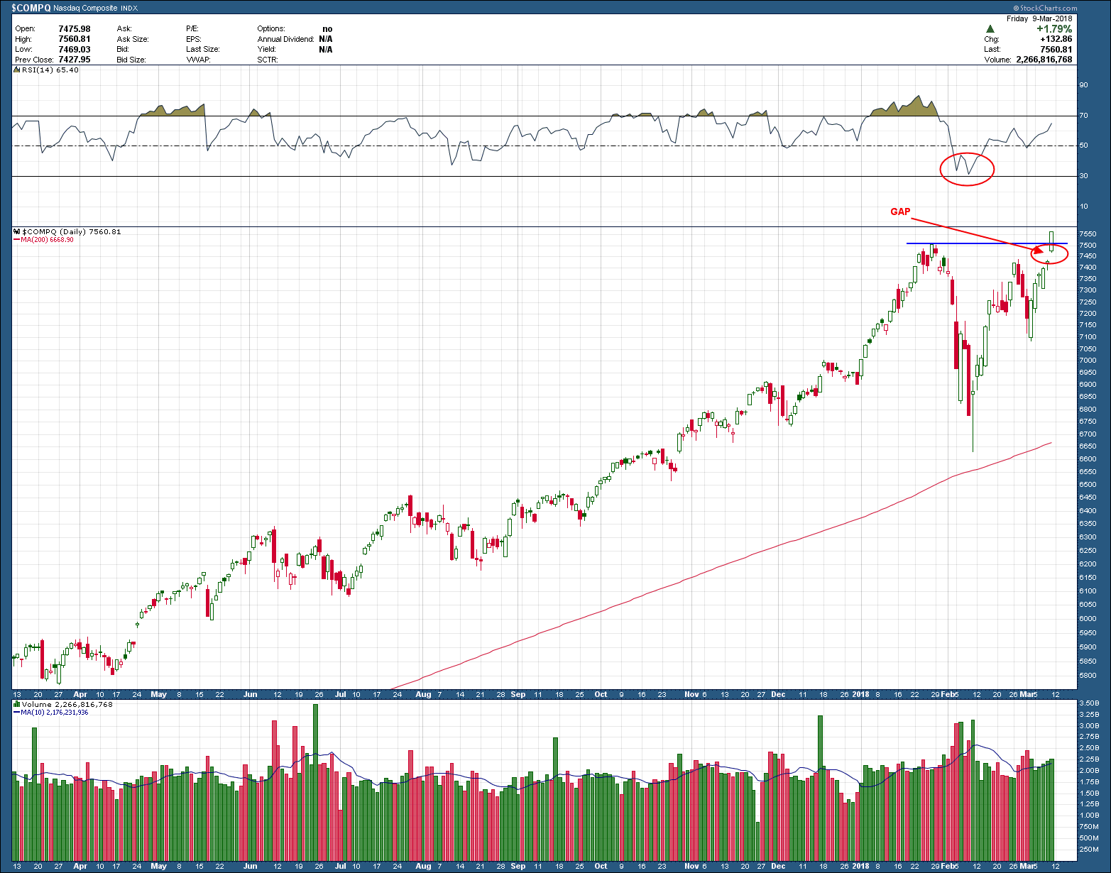
As you can see in the chart below of the Nasdaq 100 index, QQQ, it created a bearish island reversal on Monday when price gapped down below the gap created in the early March move higher. Why islands are important is because traders establishing long positions on the island (and maybe those who initiated on the rise into that island) are now trapped with losses. As such, if price were to move higher from here, closer towards the open gap, you would expect a large supply (sellers willing to sell) to quickly slow, stop, or reverse the advance as those late buyers exit their losing positions. You have often times heard me reference this as “resistance”.

san ramon and bay areas best certified financial planning ficuciary investment advisor - QQQ - 3-21-18.png

The stock market is in a trading range and looking for a catalyst and there is an important FOMC meeting today, 3-21.  It is important because the Fed began increasing interest rates at the last meeting. Traders want an idea of how often and how much the Fed will raise rates this year. The meeting creates uncertainty, which is a hallmark of a trading range. And trading ranges need a catalyst to bust out. As such, the odds are that there will be a big move after the report. Unfortunately, the move can be up, down, or even in both directions. We will only know the answer after the fact. Either way, strap in as I expect some fireworks in the coming day(s) and to discover whether this island top reversal pattern will be an accurate predictor of the short to intermediate term future.

Pinch Me 2


The chart of the Dow Jones Industrial average (DJIA) below shows how the index is currently making lower highs and higher lows. This, of course, is a what forms a triangle pattern. Price ping-pongs between a declining upper resistance and inclining rising support and as you can see is approaching the apex. These patterns are famously fickle and provide little to no investing edge so I am pointing out only for recognition’s sake. If you want to read more on triangles, I wrote a post in 2014  called “The trouble with Triangles”

Instead of spending more time whining and complaining about triangles I instead wanted to introduce another indicator I personally use but do not usually add to charts I post on the blog, Bollinger Bands (BB). The bands do nothing more than measure volatility, based on a specified standard deviation, around a moving average. The bands automatically widen when volatility increases and narrow when volatility decreases.  Without going into more detail and put you all to sleep, the take away from this is to notice how the (orange) bands are once again pinching together. This type of sideways action usually portends to an impulsive move, unfortunately (and why I dislike triangles) the direction is a coin flip. Take a look at the examples on the chart where this same pinching action occurred in the past (look left). You can see as the bands pinched together, the DJIA almost always eventually moved impulsively to the upside and went on to test the upper limit of the band. Those long the stock market should be very interested which direction the DJIA moves out from the pinch as it will tell us who won the battle inside the triangle. In technical analysis we always have to give the benefit of the doubt of the prior trend, but the sloppy action off the recent February lows has me doubtful the bulls have control. Regardless of which way it goes, I expect it retest to prior highs/lows of the triangle toot sweet.

Bay area fee only CFP san ramon independent certified investment advisor fiduciary - KELYA - 3-19-18.png

What If?

Arguably, the most crowded trade in the US right now is that of being short bonds. As you would expect most of Wall Street pundits have latched on to the story, investing client’s money and are crowding one side of the boat. Everyone knows the FED has raised rates 5 times and has been vocal about continuing down that same path in the future. The great and powerful Oz has spoken. When you add to it the signs that inflation is raising its ugly head and strong job growth pushing unemployment to levels not seen since 2001 paint an ominously dark future for bonds. Or does it?

The funny thing is the market has a proclivity to do just the opposite of what the majority expects. It tends to inflict (financial) pain on as many people as possible whenever possible. What if the majority is wrong about bonds here? There is no doubt betting on rising bond prices (interest rates rising) would be going counter to the pack and inflict enormous pain. Armed with the knowledge of these markets habits it would not surprise me if we were see to bonds rally this year. Wearing my contra-investor’s hat it’s just a thought that came to mind. Some may say a stupid one. But, making money is sometimes about zigging when everyone else is zagging.

From Wiki

The weekly COT report details trader positions in most of the futures contract markets in the United States. Data for the report is required by the CFTC from traders in markets that have 20 or more traders holding positions large enough to meet the reporting level established by the CFTC for each of those markets.1

The report provides a breakdown of aggregate positions held by three different types of traders: “commercial traders,” “non-commercial traders” and “nonreportable.” “Commercial traders” are sometimes called “hedgers”, “non-commercial traders” are sometimes known as “large speculators,” and the “nonreportable” group is sometimes called “small speculators.”

As one would expect, the largest positions are held by commercial traders that actually provide a commodity or instrument to the market or have bought a contract to take delivery of it. Thus, as a general rule, more than half the open interest in most of these markets is held by commercial traders. There is also participation in these markets by speculators that are not able to deliver on the contract or that have no need for the underlying commodity or instrument. They are buying or selling only to speculate that they will exit their position at a profit, and plan to close their long or short position before the contract becomes due. In most of these markets the majority of the open interest in these "speculator" positions are held by traders whose positions are large enough to meet reporting requirements.

A source of information I like to check in with when I have these crazy ideas is the COT (commitment of traders) data.  Scouring the data over the years I have found find it creates a very telling message when 1) seeing how the “smart money” (commercial traders) is positioned and 2) if they are positioned at extreme levels. Everything else in the data is pretty much non-actionable.

 Below is 20-years of COT data for the US 10 year Treasury note … the same one that is in an intermediate term downtrend, creating lower highs and lower lows (upper pane). In the lower pane is the number of contracts held by each of the 3 COT trader categories (commercial, large and small).  The red line is that of the commercial (smart money) specialists, the one of most interest to me. As you can see they currently hold the largest number of US 10-year Treasury contracts (long) than any time in the past 20 years. The message they are sending is loud and clear … “The smart money is betting BIG that Treasury bonds will rise”

bay area fiduciary CFP wealth manager and certified financial planner .-COT-3-14-18.png

While the “commercials” are considered the smart money, they are not infallible. It doesn’t happen often but they too make bad trades so follow at your own risk. What I have learned from them (the hard way) is it’s best not be on the other side of the boat, especially when they are positioned at extreme levels. You don’t have to necessarily join them, just don’t fight ‘em.

Things Not Normally Seen in Bear Markets

When looking at the US stock market in its entirety, the Nasdaq composite is arguably the most important index. While it is not the broadest measure of the entire market, it does hold the most significant of current technology companies paving our future. As such, the Nazzy typically leads the market, both up and down and a reason I follow it so closely.

With February’s market correction, top callers and psychic hotline workers around the globe begun to ring the bell calling for the end of the stock bull. Of course, anything is possible but the Nasdaq composite is telling us a much different story. As you can see, Friday’s open gapped higher and eventually closed the day at an all-time high. RSI momentum, held above oversold levels during the recent pullback but still has a lot of room to run to the upside before being overbought. Friday’s close also completed a cup and handle pattern which, if the break holds and the pattern completes, points to a target up around the 8245 area.

san ramon and tri valley best independent certified financial planning CFP retirement investment advisor - Comp - 3-12-18.png

There is no question bull market will end and someday those same top callers will be ringing their bell once again, eventually getting it right (even blind squirrels find a nut occasionally). I can say with high confidence bull market tops don’t occur when the most important index is braking out to all-time highs.

Coiling

BVN, a Peruvian mining company came back from the dead in January of 2016. After bottoming at $3.27 it rallied almost 400% in 8 short months. As you would expect after such an enormous run, it needed to take a rest, consolidating sideways for the last 17 months, allowing those wanting to sell the opportunity to do xo. But after this long sideways journey, the selling is waning, price has formed a cup and handle continuation pattern and is coiling above its rising 200 day moving average. A confirmed breakout above the pattern’s neckline points to a target in the $22-3$23 range, some 40% higher.

San Ramon and bay area certified financial planning advisor.png

Risk management is easily controlled as it would make no sense to hold on to the position if it closed below the prior low of 14.13. If you really wanted to give it more room, a break of the 200 day moving average would be my final exit point. Either way, the risk-reward ratio is well above the desired 3:1 target and as such provides a compelling opportunity.