
Will 2015 major trends spillover into 2016? Either way, I recommend caution ahead.
Below is a link to December's Charts on the Move video
INVESTMENT EDGE
Will 2015 major trends spillover into 2016? Either way, I recommend caution ahead.
Below is a link to December's Charts on the Move video
Over the years some dining stocks have provided stellar long term returns. For example, McDonalds (in red) and Wendy’s have returned ~1500% and ~1400% respectively over the past 24 years as you can see in the chart below. I do have to admit the last time I ate at either establishment I was in college and made a friend a bet I could eat a McDonalds regular hamburger in one bite. Yah, I won the bet and have never returned. Not because the whole ordeal left a bad taste in my mouth (pun intended) but rather, I became much pickier about what I eat and unfortunately for me neither of these make the cut.

When I look at its chart I wonder why it has done so well. Is it because of great management? Worldwide expansion? Or their apple pies? The chart below likely tells a significant part of the story.

Does anyone think this trend will be changing any time soon? Me neither. As such it’s important to remember that finding those long term trends and riding them can be a very profitable investment strategy.
Or bull trap?
I am sure everyone knows this but in case you were asleep for the past year oil has been in a severe bear market and about as loved as Rozanne singing the national anthem. It has fallen (peak to trough) almost 70% in 2 years touching levels not seen since Dec 2008. You have to go back to 2003 since prices have been this low. As this was unfolding, a couple of interesting things have developed as you will see on the chart below of West Texas Crude. Firstly, price has formed a falling wedge (as highlighted in blue in the middle pane) and RSI momentum has a 3 push divergent low in the upper pane.

Falling wedges are typically a bullish reversal pattern. One of the rules that must be met before it can be deemed bullish is that it must alternately touch the boundaries of the wedge an even number of times (at least 6) and break out to the upside on its final touch. You can see the pattern has not quite completed its development yet as it has yet to make its final touch on the upper boundary or break out. If this were to happen the target price for this pattern here would be in the very optimistic $62-$65 range. Because there is still room within the pattern and if sellers want to push to make another low, another bullish scenario would be to see price make one more touch to both the top and bottom (for 8 touches) and then break higher.
A three push oversold divergent low is very rare to see on a weekly chart so when it occurs, as chartists we need to take notice as it can provide a good investment opportunity. It occurs when starting from an oversold condition, momentum climbs higher making 3 successive higher lows while price makes 3 successive lower lows (as illustrated with red arrows). This shows momentum is strengthening but price is still falling. This is a bullish setup because at turning points momentum will precede price. As such we expect price to reverse and move higher at some point in the near future.
So, with oil resting on its 2008 low as support and forming (but not yet confirmed) a high probability bullish pattern combined with positive momentum divergence presents a very interesting opportunity. Don’t get me wrong, its not that there isn’t a lot of risk right here because there is but no more than any other equity or commodity based investment. I personally do not like trying to pick bottoms, but when convergence of multiple signals occur at or around one price pointing all in the same direction, it makes it worth my consideration. Longer-term and more risk averse investors would do best by waiting for a confirmation break out of the wedge and waiting for a higher low to be made before taking a position. Doing so would likely let the (red) 200day moving average at least flatten and possibly even turn positive, adding one more bullish argument to the investment.
Oh and back to my original question. Lifetime opportunity or bull trap? In my opinion it is likely neither. Very profitable counter trend opportunities arise in all bear markets and I believe this is setting up to be just that. If I were forced to pick between the two, I would pick bull trap as it will likely be a long time before the oil supply issue has been resolved and we are back into a full-fledged bull market.
Earlier in April of this year I wrote about expecting to see beef prices lower based upon a head and shoulders topping pattern that projected to a $63 target on the cattle futures index. The chart below is what I posted then. Negative divergence between the left shoulder and the head provided the first warning of potentially lower prices even before the formation of the right shoulder.

My next chart is the same chart above but updated as of today. On December 9th the index closed just 2 cents away from my $63 target at $62.98.
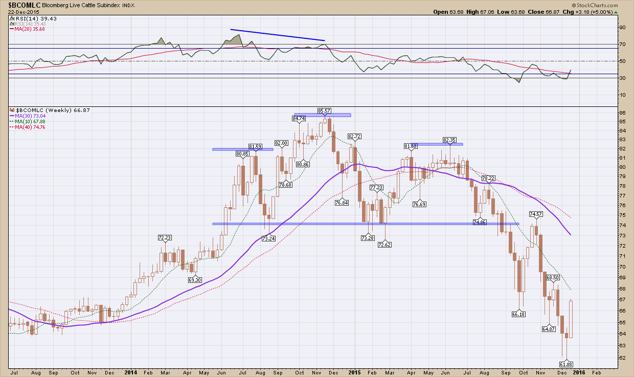
The point of this post is not about beef prices as this one is already “in the books” but rather topping patterns.
I have mentioned this in the recent past that just about everywhere I look, for those investments that have not already topped out and begin braking down, I see topping patterns lurking around every corner. I wanted to show to a couple of examples, GLW and GS. The first is is Corning glass works (GLW) who’s claim to fame is the gorilla glass that just about every cell phone and tablet use. As you can see in the chart below it after peaking just above $24 (it stopped right here 3x times before in 2006, 2007 & 2008) and like beef prices in April, has formed a very textbook, symmetrical head and shoulders pattern. Adding to the bearishness is price is below the (red) 200 day moving average which is pointing down. A breakdown below the neckline has an initial target at the Nov 2012 low ~$10. Ouch

My next example is Goldman Sachs, GS. Like GLW above, the same topping pattern is in development. Price tested the 200 day moving average from below 6 weeks ago but failed to hold and is now below. While not quite as bearish as GLW, the (red) 200 dma has flattened out and is beginning to curl southward.

All patterns, until they confirm with a break of price below the necklines are, at best, warning signs for what may lay ahead. Once they do trigger and confirm, they are best used for risk management purposes. With so many stocks already broken down, watching some of the remaining strong ones begin to crumble should have everyone very cautious here. It does me.
Now that the dust has finally settled from the Fed raising interest rates last week, some may be wondering what we might be in for based upon historical precedence of rising rates. I’ll start with the reassuring news. First rate hikes have been followed by higher stock prices over the following 12 months. Stocks have risen strongly when a rate-tightening cycle was started in response to economic growth. In the six 12-month periods starting in 1954 with core inflation characterized as low, stocks rose four times. Stocks rose every time when core inflation was low, bond valuations were high and interest rates were first raised.
Before you back up the truck, here is the asterisk. Though seemingly bullish for the current environment, the sample size is small. Plus, the current trio of a first rate hike, low inflation and high bond valuations has only previously occurred in 1954, 1958 and 2004. So while the record is favorable, it’s not a slam dunk. Since at least 1954 (if not further back), the Federal Reserve has never raised rates from such a low level. That's not to mention that large banks are currently being required to meet tougher capital requirements and oil remains in the doldrums, having traded below as $35 per barrel which was last touched at the 2009 bottom.
In 1954, the Korean War had recently ended and the Federal Reserve was just a few years past no longer having to monetize Treasury debt at a fixed rate. In 1972, Bretton Woods had recently ended and the Arab oil embargo ensued not too far afterward. In 1983, Paul Volcker was battling double-digit inflation. In 1998, the tech bubble was quickly enlarging. The point is that there are always events occurring that not only influence the decisions made by the Federal Open Market Committee (FOMC), but also how stocks and bonds perform after the rate hike tightening cycle begins.
What matters going forward is how the U.S. economy performs as well as the magnitude of future rate hikes and more importantly the pace at which they occur. The FOMC thought our economy is finally strong enough to withstand a rate hike, though inflation remains below its target. Globally, economic growth remains weak. China is slowing, while Europe and Japan are stagnant. Commodity-producing countries continue to be adversely affected by weak oil, coal and metal prices. If these conditions continue, it would be easier for the FOMC to justify gradual increases in rates, which Chair Janet Yellen suggested would be the path going forward.
Rising prices are nice, but the magnitude of the price gains is also important. Periods of monetary tightening are associated with small-cap stocks being adversely affected more than large-cap stocks, but both have realized lower, though—and importantly—still positive, returns. The sample size is small and while history often rhymes, the future has a tendency of unfolding in ways we do not expect it to.
Between robust employment gains, rate hikes, falling oil, and a strong dollar, the market cannot decide on a direction. This, combined with the fact we have a flat 200 day moving average leads to choppy markets where every breakout/breakdown fizzles and reverses days later. As I have stated in the past when in this environment it is best to just sit on your hands and wait for the existing trend to reestablish (up) or new trend to commence (down).
Looking at the US SP500 index
All year, the S&P 500 has been trading in a large trading range. More and more areas of the market are breaking down while fewer and fewer remain in good shape The last two months on the S&P 500 have been a microcosm of the entire year – the index has not really gone anywhere, but where ever it has gone it has done so quickly. This market continues to produce the feeling to me that we are experiencing a major topping process. 4 of my 5 indicators have provided a sell signal over the past 6 months and as a result has increased our cash position to the highest point of the year. Although a healthy year-end rally could easily reverse all damage.
As you can see in the chart below, the rounded top that has been developing for the past year has not been invalidated and is still in play. Until price can break above the 2130 prior high in May we are in an intermediate term downtrend. If we break below the 1990 first red horizontal support we are likely to see further downside and retest the 1870 August lows (lower red horizontal). A break and confirmation below that? Well let’s just say that will indicate a new short, intermediate and long term bear market has likely begun.

Stepping back and taking a look from the 50000 ft level, it’s a strange world as we sit only 6% from all-time highs and it feels like the market has caved in around us. With the year winding down and most of Wall St and traders unplugging their computers, market movements over the final two will be viewed with a skeptical eye. 2016 seems to me is setting up to be a doozy as it is unlikely we stay range bound as we have this year.