
Brazil has been in a downtrend since since 2011 and has since declined more than 70%. As you can see in the chart below it found a bottom in September of last year and has been chopping around sideways, bound between the upper and lower red support/resistance lines. Since these consolidations can break either way, as investors you want to wait until you get confirmation before you take a position (on either side). Today we got our confirmation and it was to the downside. Price gapped down through lower support one more than 40% average volume. This combined with the negative slope on the 200dma is supportive of further downside. If this move plays out, the target would be around $16 more than a 20% drop.

December - Charts on the Move
Will 2015 major trends spillover into 2016? Either way, I recommend caution ahead.
Below is a link to December's Charts on the Move video
Let’s Get Takeout
Over the years some dining stocks have provided stellar long term returns. For example, McDonalds (in red) and Wendy’s have returned ~1500% and ~1400% respectively over the past 24 years as you can see in the chart below. I do have to admit the last time I ate at either establishment I was in college and made a friend a bet I could eat a McDonalds regular hamburger in one bite. Yah, I won the bet and have never returned. Not because the whole ordeal left a bad taste in my mouth (pun intended) but rather, I became much pickier about what I eat and unfortunately for me neither of these make the cut.

When I look at its chart I wonder why it has done so well. Is it because of great management? Worldwide expansion? Or their apple pies? The chart below likely tells a significant part of the story.

Does anyone think this trend will be changing any time soon? Me neither. As such it’s important to remember that finding those long term trends and riding them can be a very profitable investment strategy.
Once in a Lifetime Opportunity?
Or bull trap?
I am sure everyone knows this but in case you were asleep for the past year oil has been in a severe bear market and about as loved as Rozanne singing the national anthem. It has fallen (peak to trough) almost 70% in 2 years touching levels not seen since Dec 2008. You have to go back to 2003 since prices have been this low. As this was unfolding, a couple of interesting things have developed as you will see on the chart below of West Texas Crude. Firstly, price has formed a falling wedge (as highlighted in blue in the middle pane) and RSI momentum has a 3 push divergent low in the upper pane.

Falling wedges are typically a bullish reversal pattern. One of the rules that must be met before it can be deemed bullish is that it must alternately touch the boundaries of the wedge an even number of times (at least 6) and break out to the upside on its final touch. You can see the pattern has not quite completed its development yet as it has yet to make its final touch on the upper boundary or break out. If this were to happen the target price for this pattern here would be in the very optimistic $62-$65 range. Because there is still room within the pattern and if sellers want to push to make another low, another bullish scenario would be to see price make one more touch to both the top and bottom (for 8 touches) and then break higher.
A three push oversold divergent low is very rare to see on a weekly chart so when it occurs, as chartists we need to take notice as it can provide a good investment opportunity. It occurs when starting from an oversold condition, momentum climbs higher making 3 successive higher lows while price makes 3 successive lower lows (as illustrated with red arrows). This shows momentum is strengthening but price is still falling. This is a bullish setup because at turning points momentum will precede price. As such we expect price to reverse and move higher at some point in the near future.
So, with oil resting on its 2008 low as support and forming (but not yet confirmed) a high probability bullish pattern combined with positive momentum divergence presents a very interesting opportunity. Don’t get me wrong, its not that there isn’t a lot of risk right here because there is but no more than any other equity or commodity based investment. I personally do not like trying to pick bottoms, but when convergence of multiple signals occur at or around one price pointing all in the same direction, it makes it worth my consideration. Longer-term and more risk averse investors would do best by waiting for a confirmation break out of the wedge and waiting for a higher low to be made before taking a position. Doing so would likely let the (red) 200day moving average at least flatten and possibly even turn positive, adding one more bullish argument to the investment.
Oh and back to my original question. Lifetime opportunity or bull trap? In my opinion it is likely neither. Very profitable counter trend opportunities arise in all bear markets and I believe this is setting up to be just that. If I were forced to pick between the two, I would pick bull trap as it will likely be a long time before the oil supply issue has been resolved and we are back into a full-fledged bull market.
I See Cows Everywhere
Earlier in April of this year I wrote about expecting to see beef prices lower based upon a head and shoulders topping pattern that projected to a $63 target on the cattle futures index. The chart below is what I posted then. Negative divergence between the left shoulder and the head provided the first warning of potentially lower prices even before the formation of the right shoulder.

My next chart is the same chart above but updated as of today. On December 9th the index closed just 2 cents away from my $63 target at $62.98.
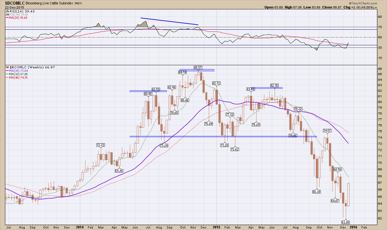
The point of this post is not about beef prices as this one is already “in the books” but rather topping patterns.
I have mentioned this in the recent past that just about everywhere I look, for those investments that have not already topped out and begin braking down, I see topping patterns lurking around every corner. I wanted to show to a couple of examples, GLW and GS. The first is is Corning glass works (GLW) who’s claim to fame is the gorilla glass that just about every cell phone and tablet use. As you can see in the chart below it after peaking just above $24 (it stopped right here 3x times before in 2006, 2007 & 2008) and like beef prices in April, has formed a very textbook, symmetrical head and shoulders pattern. Adding to the bearishness is price is below the (red) 200 day moving average which is pointing down. A breakdown below the neckline has an initial target at the Nov 2012 low ~$10. Ouch

My next example is Goldman Sachs, GS. Like GLW above, the same topping pattern is in development. Price tested the 200 day moving average from below 6 weeks ago but failed to hold and is now below. While not quite as bearish as GLW, the (red) 200 dma has flattened out and is beginning to curl southward.

All patterns, until they confirm with a break of price below the necklines are, at best, warning signs for what may lay ahead. Once they do trigger and confirm, they are best used for risk management purposes. With so many stocks already broken down, watching some of the remaining strong ones begin to crumble should have everyone very cautious here. It does me.