Biases

San Ramon fee only CFP, independent investment advisor - biases - 8-20-18.jpg

Source: New York Times

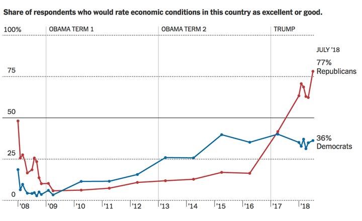
Surprise! Partisan politics confuses some peoples’ ability to make objective assessments of economic data:

“Americans’ perceptions of the economy’s prospects increasingly depend more on their political identity than statistics on output or stock markets. “

Is it a cognitive issue? Of course! Salesmanship? Maybe. Bias? Definitely. But why else would the change in POTUS affect anyone’s impression of the economy improving? Is it more likely forward expectations or tribalism?

Truth be told, it really does not matter.

What does matter is this simple bottom line: your biases affect how you see the world, which in turn affects how you think about, well, everything: politics, money, the economy, and of course, your investments.

You can do your best to not allow these elements into your investing strategies, but if you are human, it is all but inevitable that cognitive errors and biases eventually show up in your portfolios . . .

Blame it on the Millennials

The Millennial's get a bad rap for their adoration of avocados and so it should not be too much of a surprise when you look at the chart of “The First Name in Avocados”, CVGW. As you can see in the longer term view, the stock is up more than 350% over the past 5 years.  This rise has only been interrupted once when it broke its first uptrend line during the 2016-2017 consolidation. While there is negative divergence on RSI momentum, it is still above both its rising 200day moving average and second, long term uptrend. Remember, divergence doesn’t matter … until it does.

bay area CFP fee only investment advisor 8-15-18 CVGW2.png

On a shorter term time frame of the stock below, we see price has broken out above prior resistance and out of a bullish cup and handle continuation pattern. The upside target for this pattern is up around the $113 level. With the breakout occurring on large volume (bottom pane), it helps to confirm and validate the setup. From a risk management standpoint, I see no reason to hold on to the stock if it falls back below the breakout level. As such, with a $15+ reward and $3.5 risk (fall below breakout level), this exceeds our desired >3:1 reward to risk on individual stock opportunities   

san ramon CFP fee only investment advisor. - 8-15-18 CVGW.png

Peter Lynch was the best investor I know of who would watch for areas to invest in based upon strength in certain social behavior. And he had one of the best performance records … ever.  As it turns out in the spirit of Peter, internet memes appear to also be a great place to troll for investment ideas.  

Finally, Some Clarity

We have all heard the catchy investing phrase “Sell in May and Go Away” and have likely seen the supporting data used to grab our attention. What has always bothered me, not having fully been able to do my own back-testing, was how a few major corrections skewed the data and, if removed, what would the results be. Those major corrections were fat-tailed events and not indicative of a “normal” market. I always wondered if you normalized the data (ie remove those fat tails) what would the data show. Finally, one of my favorite technicians, Tom McClellan did exactly that. 

His bottom line is “Sell in May and Go Away” is not valid BUT being cautious in August and September is as it has been historically a weak period for stocks. I wish I were, but I am not good enough to come up with a snappy rhyming jingle for this “new normal”.

I have pasted part of his analysis below. For those who want to read the entire findings it is available here.

 How Seasonality Has Changed

Bay areas best fee only independent investment advisor and certified financial planner 8-13-18 #1.gif

We all know about the factor of seasonality, and especially about how it is distilled into the bit of TV news wisdom, “Sell In May and go away”.  That phrase has been around for decades, originally supposedly referring to traders in England who would “Sell in May and go away, and come back on St. Leger’s Day”.  This referred to the custom of aristocrats, merchants, and bankers who would skip town and go to the country during the hot months, returning for the St. Leger’s Stakes, a horse race held in September. Source=Investopedia

It just happens to be a fun rhyme for the U.S. stock market, minus the St. Leger’s Stakes reference, but only during the past couple of decades.  Years ago, seasonality did not work that way, which is what I explore with this week’s chart. 

For years I have employed a file of data I created going back to 1976, a start point chosen so as to have a decent representative sample of what seasonality looks like.  I also elected to omit the enormous bear market year of 1974, and its enormous rebound year of 1975, neither of which makes for a good contribution toward what “normal” looks like. 

Creating an annual seasonal pattern requires several mathematical steps.  One must first chop up the data into 1-year chunks of time.  Next, one must equalize each of the years, as best as is possible, so that the years one is examining are as close to the same as possible.  Back in the 1970s, there were 253 trading days per year, and now it is 252 due to a change in holidays.  And then in years like 2012, when Hurricane Sandy shut down trading for a couple of days, there are days missing.  All of these require adjustments.

I also leave out 1987 entirely, because the height of the peak that year and the depth of the October 1987 crash tend to drown out the voices of the other data.  1987 is not a good example of “normal” market behavior.

Next, each year’s data has to be reset to reflect a percentage change from the start point.  Averaging together a year when the DJIA is above 20,000 with ones when it is below 1,000 makes no mathematical sense, and so we have to adjust for that. 

Once each year’s data is fitted in a Procrustean fashion to our ideal year, we can then then average all of the years together to get an ideal average pattern of what “seasonality” looks like.  But this is only the starting point for doing any meaningful analysis. 

Throwing all possible years together into one average pattern can miss important information, such as a shift in the nature of seasonality.  That is the point behind this week’s chart.  In the 1970s and 1980s, there was not a lot of difference in the months of the year.  The August and September weakness we are all aware of now really was not a relevant factor in that earlier period.

This is fascinating, and a sign that we might not all understand as much as we think we know about what drives price behavior.  Among the theories offered for why summer to autumn weakness is a relevant factor is that financial liquidity gets tied up in the agricultural futures market, as money needs to be available to pay farmers for their harvests each fall, taking it away from the stock market.  But if that factor is not present for a 20-year period, it is probably not a relevant and enduring factor. 

Getting to the “why” is much less important than establishing the “is”.  And the “is” always trumps the “why”, and also the “should”.  The last 20 years’ data show that August and September have become pretty consistently weak months for the U.S. stock market.

Here is a current chart of the DJIA in 2018 versus the pattern of the last 20 years:

san ramon's best fee only independent investment advisor and certified financial planner 8-13-18 #2.gif

Two for the Bulls

Since I provided two setups for the bears a couple of weeks ago, in the attempt to be fair, balanced and unbiased, here are two setups for the bulls. Neither has provided a confirmed buy signal yet but both are very close and have excellent upside potential.

The first is Adtran, ADTN, which after falling 40 in seven months, has started to form a nice base. Price sits just below near-term resistance, its 200 day moving average and long term trend line. On the positive side, price is above a rising 50 day moving average, has formed a tight flag pattern after a spate of large institutional buyers stepped in and has formed, but not yet broken out of an inverse head and shoulders reversal pattern.

Ideally, I would prefer to see price drift sideways further and create better symmetry (right shoulder is currently shorter than the left) before it moves higher. A confirmed breakout provides a target that is at the underside of the open gap made at the end of last year, a 20% target from here. Of course, all gaps eventually get filled so I would expect price not stop at bottom of the gap and instead easily move though it and instead find resistance back at December’s. If so, the upside target improves to a 38% gain.

bay area best fee only retirement planning certified financial planning investment advisor - adtn - 8-8-18.png

The second opportunity is in Regeneron, REGN. As you can see it is much further along in its recovery from a large selloff than ADTN is. After falling 43% in ~8 months, REGN found a bottom in early May. Since then, price has climbed above its long term trend line, 50day and 200day moving averages. Additionally, the 50 day moving average is now pointing higher and sits just fractionally below its 200 dma. RSI momentum has moved out of the bearish range and now very bullishly aligned. Last week price popped higher on a very large institutional buy, topped right at prior resistance and since then has drifted lower on declining volume. This is a very ideal set up after a large pop as price is consolidating, building energy for an extended move higher. One could look at the current setup as a very large inverse head and shoulders bottom reversal pattern which has a target back at last September’s highs some 30% above yesterday’s close.  Like ADTN, I would like to see the current consolidation drift sideways long enough to improve upon and balance the symmetry of the pattern.

san ramons best fee only retirement planning certified financial planning investment advisor - regn - 8-8-18.png

I feel compelled to say both charts are not quite ready but are setting up for potential large upsides. It could be hours, days, weeks, months or ...? These opportunities may never materialize so think of this as my ideas, your plan. As much as both patterns would benefit from further consolidation, the market does not care what we want so you need to be nimble as you stalk as they could breakout and trigger at any time (or never).

July 2018 Charts on the Move Video

US stock markets are leading the rest of the world higher.  The intermediate term rally in the dollar has either reversed or put the case for over-weighting foreign investments on hold. I think we muddle through the summer/autumn months and then rally into year-end.  Anyone thinking the same? 

July's Charts on the Move video can be viewed at the link below

https://youtu.be/lmdfJ5p16es